A brand built to communicate the value of organisational change.
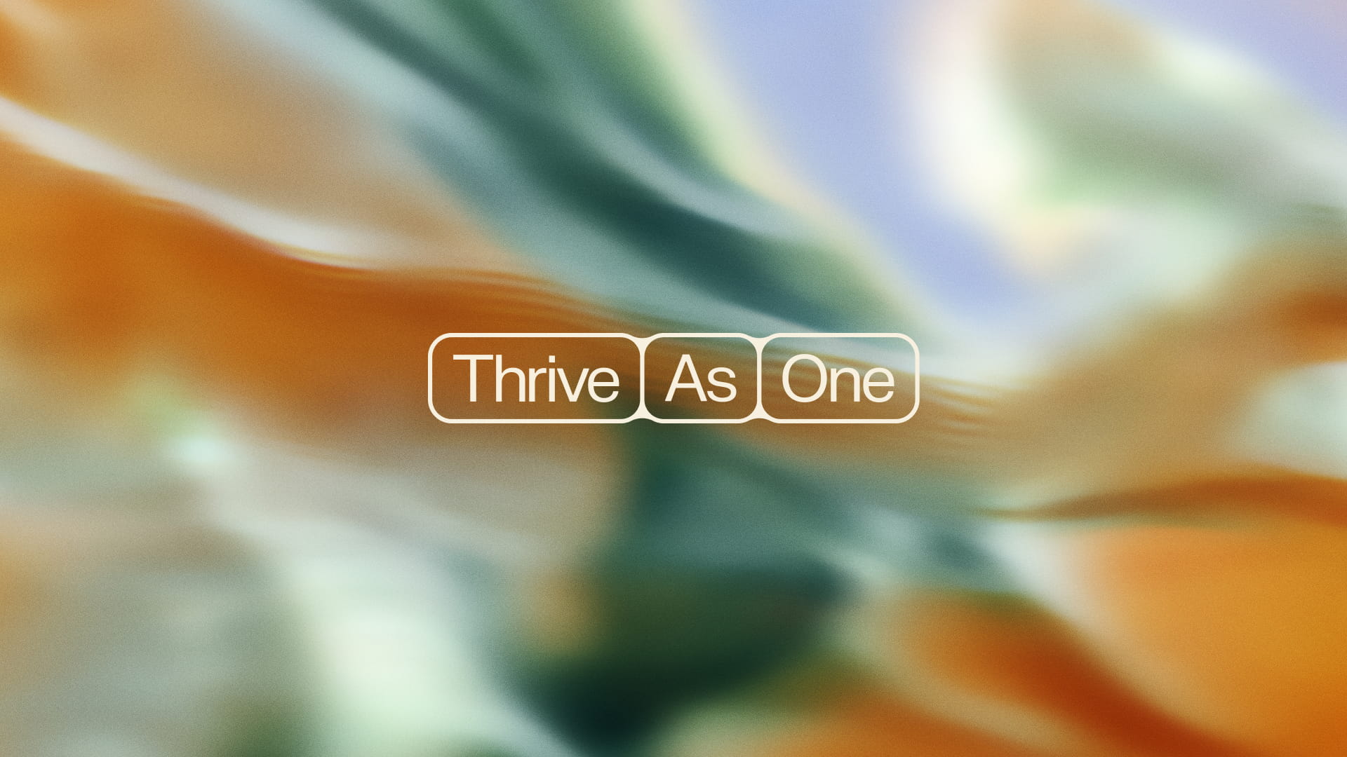
Thrive As One
Thrive As One works with business leaders, teams and organisations to uncover deeply embedded structural issues and create healthier systems for organisational growth.
Through a process of discovery, alignment, cultivation and transition, the consultancy embeds itself within organisations to understand how people, processes and patterns interact across different levels of the business.
With a layered offer rooted in leadership development, culture and whole-system change, Thrive As One needed a brand that could make a complex, deeply human service feel clear and accessible.


Thrive As One had developed a valuable service that helped organisations work through complex structural challenges, addressing the systems, relationships and patterns that shape how people lead, communicate and grow together.
The challenge was that the value of this work was not always easy to articulate to those encountering the consultancy for the first time. With a layered process and outcomes that were often intangible, prospective clients could find it difficult to quickly grasp what Thrive As One did, how the service worked and why it mattered.
As a result, much of the consultancy’s work came through referrals, where trust and understanding had already been established. To grow beyond its existing network, Thrive As One needed to be able to articulate its offering much more clearly.
Our strategic work centred around a series of collaborative workshops in which we worked closely with Thrive As One to understand what the consultancy fundamentally believed, how that perspective shaped its service, and why clients connected with its work.
The aim was to understand the offer deeply enough to repackage it in a way that made sense to prospective clients, not just those already familiar with the work. The challenge was to make the service more accessible and easier to follow, without losing the depth or nuance of what Thrive As One does.
From there, we shaped a clear worldview around the business, rooted in the belief that organisations are living systems, where small actions can create wider ripple effects and meaningful change depends on the relationship between people, purpose and structure.
This idea of interconnectedness became central to the brand, informing both the way Thrive As One explained its work and the visual identity that would bring that thinking to life.
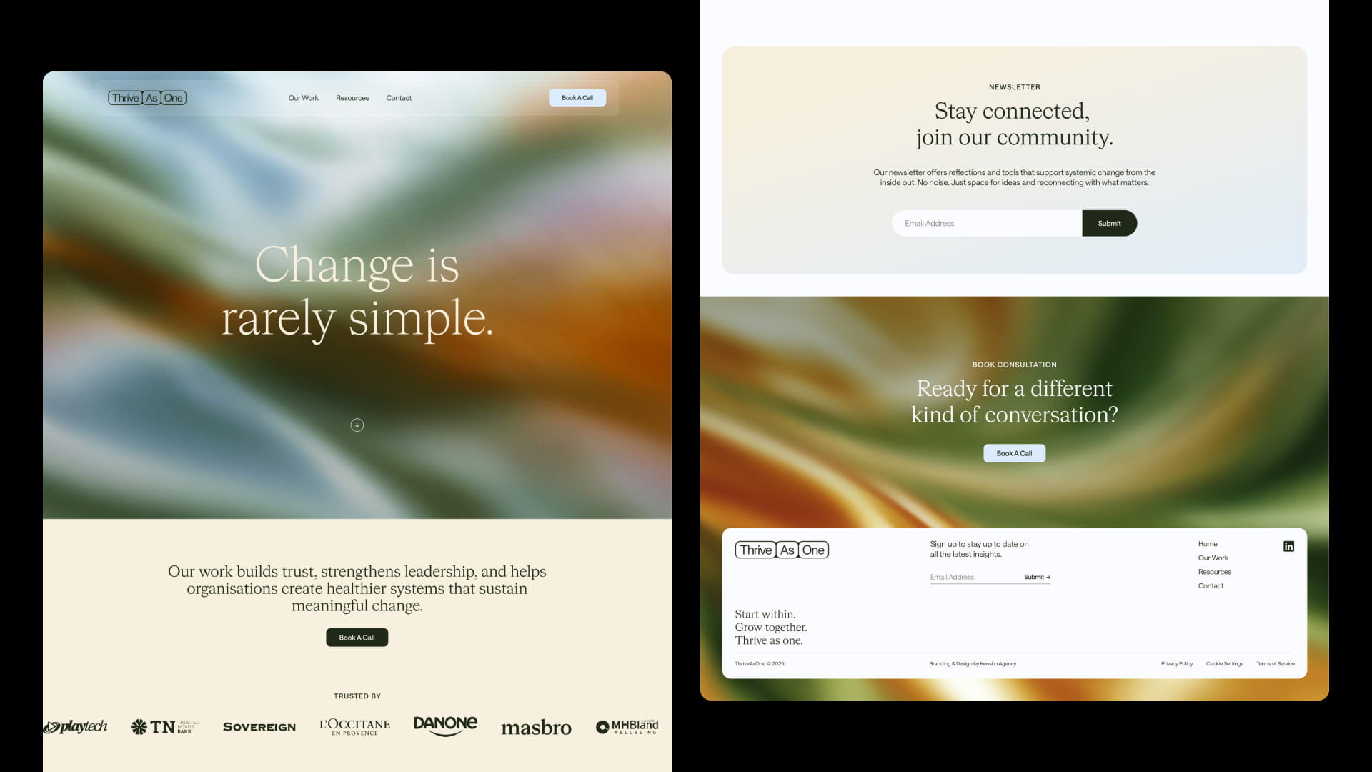
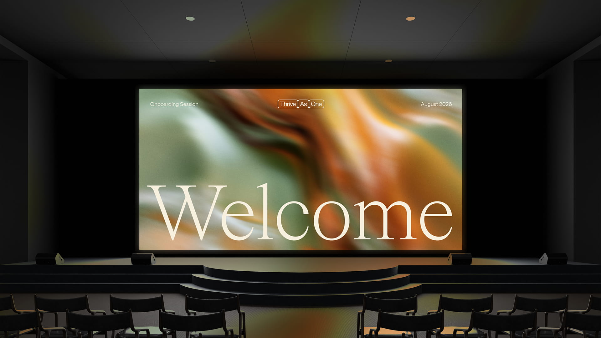
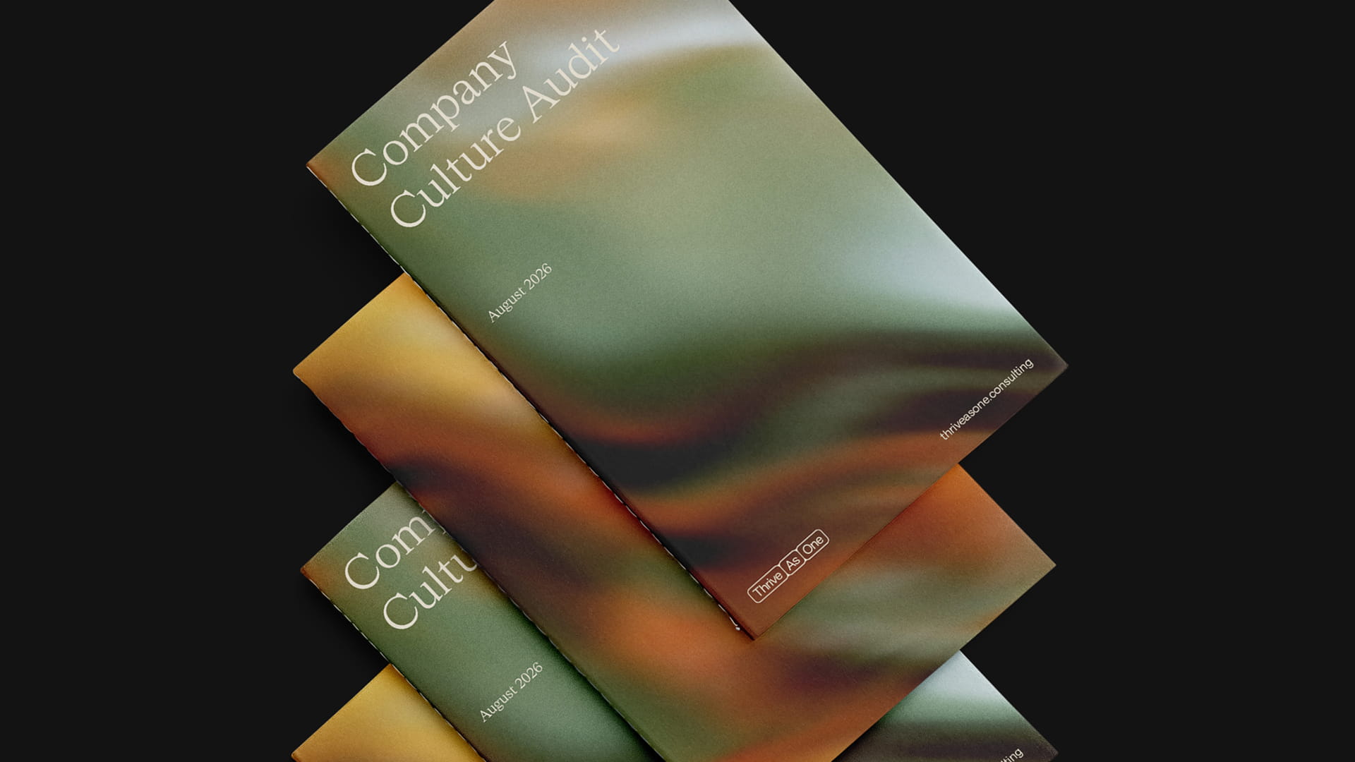
The creative direction was shaped directly by the worldview uncovered through the strategic process. The identity was designed to feel organic and considered, while still carrying the authority needed for a consultancy working with complex organisational challenges.
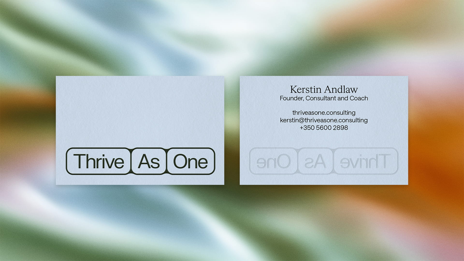
The visual language drew from ideas of interconnectedness, the natural world and movement. Looped, textural environments use shape and colour to suggest a living, breathing system, where elements coexist, react and shift in relation to one another.
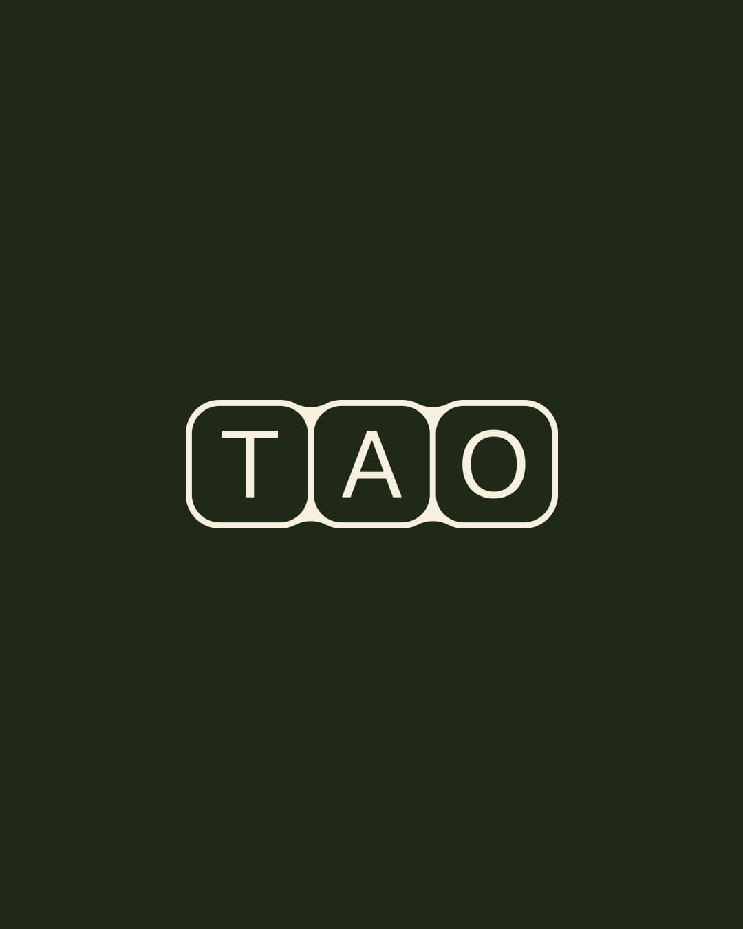
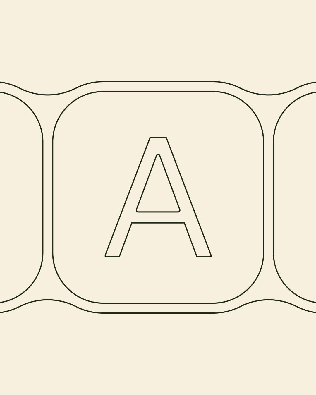
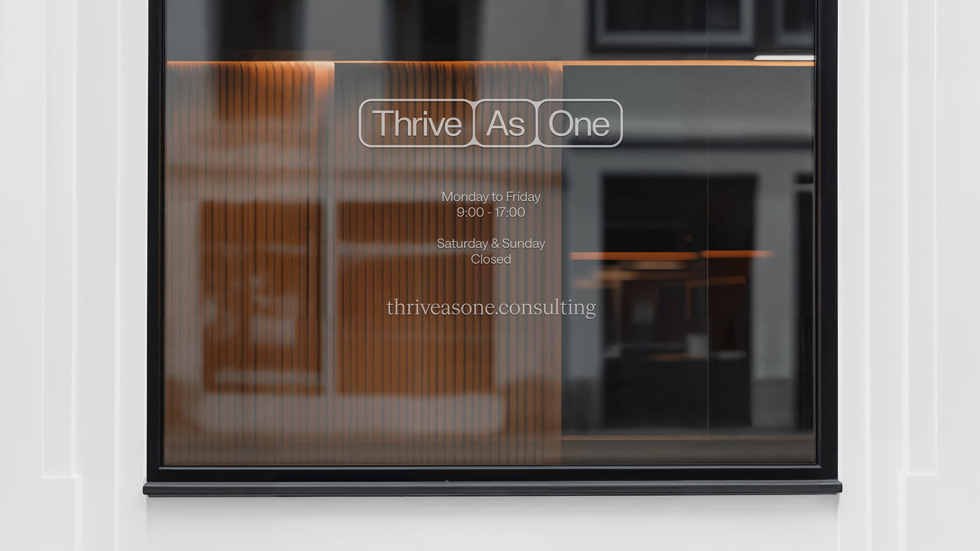
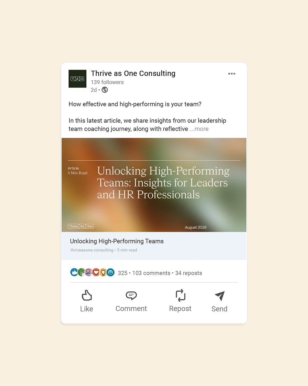
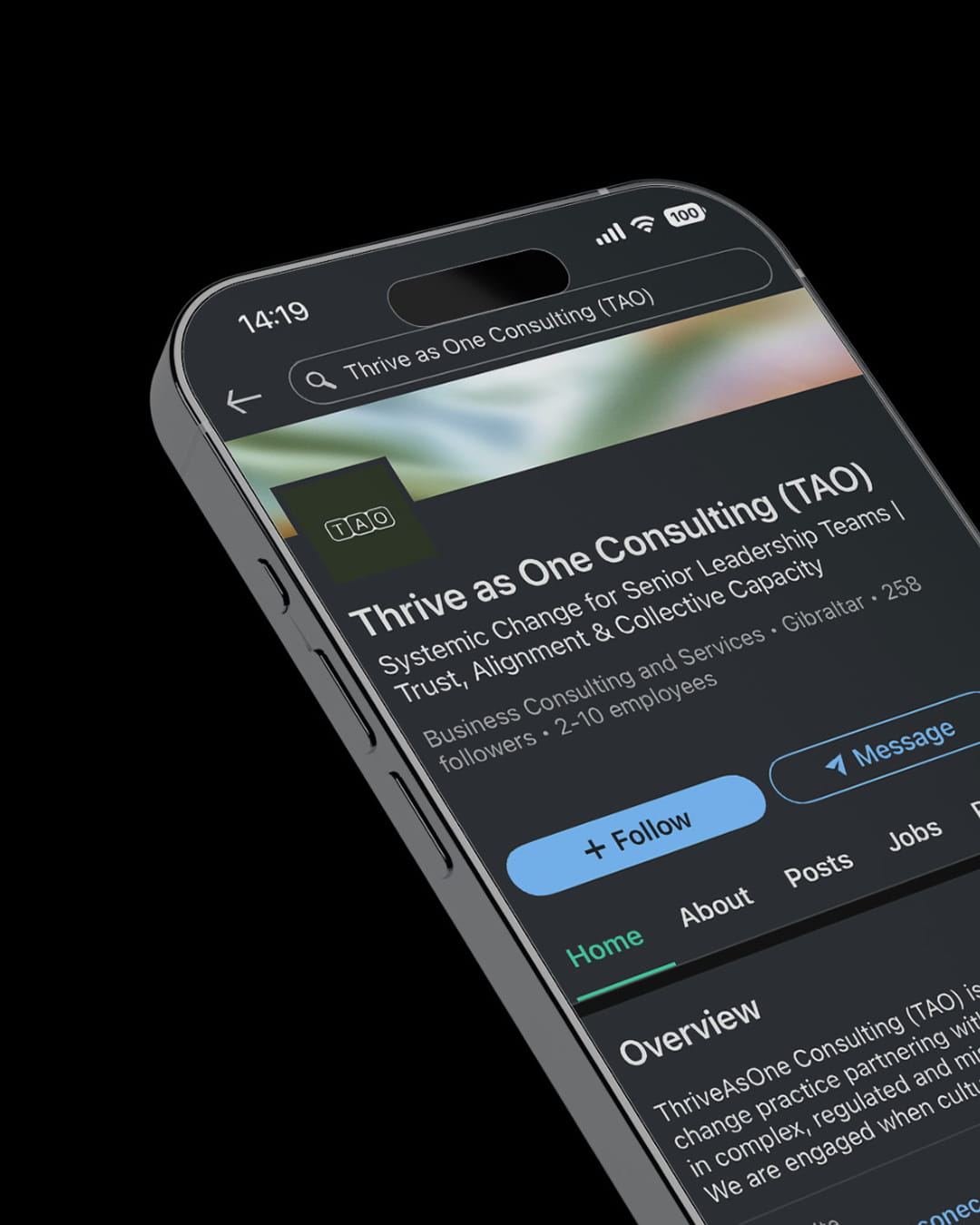
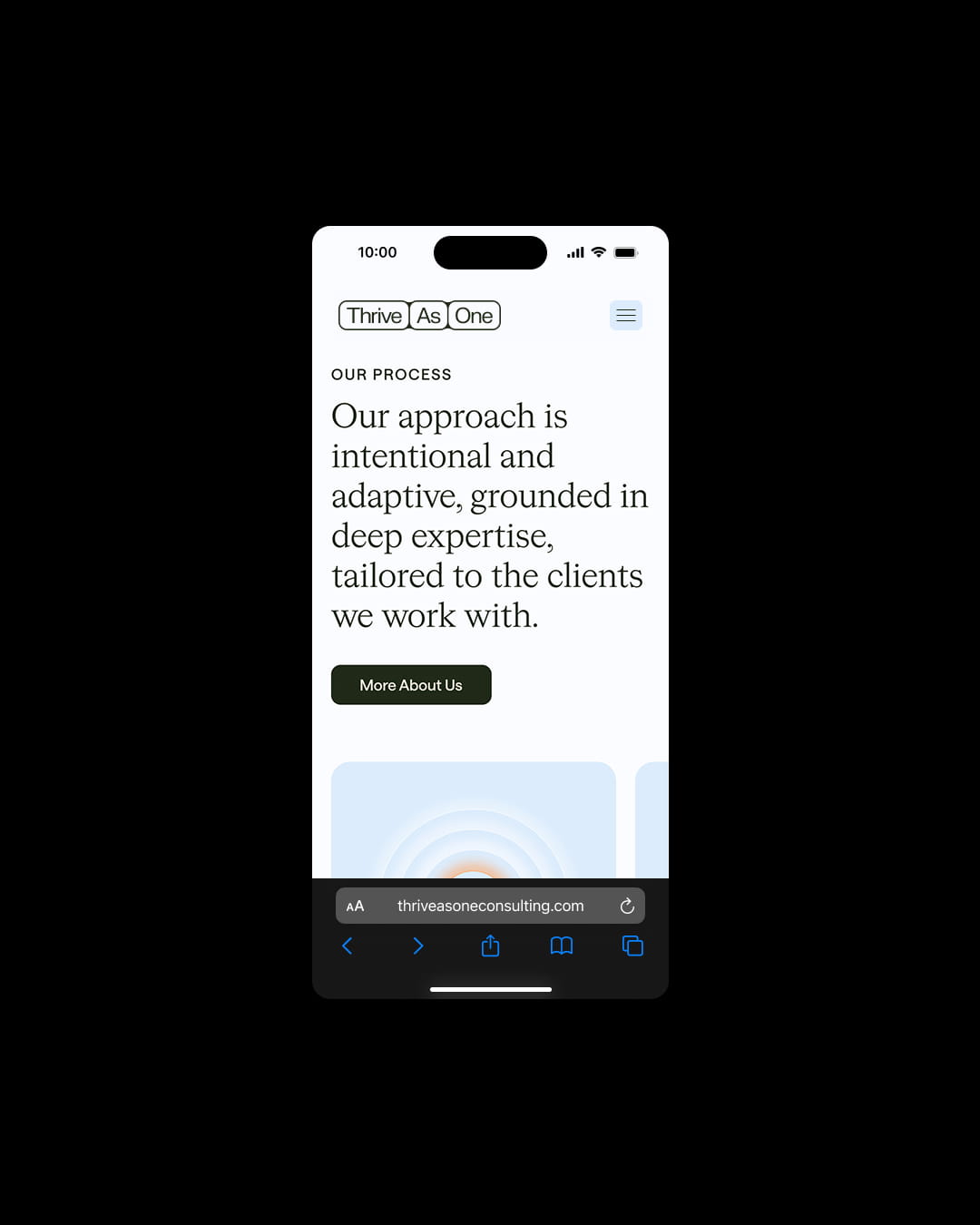
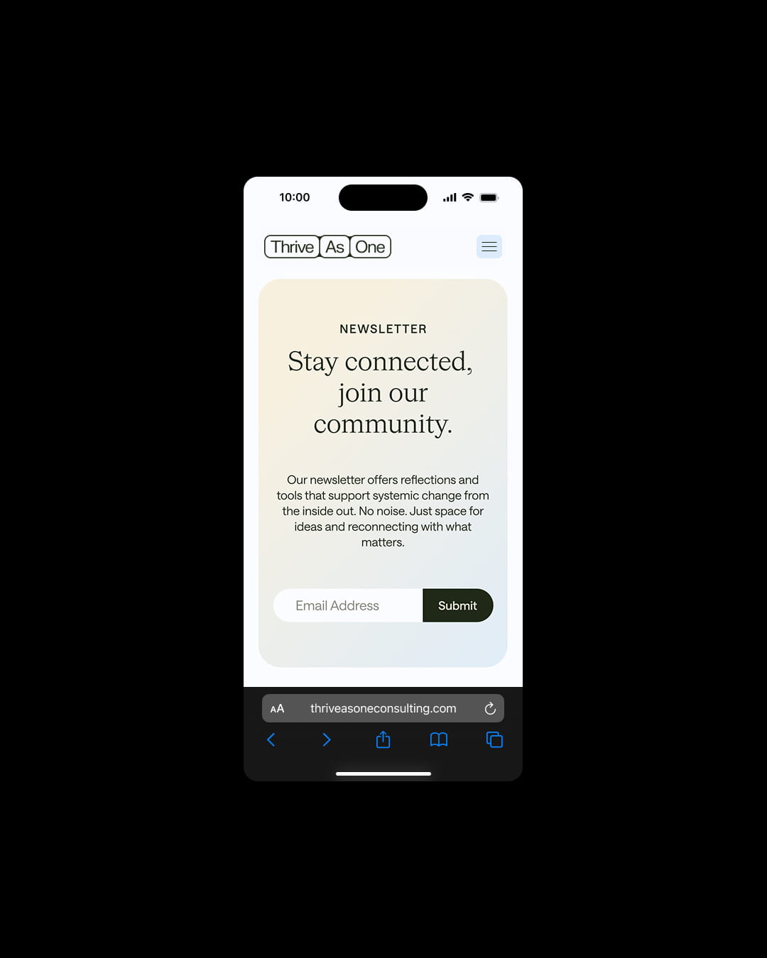
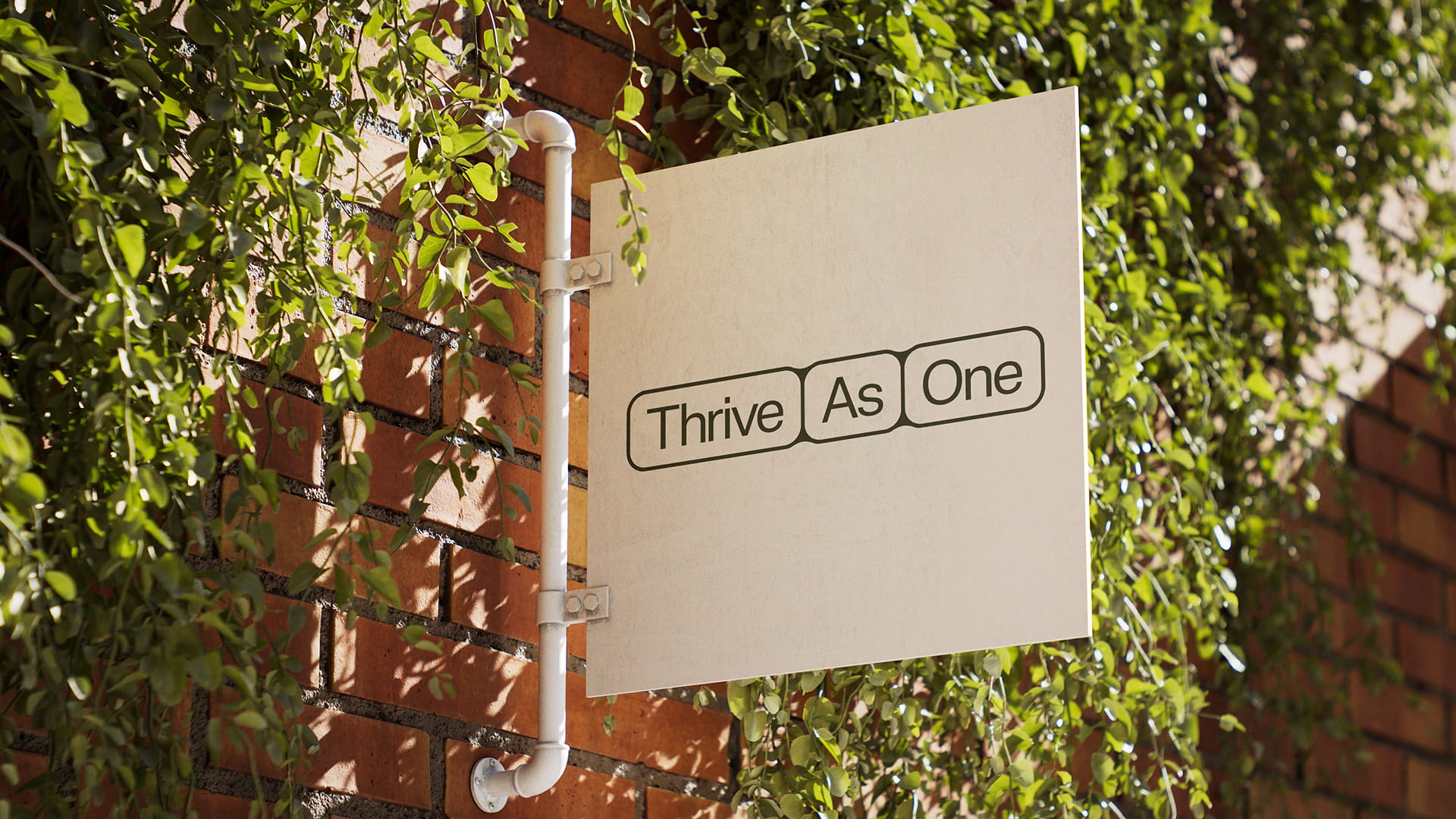
That same idea was carried into the logo suite. The full Thrive As One wordmark and its shorter TAO acronym were built as a flexible system, expanding and contracting between long-form and short-form versions. Inspired by cellular structures, the words and letters sit within containers that connect and relate to one another, suggesting a system in constant movement.
Case details
Thrive As One had developed a valuable service that helped organisations work through complex structural challenges, addressing the systems, relationships and patterns that shape how people lead, communicate and grow together.
The challenge was that the value of this work was not always easy to articulate to those encountering the consultancy for the first time. With a layered process and outcomes that were often intangible, prospective clients could find it difficult to quickly grasp what Thrive As One did, how the service worked and why it mattered.
As a result, much of the consultancy’s work came through referrals, where trust and understanding had already been established. To grow beyond its existing network, Thrive As One needed to be able to articulate its offering much more clearly.
Our strategic work centred around a series of collaborative workshops in which we worked closely with Thrive As One to understand what the consultancy fundamentally believed, how that perspective shaped its service, and why clients connected with its work.
The aim was to understand the offer deeply enough to repackage it in a way that made sense to prospective clients, not just those already familiar with the work. The challenge was to make the service more accessible and easier to follow, without losing the depth or nuance of what Thrive As One does.
From there, we shaped a clear worldview around the business, rooted in the belief that organisations are living systems, where small actions can create wider ripple effects and meaningful change depends on the relationship between people, purpose and structure.
This idea of interconnectedness became central to the brand, informing both the way Thrive As One explained its work and the visual identity that would bring that thinking to life.
The creative direction was shaped directly by the worldview uncovered through the strategic process. The identity was designed to feel organic and considered, while still carrying the authority needed for a consultancy working with complex organisational challenges.
The visual language drew from ideas of interconnectedness, the natural world and movement. Looped, textural environments use shape and colour to suggest a living, breathing system, where elements coexist, react and shift in relation to one another.
That same idea was carried into the logo suite. The full Thrive As One wordmark and its shorter TAO acronym were built as a flexible system, expanding and contracting between long-form and short-form versions. Inspired by cellular structures, the words and letters sit within containers that connect and relate to one another, suggesting a system in constant movement.
Like what you see?