Evolving a performance cycling brand for the global stage.
Nich
Nich is a high-performance Thai bicycle brand with more than 15 years of history, trusted by casual riders and professional athletes alike.
With years of success across Southeast Asia, the brand was preparing to expand into North America, Europe and Oceania. That push called for an identity that could support Nich on a broader international stage while remaining true to the spirit of the existing brand.








Nich had reached a defining moment in its growth, setting its sights beyond Southeast Asia and towards new international markets. As part of that next step, the brand took a hard look at how it presented itself and recognised the need for a refresh that could elevate its identity for a broader global stage.
We were brought on board to help lead that evolution, refining the brand while retaining the soul of the existing identity, which held deep meaning for both the company and its followers.
Our team travelled to Bangkok and spent time closely embedded with Nich, gaining a first-hand understanding of the company’s ambitions, culture and the motivations behind its move into new markets.
That process made two things clear. First, the existing logo carried real value and needed to be preserved in spirit, making this an exercise in refinement rather than reinvention. Second, the time spent in Thailand brought the brand’s cultural context into sharper focus, revealing a deeper layer of identity that could help shape how Nich presents itself beyond performance alone.
From there, our strategy centred on elevating what already existed, refining the identity into something more precise, contemporary and aligned with themes of sporting excellence, while drawing on Thai culture and way of life to inform the wider brand world.
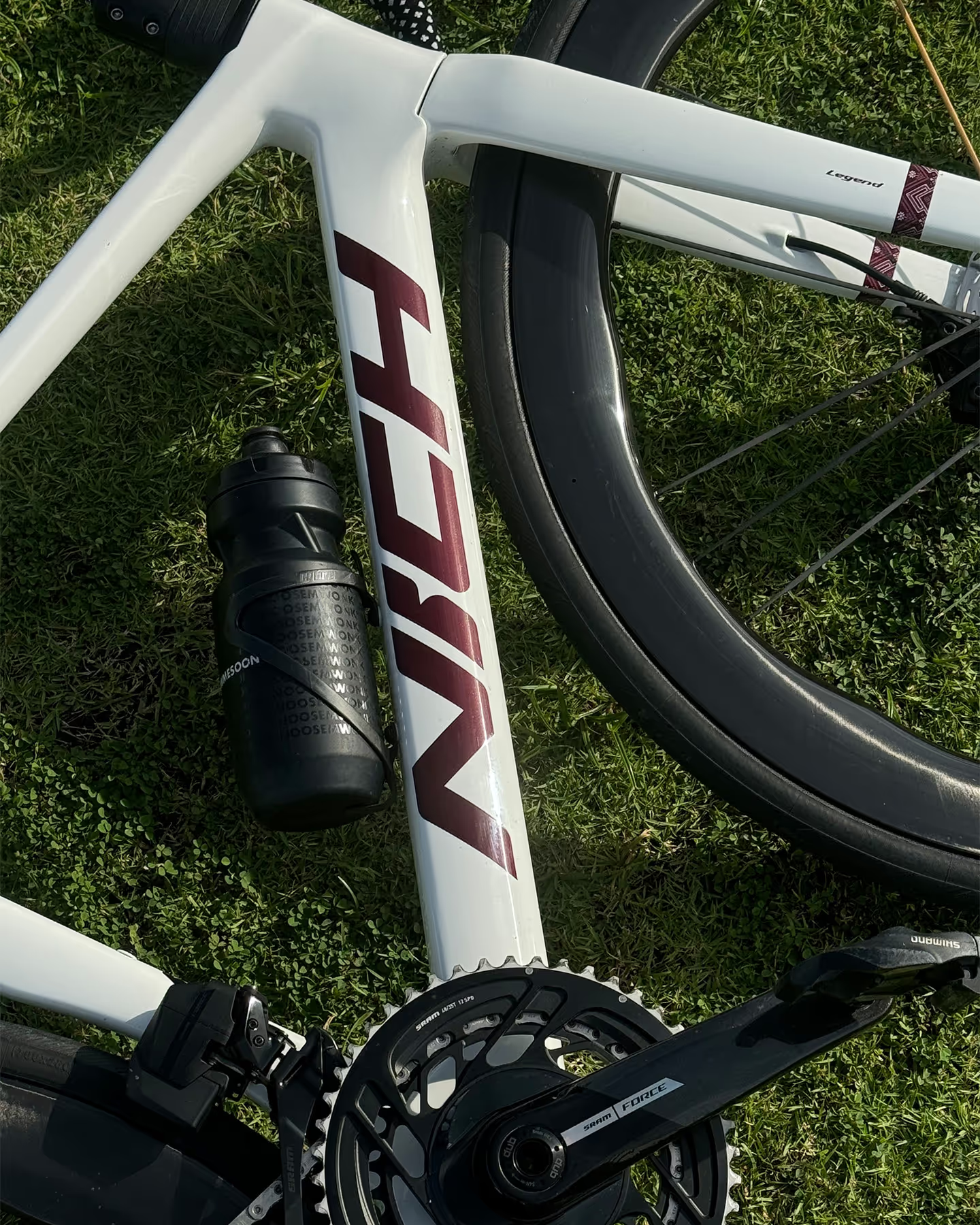
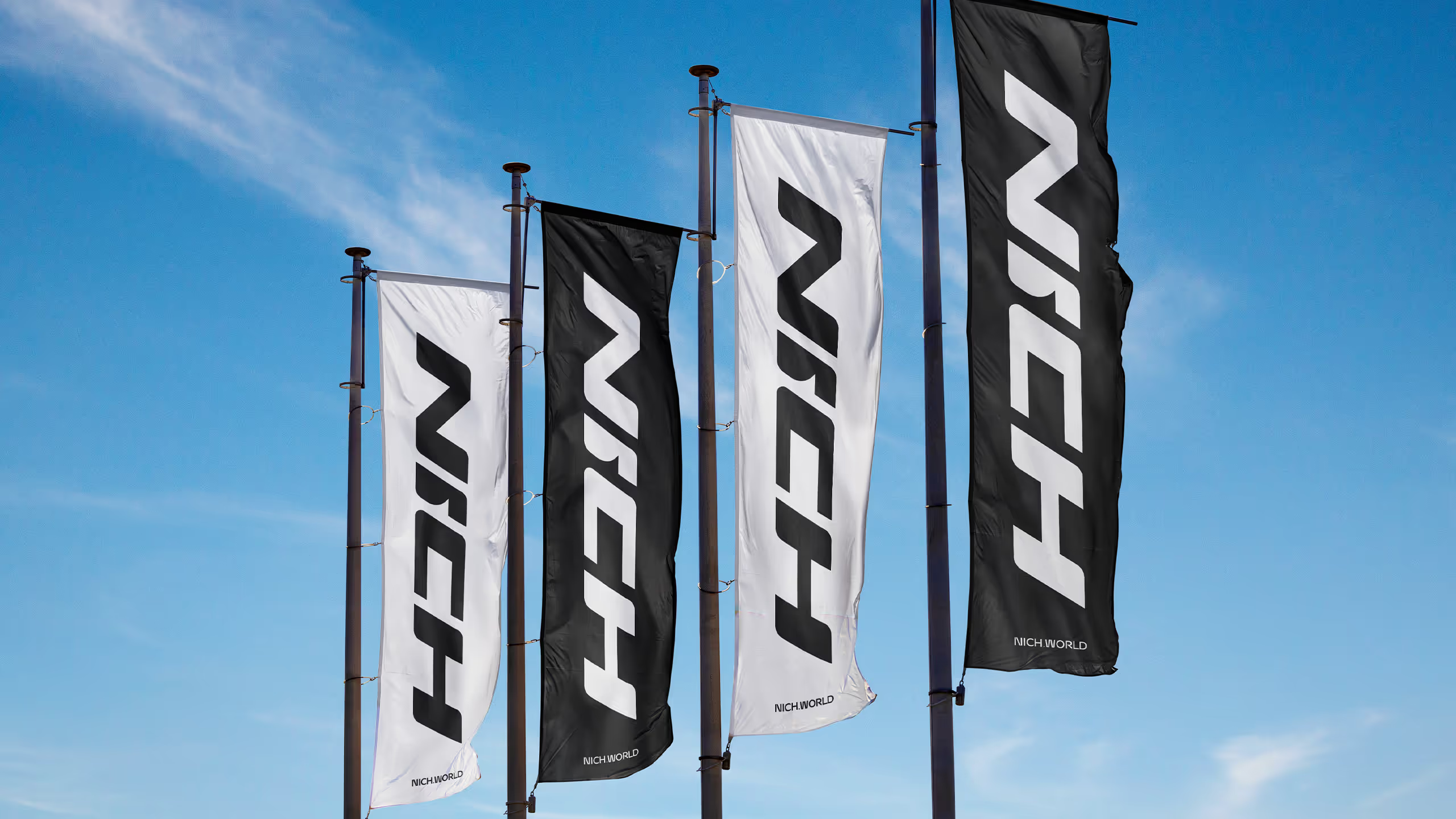
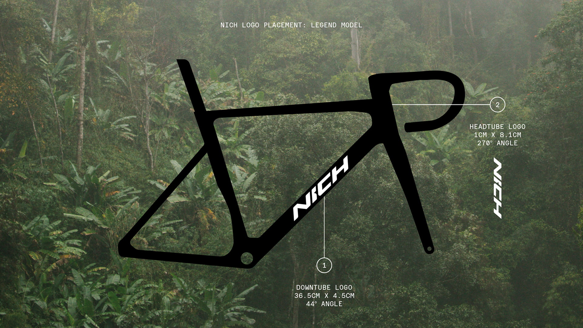
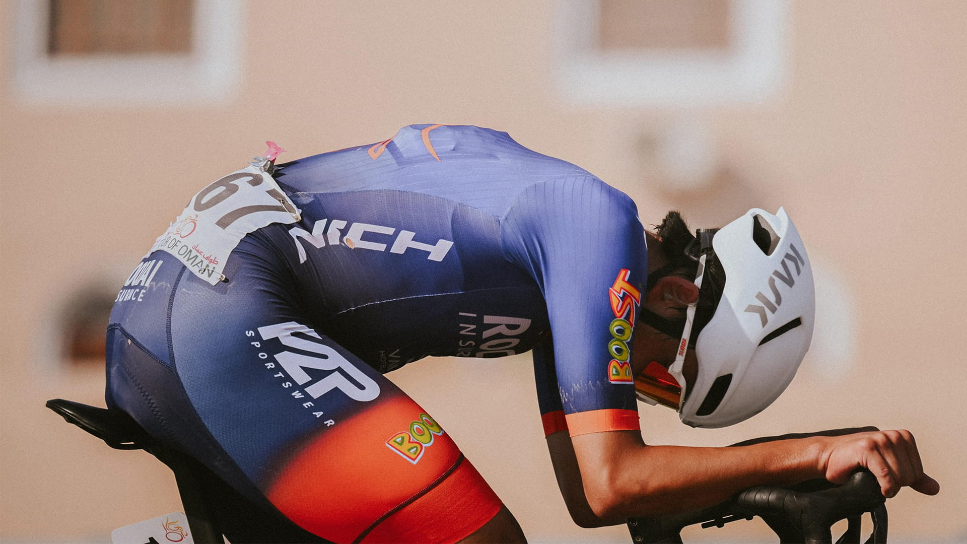
The refreshed identity centred on the Nich logo and its application across the brand, most importantly on the bicycle itself. We explored and reconstructed the existing mark, retaining its most distinctive features while refining it into something sharper, faster and more dynamic. Its construction was heavily influenced by how it would appear on a bicycle down tube, where impact and legibility were paramount.
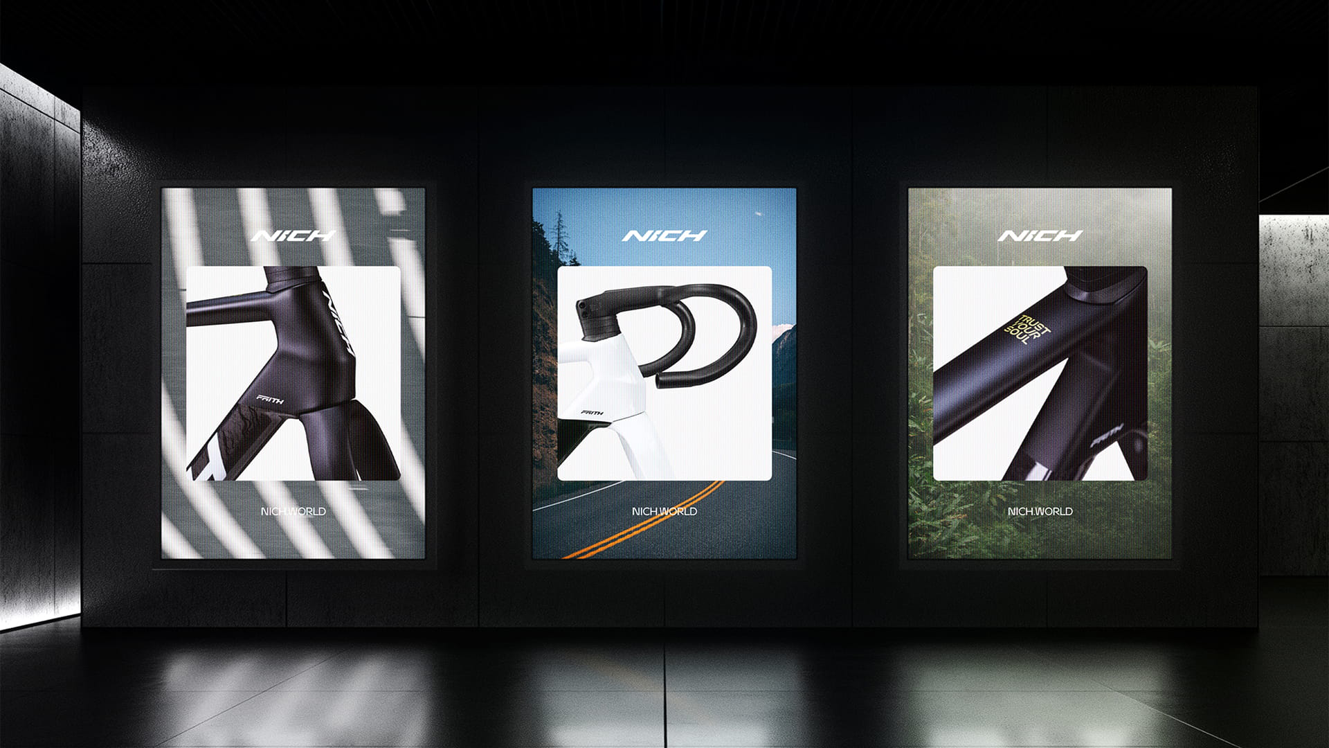
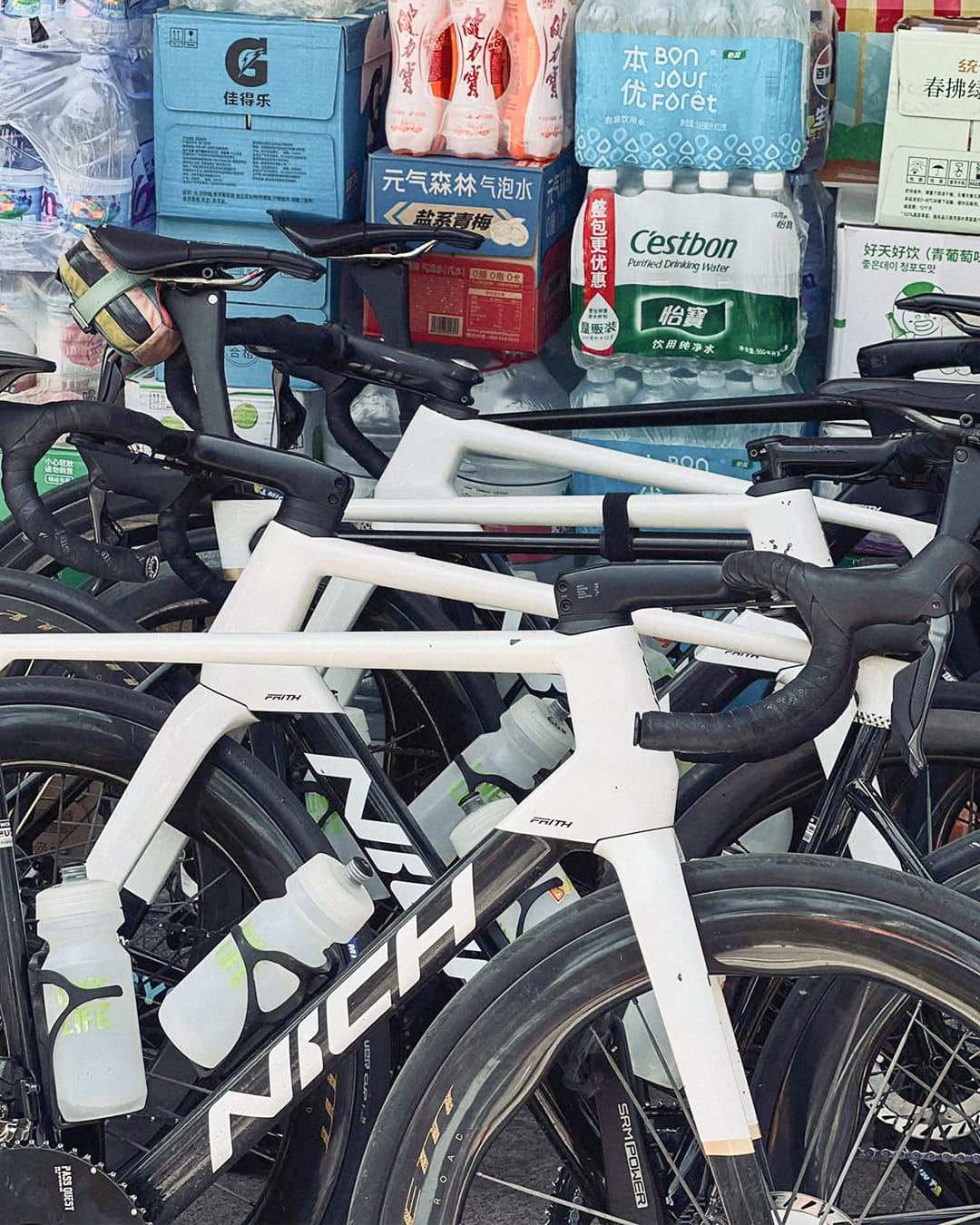
Alongside the identity, we developed an art direction system informed by Nich’s Thai heritage and a strong sense of human spirit. Built around themes of diversity, camaraderie and exploration, it moved beyond pure performance imagery to capture the fuller experience of cycling, the effort, the pause, the conversation, the moments in between. This gave the brand greater richness and emotional depth, creating a visual world that felt grounded, human and true to the culture of riding.
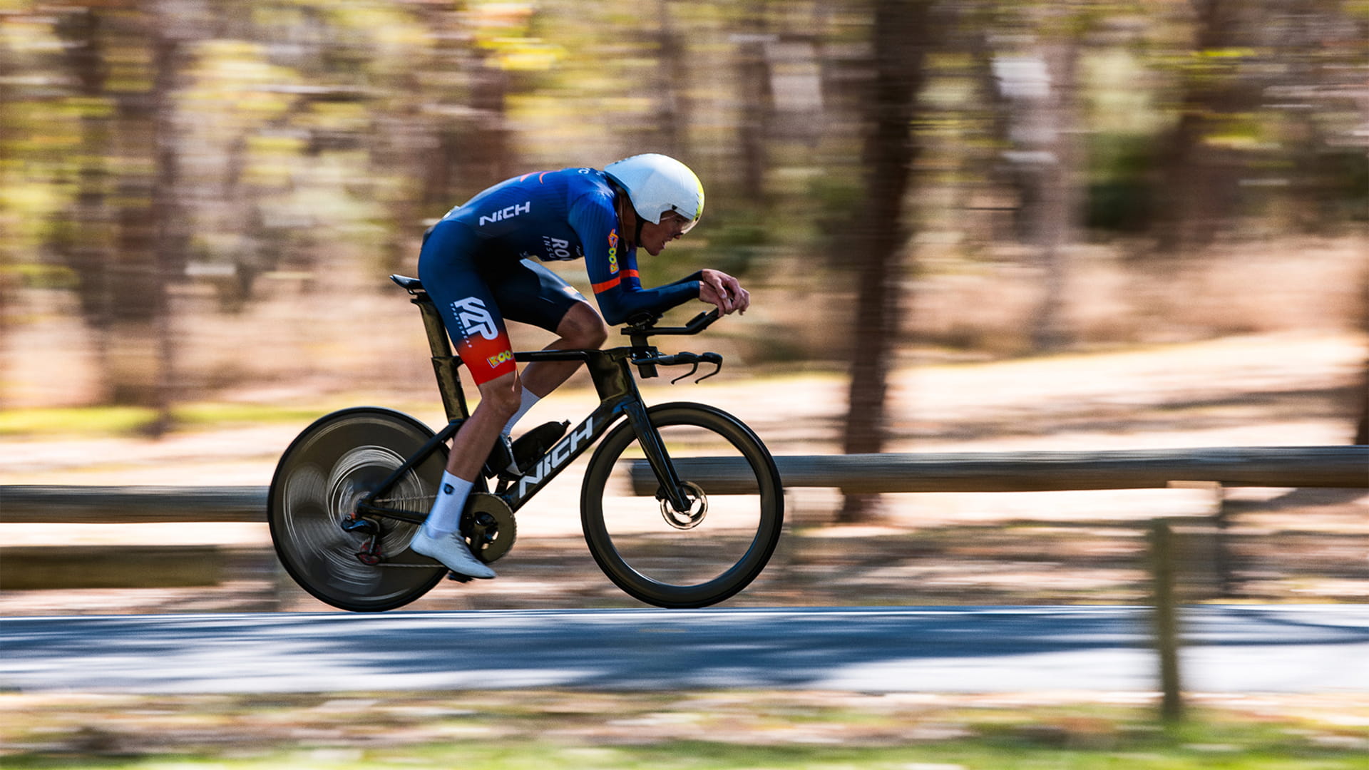
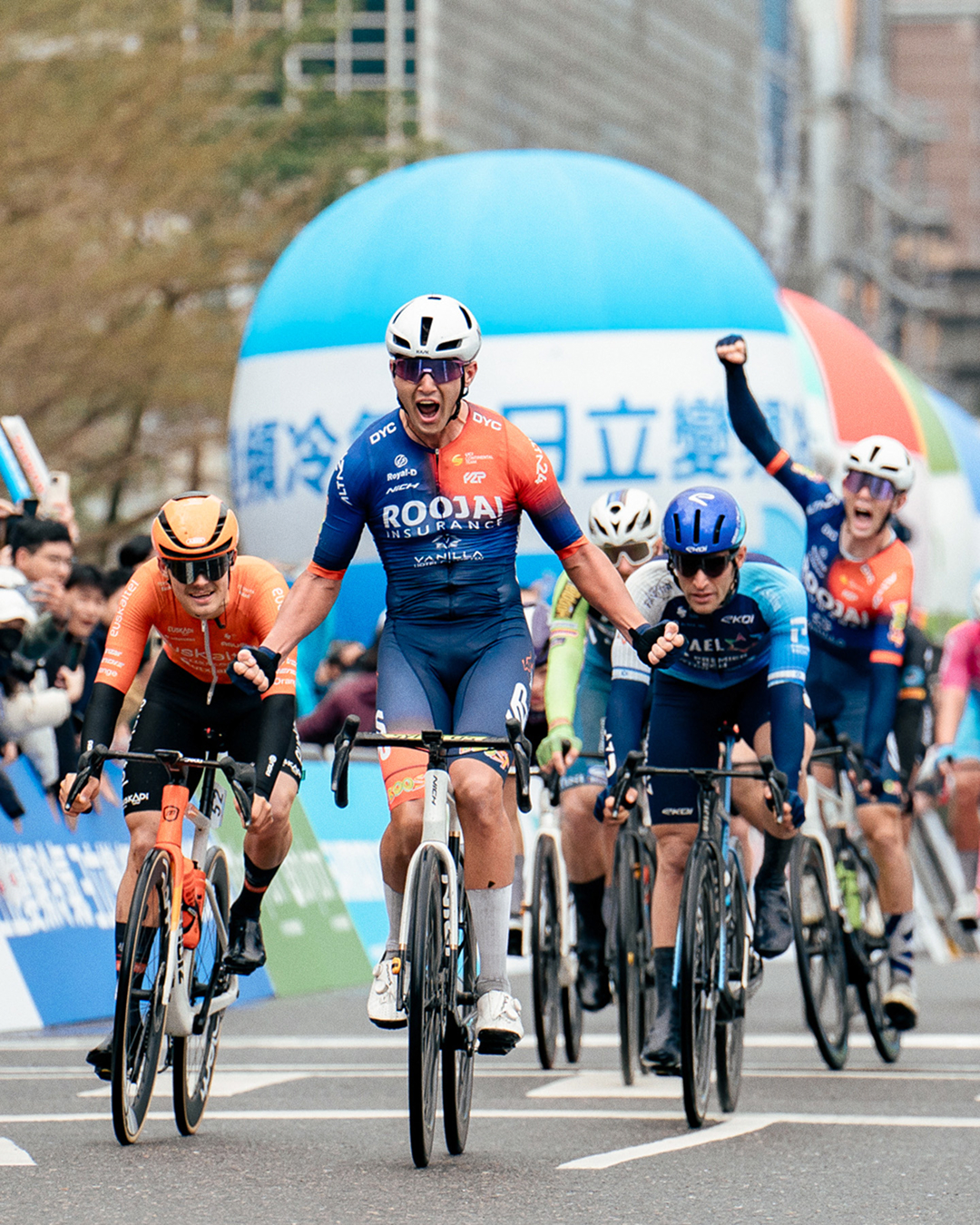
Today, Nich bicycles are raced internationally by the Roojai UCI Continental professional cycling team, ridden by the University of Colorado Boulder cycling team, and used by MRPSBR’s racing teams, including Supercross and motocross athletes, as part of their training.
Case details
Nich had reached a defining moment in its growth, setting its sights beyond Southeast Asia and towards new international markets. As part of that next step, the brand took a hard look at how it presented itself and recognised the need for a refresh that could elevate its identity for a broader global stage.
We were brought on board to help lead that evolution, refining the brand while retaining the soul of the existing identity, which held deep meaning for both the company and its followers.
Our team travelled to Bangkok and spent time closely embedded with Nich, gaining a first-hand understanding of the company’s ambitions, culture and the motivations behind its move into new markets.
That process made two things clear. First, the existing logo carried real value and needed to be preserved in spirit, making this an exercise in refinement rather than reinvention. Second, the time spent in Thailand brought the brand’s cultural context into sharper focus, revealing a deeper layer of identity that could help shape how Nich presents itself beyond performance alone.
From there, our strategy centred on elevating what already existed, refining the identity into something more precise, contemporary and aligned with themes of sporting excellence, while drawing on Thai culture and way of life to inform the wider brand world.
The refreshed identity centred on the Nich logo and its application across the brand, most importantly on the bicycle itself. We explored and reconstructed the existing mark, retaining its most distinctive features while refining it into something sharper, faster and more dynamic. Its construction was heavily influenced by how it would appear on a bicycle down tube, where impact and legibility were paramount.
Alongside the identity, we developed an art direction system informed by Nich’s Thai heritage and a strong sense of human spirit. Built around themes of diversity, camaraderie and exploration, it moved beyond pure performance imagery to capture the fuller experience of cycling, the effort, the pause, the conversation, the moments in between. This gave the brand greater richness and emotional depth, creating a visual world that felt grounded, human and true to the culture of riding.
Today, Nich bicycles are raced internationally by the Roojai UCI Continental professional cycling team, ridden by the University of Colorado Boulder cycling team, and used by MRPSBR’s racing teams, including Supercross and motocross athletes, as part of their training.
Like what you see?