Marking 25 years of a landmark Gibraltarian album.
Melon Diesel
Melon Diesel are one of Gibraltar’s most successful musical exports, emerging onto the Spanish rock scene in the 90s and building a career that saw them achieve major commercial success, receive Latin Grammy nominations and share stages with acts including R.E.M., Manic Street Preachers and Oasis.
To celebrate the 25th anniversary of their debut album, La Cuesta de Mr. Bond, we were engaged by the concert promoter to create a one-off identity for a milestone performance at Gibraltar’s Europa Sports Complex.



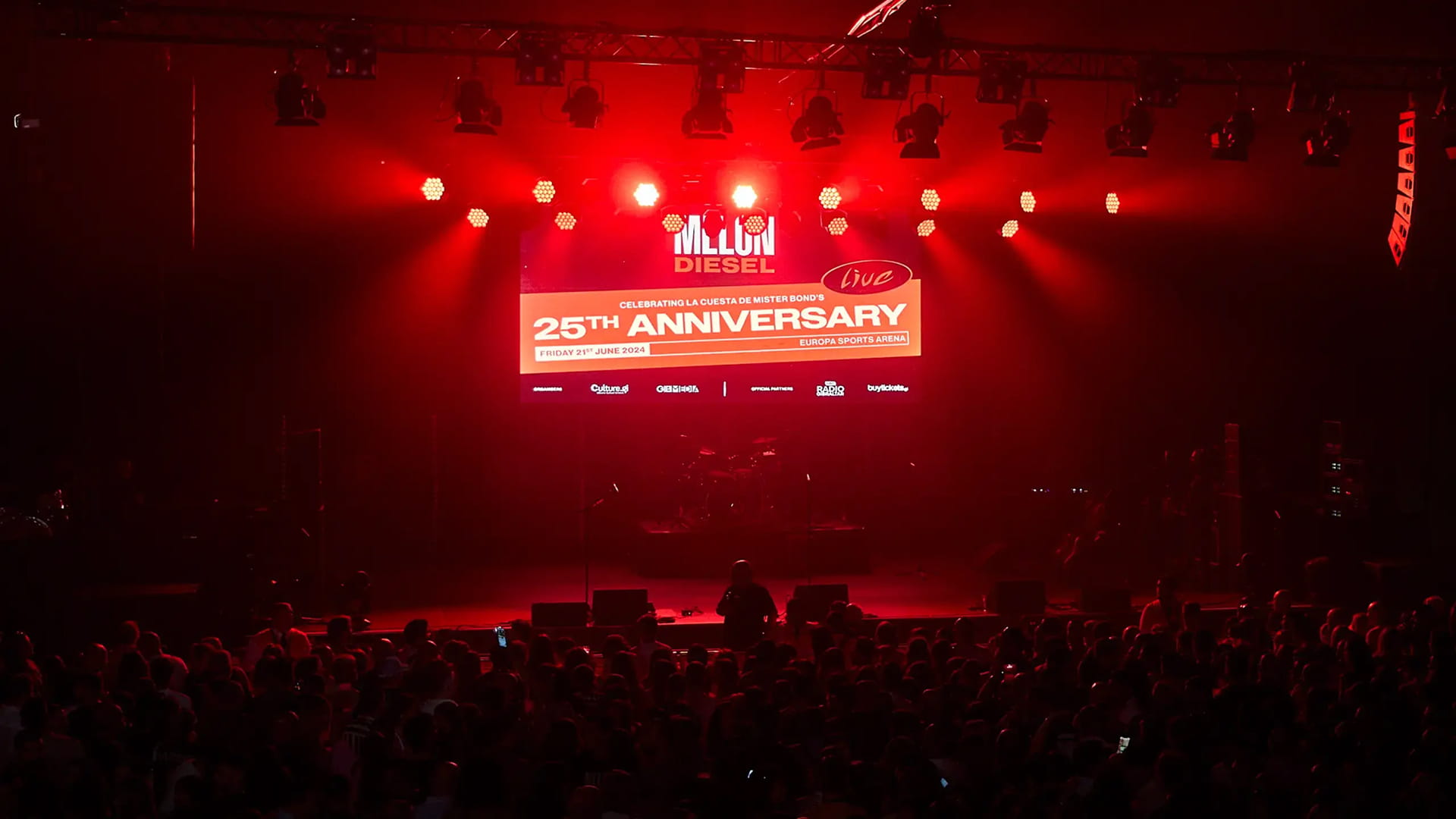
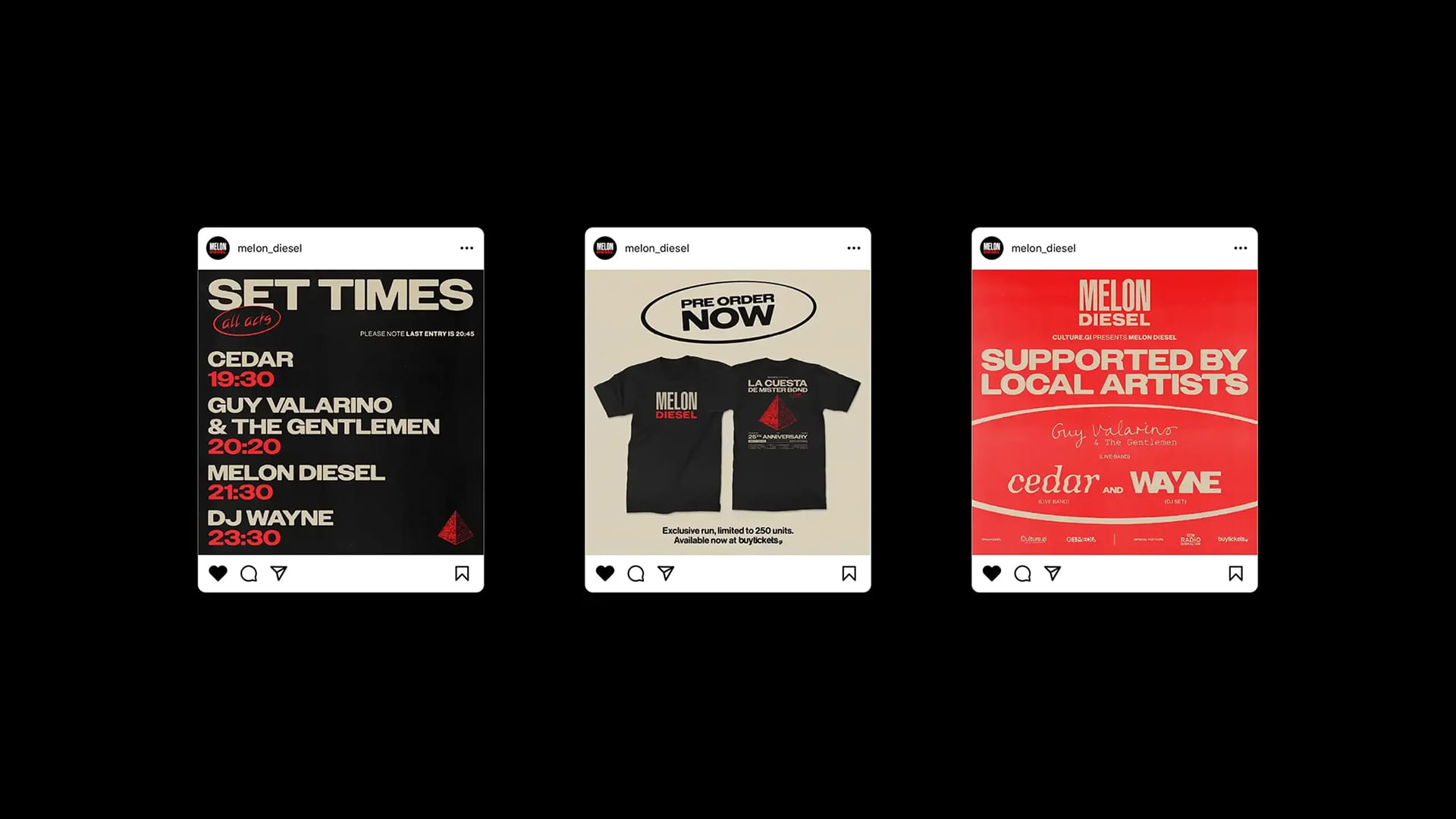





Twenty-five years after the release of La Cuesta de Mr. Bond, the anniversary concert marked an important moment in Melon Diesel's history.
The anniversary presented an opportunity to give that milestone the attention it deserved, creating a concert experience with its own identity and a heightened sense of occasion that went beyond the music alone.
As one of Gibraltar’s most widely recognised bands, Melon Diesel were already familiar to us. However, our strategic work began by speaking with the promoter to better understand the significance of La Cuesta de Mr. Bond, the band’s history and how design could support the event in a meaningful way.
Because the concert was a celebration of an album released 25 years earlier, we knew the identity had to draw from that moment in time. We immersed ourselves in the band’s archive, looking at photography, CD artwork, graphic treatments and the broader visual language surrounding Melon Diesel in the late 1990s.
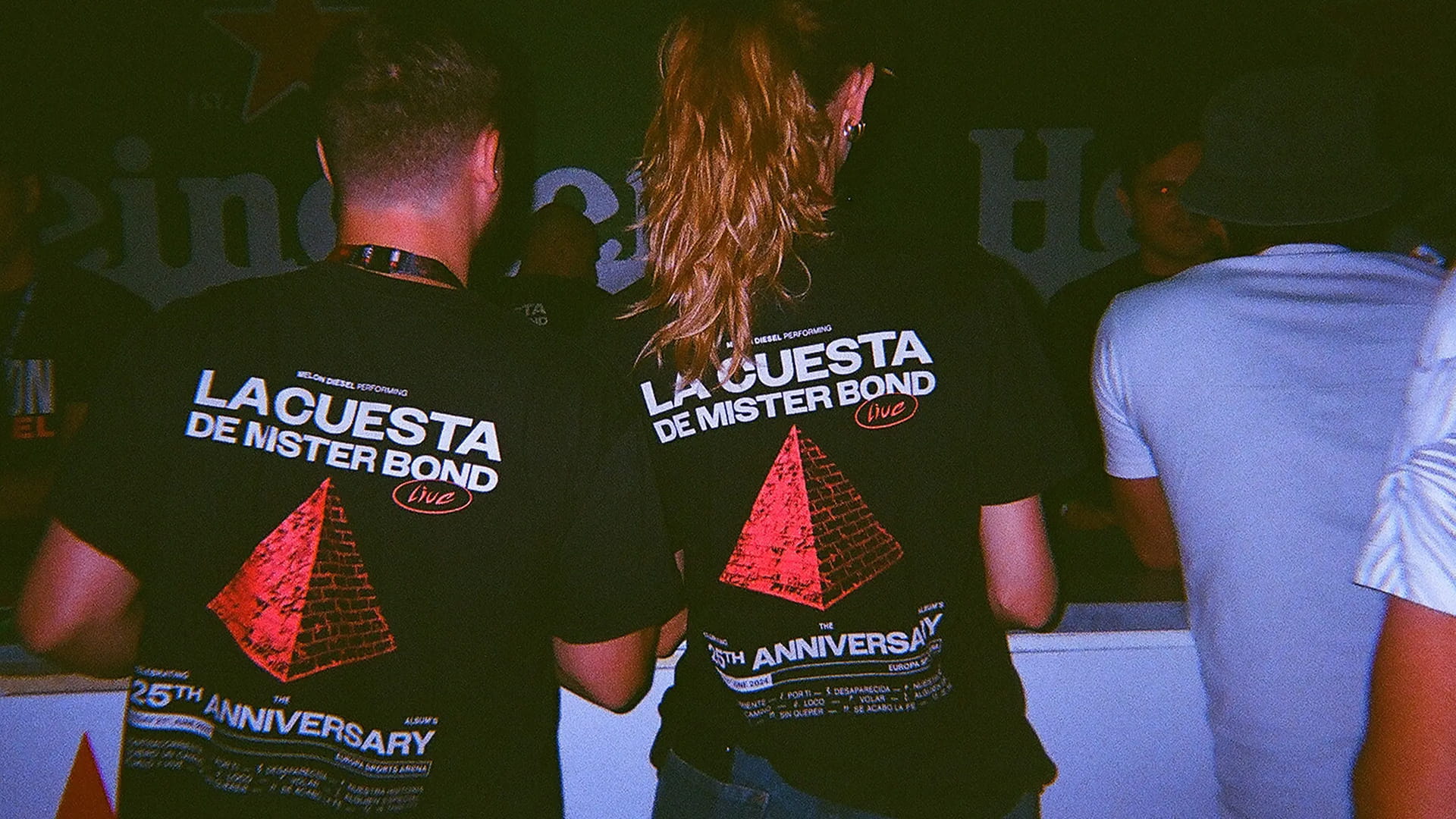
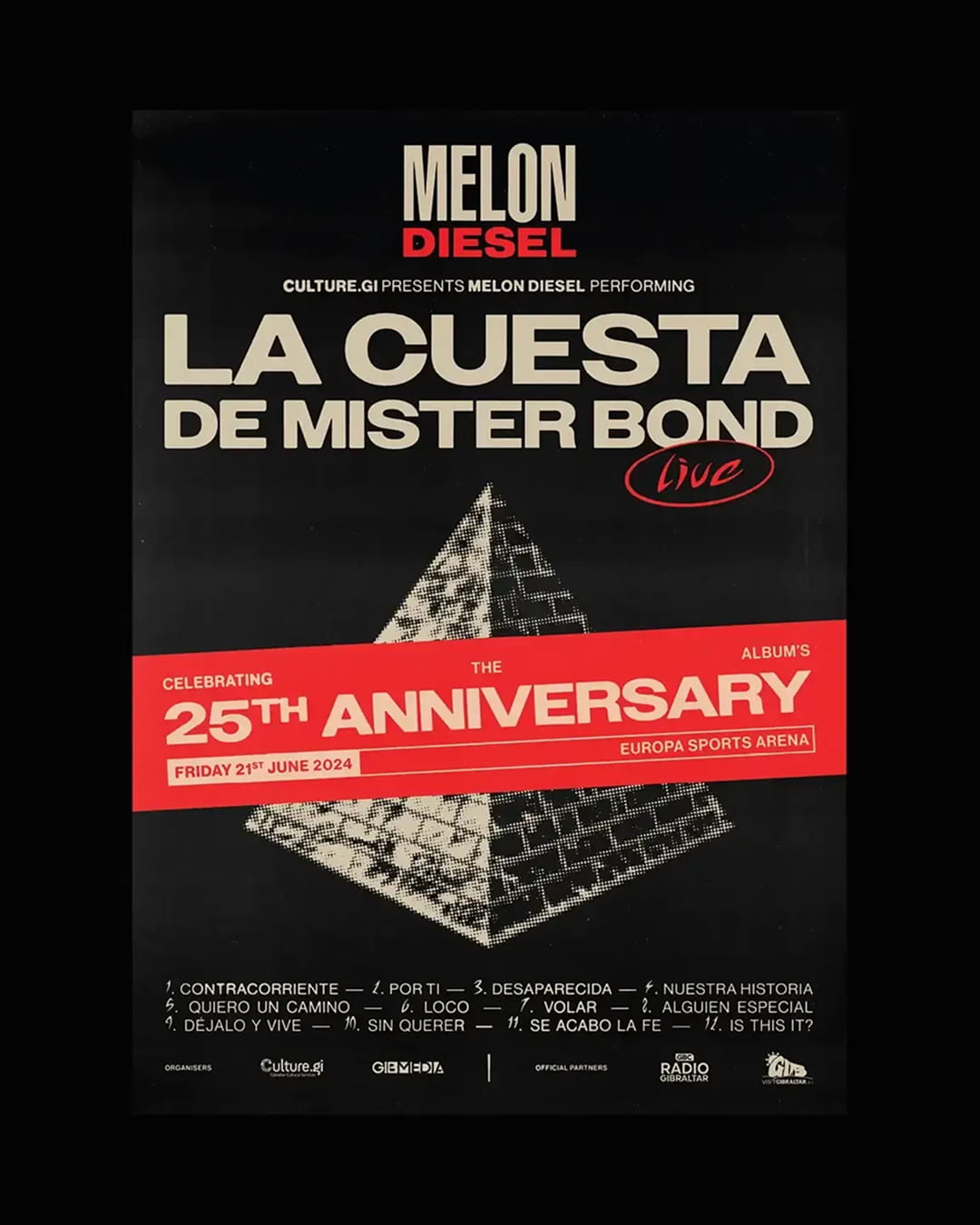
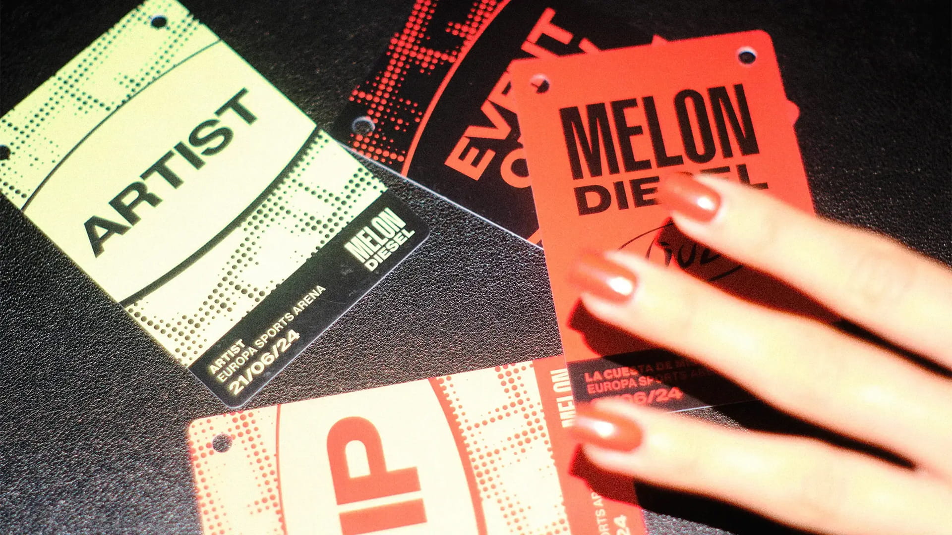
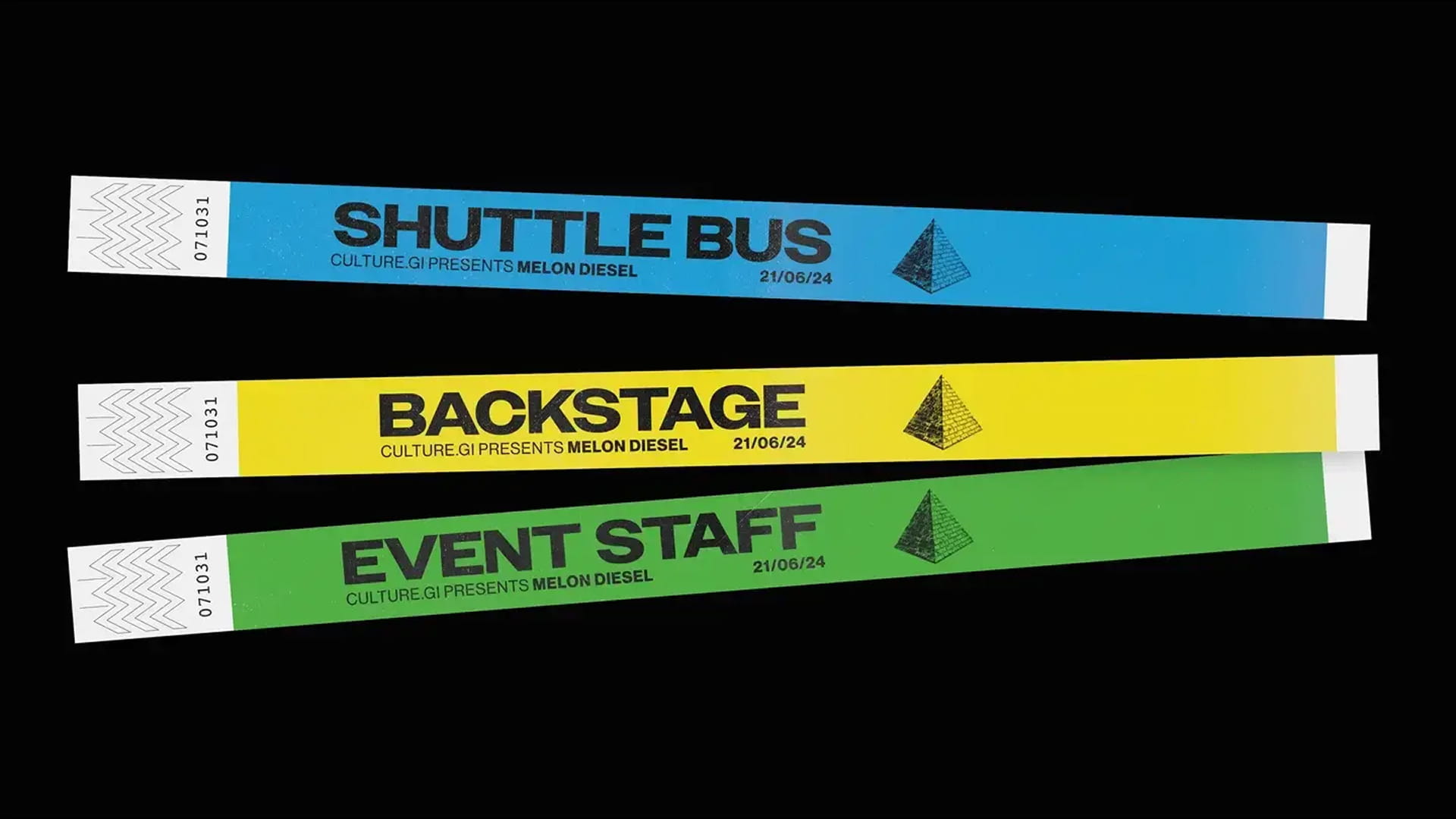
The identity was built around three core elements: the pyramid motif, a bold typographic system and a high-contrast colour palette.
The pyramid became the central visual device. Originally a small structure that stood at Europa Point, it was a slightly unusual local landmark that many Gibraltarians remember. More importantly, it appeared on the original La Cuesta de Mr. Bond CD, making it a direct link between the album, the band and Gibraltar itself.
We developed a flexible system around the pyramid, using it in contextual and abstract ways. It appeared throughout the identity system as both a recognisable motif and as a decontextualised pattern or graphic device.
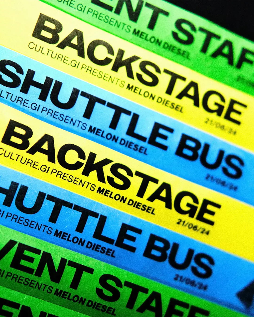
The typography took cues from the Melon Diesel logo, using bold sans-serif forms to give the identity the presence expected of a rock concert. The colour palette was led by black, red and off-white, drawing from the band’s own visual world while introducing complementary tones that helped expand the system across different touchpoints.
Case details
Twenty-five years after the release of La Cuesta de Mr. Bond, the anniversary concert marked an important moment in Melon Diesel's history.
The anniversary presented an opportunity to give that milestone the attention it deserved, creating a concert experience with its own identity and a heightened sense of occasion that went beyond the music alone.
As one of Gibraltar’s most widely recognised bands, Melon Diesel were already familiar to us. However, our strategic work began by speaking with the promoter to better understand the significance of La Cuesta de Mr. Bond, the band’s history and how design could support the event in a meaningful way.
Because the concert was a celebration of an album released 25 years earlier, we knew the identity had to draw from that moment in time. We immersed ourselves in the band’s archive, looking at photography, CD artwork, graphic treatments and the broader visual language surrounding Melon Diesel in the late 1990s.
The identity was built around three core elements: the pyramid motif, a bold typographic system and a high-contrast colour palette.
The pyramid became the central visual device. Originally a small structure that stood at Europa Point, it was a slightly unusual local landmark that many Gibraltarians remember. More importantly, it appeared on the original La Cuesta de Mr. Bond CD, making it a direct link between the album, the band and Gibraltar itself.
We developed a flexible system around the pyramid, using it in contextual and abstract ways. It appeared throughout the identity system as both a recognisable motif and as a decontextualised pattern or graphic device.
The typography took cues from the Melon Diesel logo, using bold sans-serif forms to give the identity the presence expected of a rock concert. The colour palette was led by black, red and off-white, drawing from the band’s own visual world while introducing complementary tones that helped expand the system across different touchpoints.
Like what you see?