How do you work handlebars into a logo?
KEYS
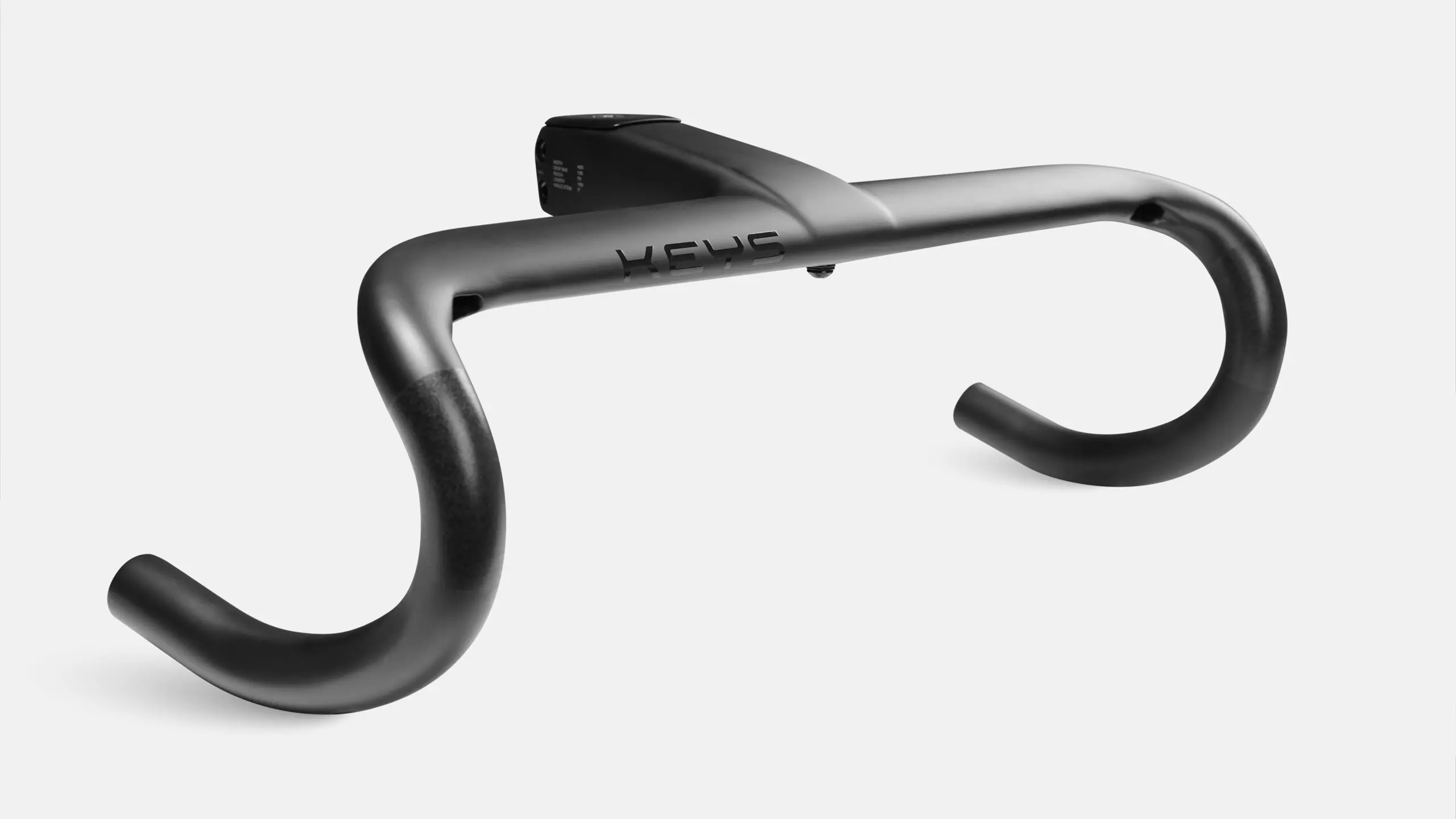
KEYS is a premium line of high-performance bicycle components developed by Thai cycling manufacturer Nich.
As part of Nich’s wider rebrand, the company identified several product lines that would benefit from refinement. KEYS already had an existing mark, but needed a more performance-led solution that could reflect its quality, speed and technical nature.
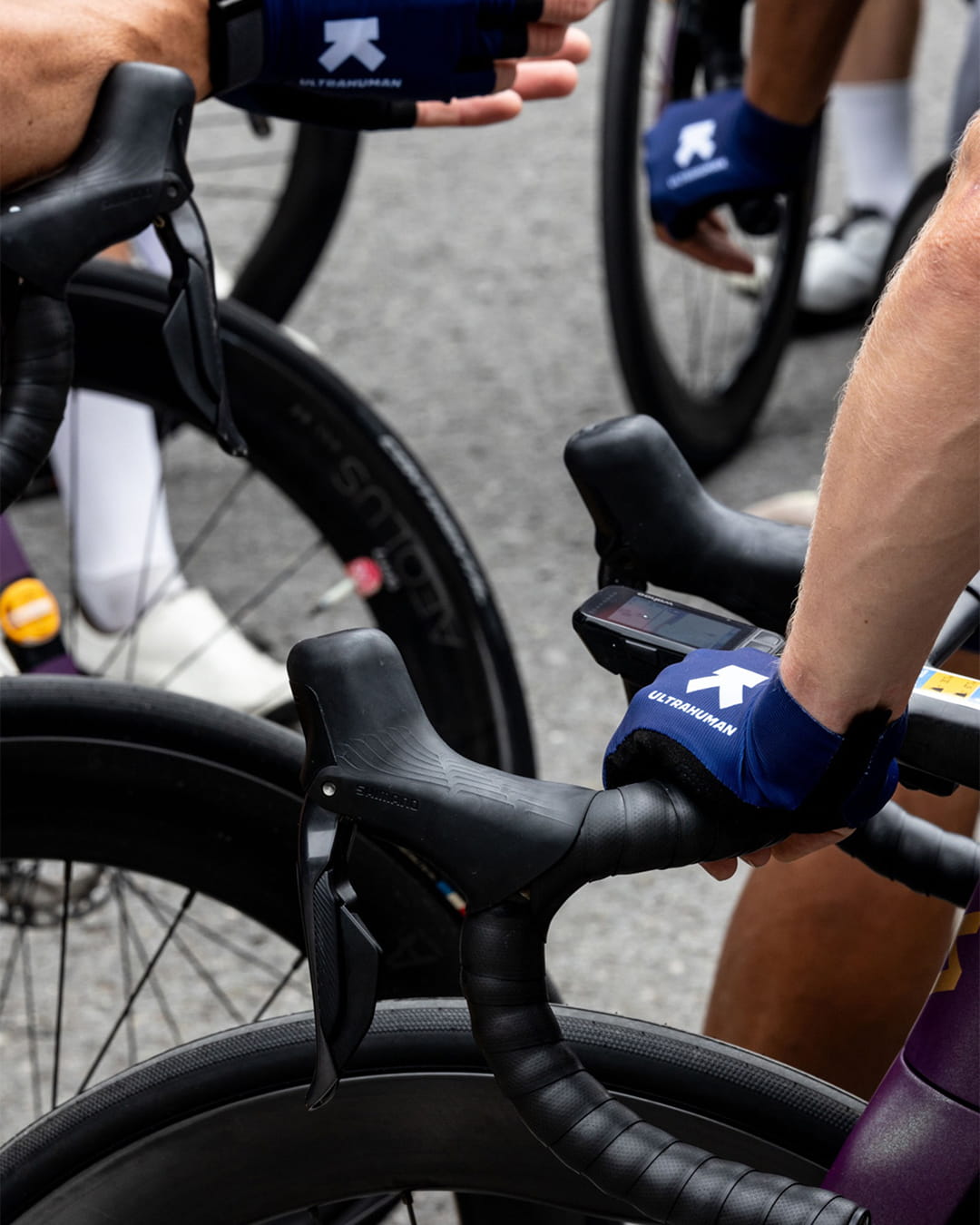
As part of the wider Nich rebrand, we were already immersed in the brand’s performance-led world, looking closely at how its identity and product lines could evolve.
That process created an opportunity to review some of Nich’s sub-brands, including KEYS. The product line already had an existing logo, and there was a desire to retain its general structure. However, the mark needed refinement to become aligned with the high-performance direction being developed for the parent brand.
We centred our process around studying both the existing KEYS logo and the components it would appear on. The goal was to understand how the mark could feel more closely connected to the product, rather than simply applied to it.
The reworked logo builds on the structure of the original mark, redrawn in full to give each character greater precision and intent. The result feels more dynamic and performance-oriented while remaining close to what already existed.
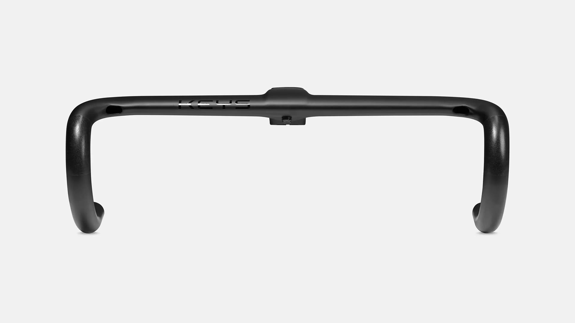
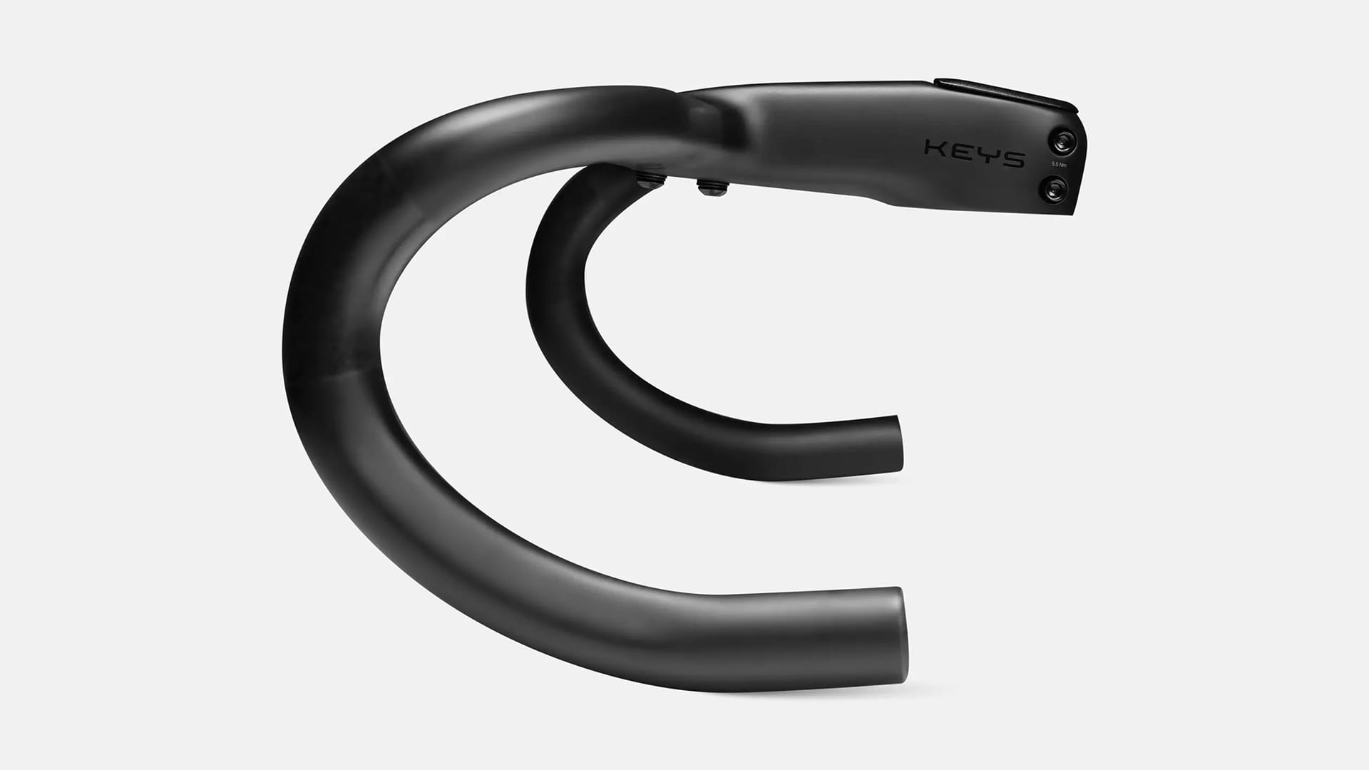
The defining detail is the custom-drawn "Y", shaped to resemble a bird's-eye view of racing bike handlebars, one of the main components manufactured by KEYS. It is a subtle addition, but one that creates a direct connection between the mark and the product it represents.
The refined identity sits comfortably within the wider Nich brand family, sharing the same performance-led sensibility while giving KEYS a mark that feels specific to what it makes. The handlebar detail rewards closer inspection, creating a conversation point that speaks directly to the cycling community the brand serves.
Case details
As part of the wider Nich rebrand, we were already immersed in the brand’s performance-led world, looking closely at how its identity and product lines could evolve.
That process created an opportunity to review some of Nich’s sub-brands, including KEYS. The product line already had an existing logo, and there was a desire to retain its general structure. However, the mark needed refinement to become aligned with the high-performance direction being developed for the parent brand.
We centred our process around studying both the existing KEYS logo and the components it would appear on. The goal was to understand how the mark could feel more closely connected to the product, rather than simply applied to it.
The reworked logo builds on the structure of the original mark, redrawn in full to give each character greater precision and intent. The result feels more dynamic and performance-oriented while remaining close to what already existed.
The defining detail is the custom-drawn "Y", shaped to resemble a bird's-eye view of racing bike handlebars, one of the main components manufactured by KEYS. It is a subtle addition, but one that creates a direct connection between the mark and the product it represents.
The refined identity sits comfortably within the wider Nich brand family, sharing the same performance-led sensibility while giving KEYS a mark that feels specific to what it makes. The handlebar detail rewards closer inspection, creating a conversation point that speaks directly to the cycling community the brand serves.
Like what you see?