A heritage-led brand refresh for a trust firm entering its next chapter.

Finsbury Trust
Finsbury Trust is a leading independent provider of corporate trust and fund services, founded in Gibraltar in 1983. With more than four decades of experience and a reputation built on longstanding client relationships, the firm serves clients globally while remaining deeply rooted in Gibraltar.
In 2023, Finsbury Trust acquired and began renovating a landmark new headquarters, Finsbury House. Ahead of the move, the business engaged us to refresh its identity and mark the beginning of a new chapter.
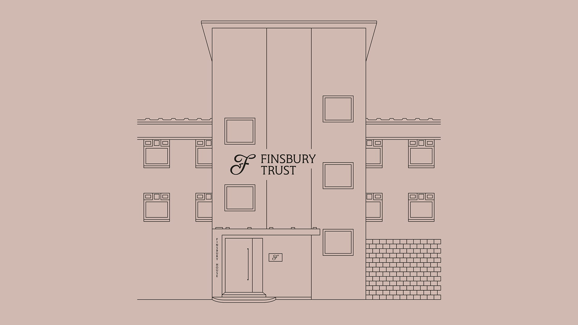




The move to Finsbury House represented more than a change of premises. It was a significant moment in the company's story, and an opportunity to present Finsbury Trust in a way that better reflected both its heritage and its ambition.
The challenge was not to reinvent the brand, but to refine it with care. Finsbury Trust needed to retain the seriousness and credibility the firm was known for, but the existing identity had grown dated, and there was a clear need to bring it into step with where the business was heading.
Working closely with multiple stakeholders across the business, our role was to find common ground and shape a direction that reflected the needs of the company as a whole. Through that process, it became clear that evolution rather than reinvention was the right approach.
With this in mind we looked carefully at the equity already held within the existing identity to understand what could be preserved, reworked and carried forward.
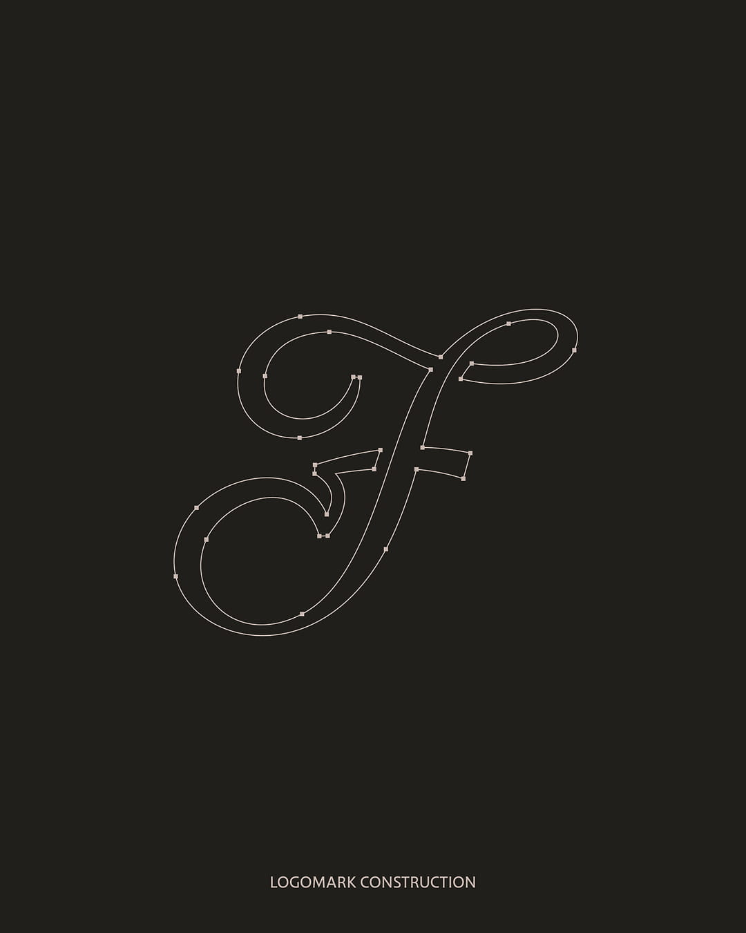
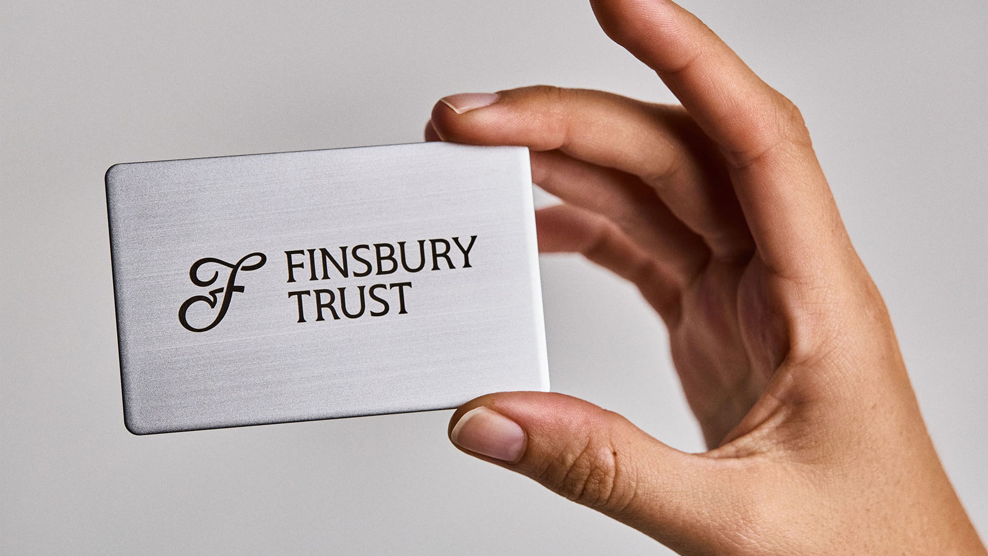
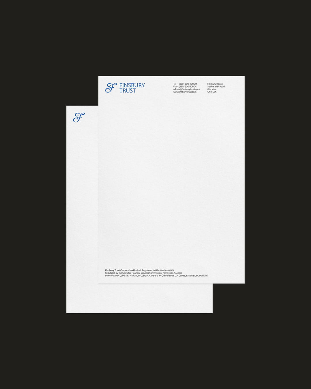
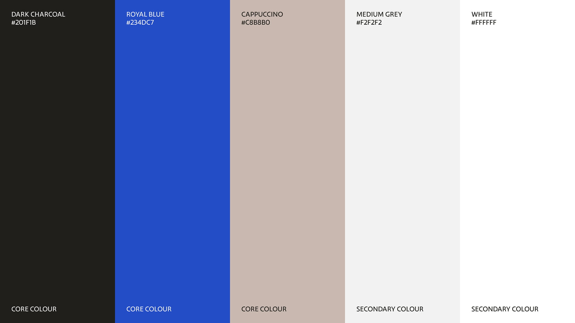
The Finsbury F, a redrawn symbol derived from the overlaid script F in the company's original logo, became the cornerstone of the refreshed identity. It carried forward a recognisable piece of brand equity while giving the business a distinctive visual asset. Around it, we developed a supporting logotype and evolved the colour palette, staying sympathetic to what came before while introducing greater vibrance and sophistication.
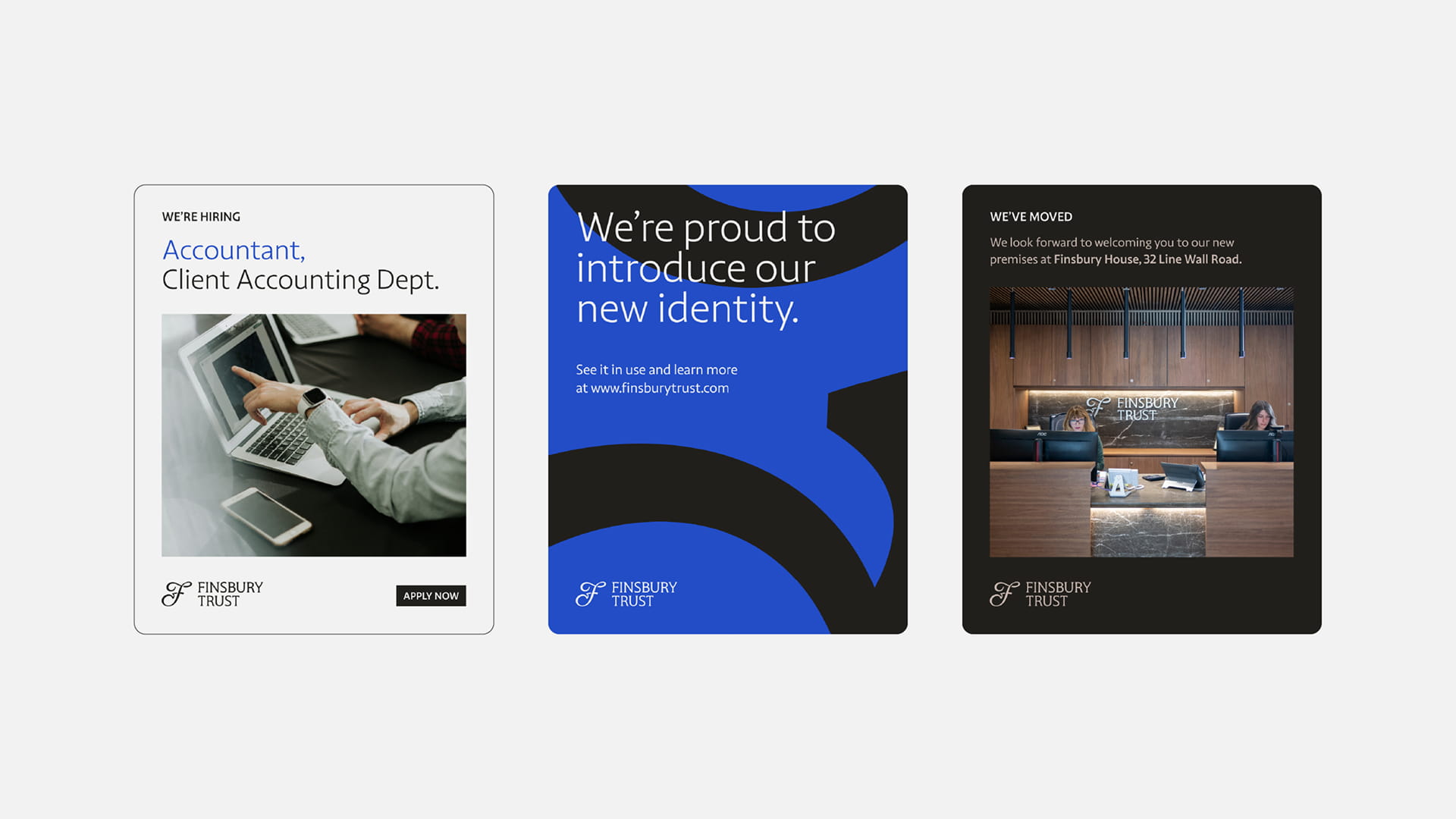
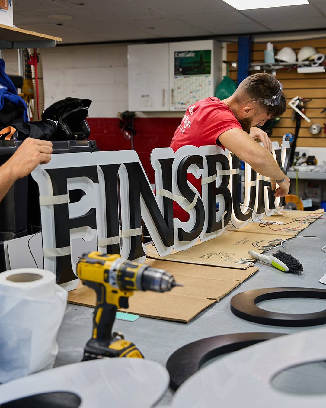
By scaling and cropping the Finsbury F, we created a series of graphic forms that could be used across physical and digital touchpoints. These shapes gave the brand a flexible design device, adding dynamism and character throughout the system.
Supported by updated typography, photography and a refined visual framework, the result was an identity that maintained the professionalism the firm is known for, while feeling more current and confident in its expression.
Case details
The move to Finsbury House represented more than a change of premises. It was a significant moment in the company's story, and an opportunity to present Finsbury Trust in a way that better reflected both its heritage and its ambition.
The challenge was not to reinvent the brand, but to refine it with care. Finsbury Trust needed to retain the seriousness and credibility the firm was known for, but the existing identity had grown dated, and there was a clear need to bring it into step with where the business was heading.
Working closely with multiple stakeholders across the business, our role was to find common ground and shape a direction that reflected the needs of the company as a whole. Through that process, it became clear that evolution rather than reinvention was the right approach.
With this in mind we looked carefully at the equity already held within the existing identity to understand what could be preserved, reworked and carried forward.
The Finsbury F, a redrawn symbol derived from the overlaid script F in the company's original logo, became the cornerstone of the refreshed identity. It carried forward a recognisable piece of brand equity while giving the business a distinctive visual asset. Around it, we developed a supporting logotype and evolved the colour palette, staying sympathetic to what came before while introducing greater vibrance and sophistication.
By scaling and cropping the Finsbury F, we created a series of graphic forms that could be used across physical and digital touchpoints. These shapes gave the brand a flexible design device, adding dynamism and character throughout the system.
Supported by updated typography, photography and a refined visual framework, the result was an identity that maintained the professionalism the firm is known for, while feeling more current and confident in its expression.
Like what you see?