Never doubt the underdog, branding a football club that dares to dream.
FC Hound Dogs
FC Hound Dogs is a Gibraltar-based football club founded in 2012 by two brothers who wanted to create a space for young players who had fallen out of love with the game.
For much of its existence, the club played in Gibraltar’s second division and intermediate league, building slowly around a strong internal ethos and a close-knit group of people. In the 2025/26 season, Hound Dogs entered Gibraltar’s Premier Division for the first time and became the territory’s most recently awarded domestic gold licence member, marking a significant step in the club’s development.
As Gibraltar’s football landscape continued to professionalise, Hound Dogs needed an identity that could reflect how far the club had come, where it wanted to go, and the values that had carried it there.
Strategy, Visual Identity, Kit Design, Art Direction, Campaign, Photography
Since FC Hound Dogs was founded in 2012, football in Gibraltar has changed dramatically. The territory’s entry into UEFA and FIFA brought new levels of opportunity, visibility and professionalism to the domestic game.
For Hound Dogs, admission into Gibraltar’s first division marked a defining moment. The club had moved from being a reserve league side to a first division team with a direct route, however ambitious, into European competition.
At this new stage, the club did not have a visual identity that reflected what it had become. Hound Dogs had an outdated crest and club colours, with little else to express its story outwardly.
Much of what made the club special already existed in practice: in its people, values and the way it conducted itself. Our role was to bring that internal culture to the fore, giving the club an outward-facing identity to be proud of.
Our strategic process began by working with the club president and committee members to understand Hound Dogs' origins, ethos and journey to date.
What resonated was the story of the perennial underdog. Hound Dogs had taken the slow route because it felt true to the club, growing against the odds while staying close to the principles it was founded on.
The opportunity was to tell that story. FC Hound Dogs was not just another team in Gibraltar's first division. It was a community club trying to do things the right way, with a memorable name, playing in a unique league and with genuine European ambition.
There was also a wider cultural opportunity. Interest in niche clubs, distinctive kits and emotive football storytelling has grown significantly beyond traditional fanbases. The brand needed to represent Hound Dogs authentically, while giving people beyond Gibraltar a reason to notice, follow and support the club.
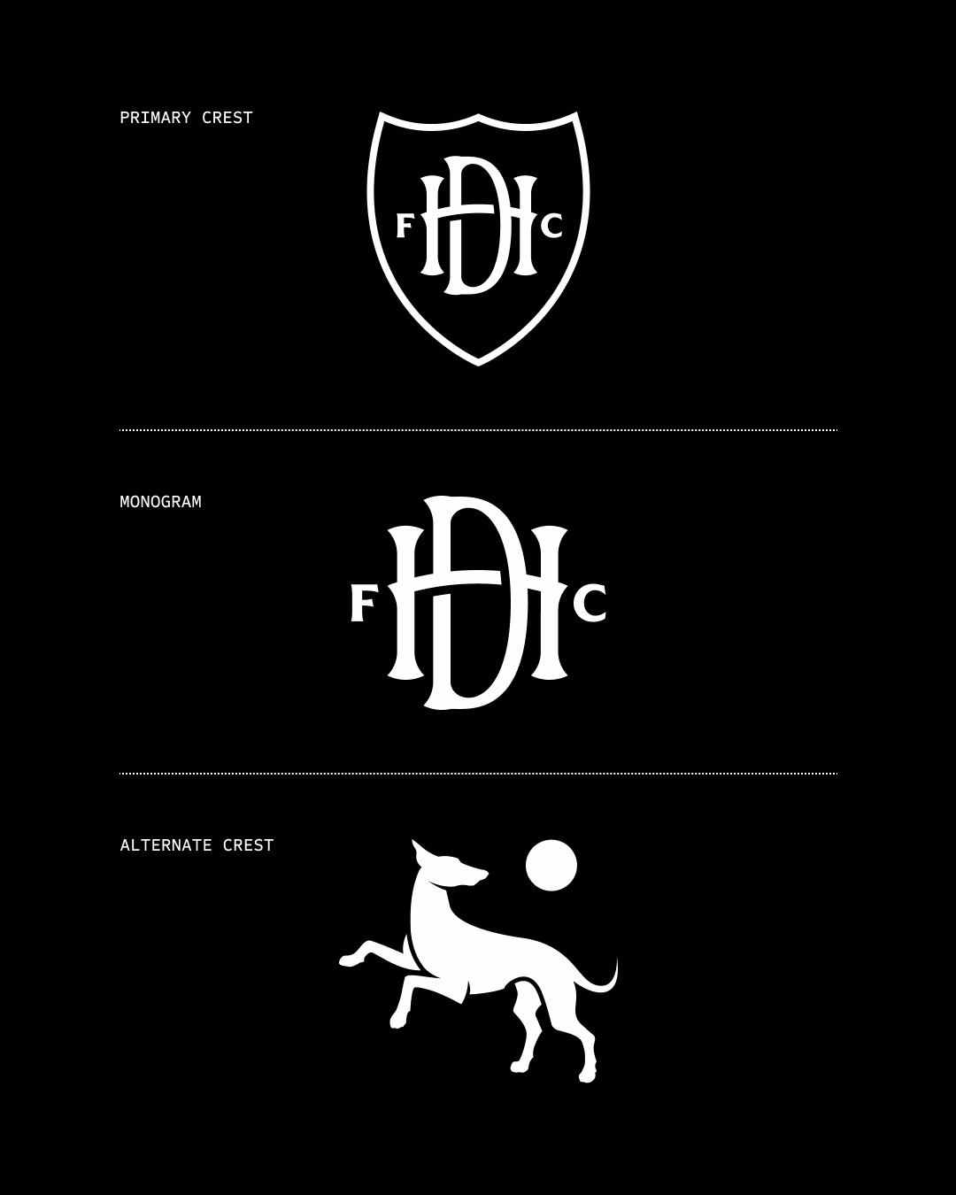
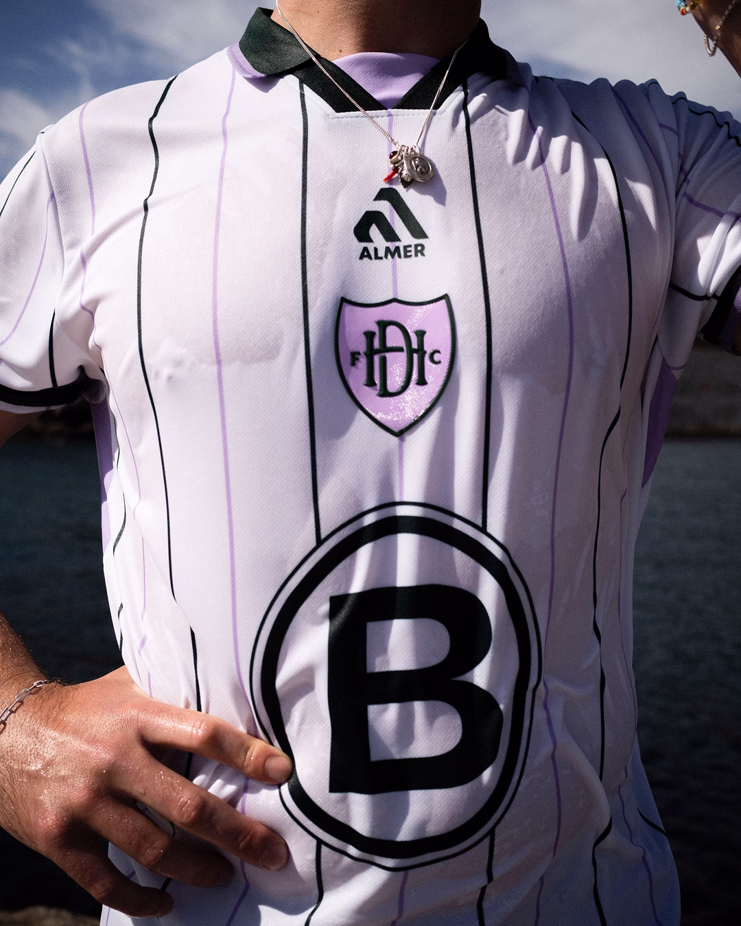
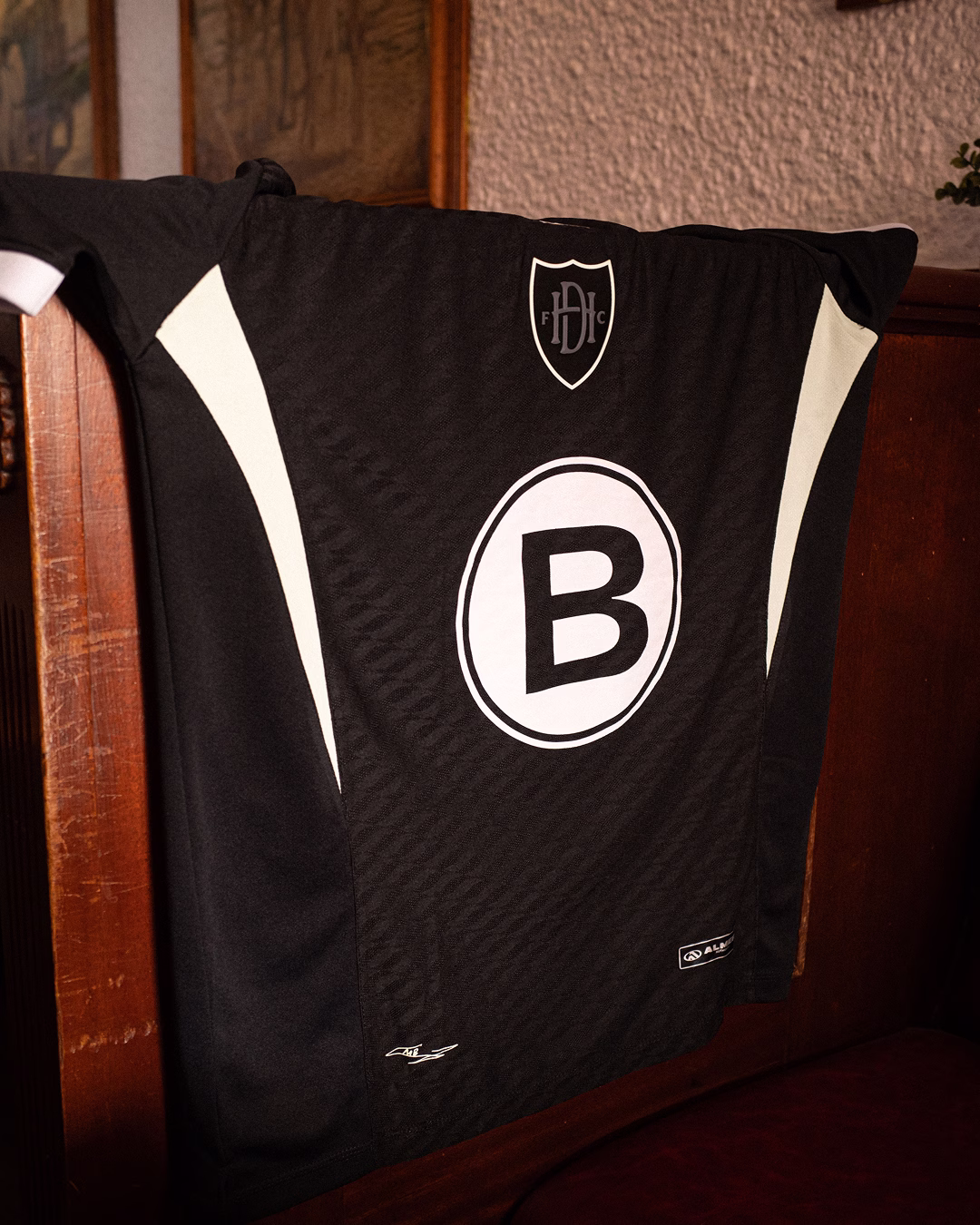
We began by assessing what the club already had and identifying what was worth carrying forward. The shield from the original crest was adapted and refined, creating the structure for a new primary mark.
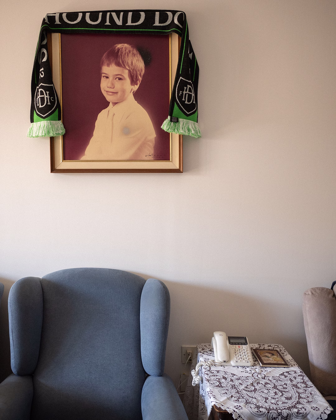
At the centre of the identity is an intertwined H and D monogram, designed to feel timeless and powerful. Alongside it, we introduced a secondary hound mark inspired by the club's name and original crest, adding movement, personality and a more playful expression of the brand.
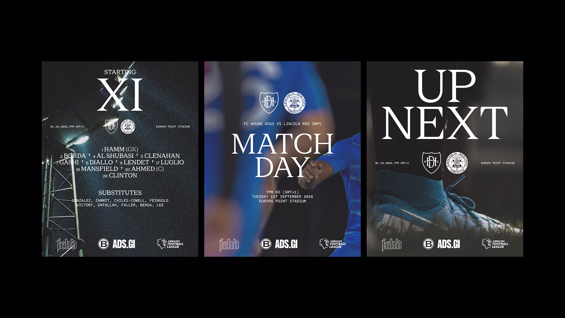
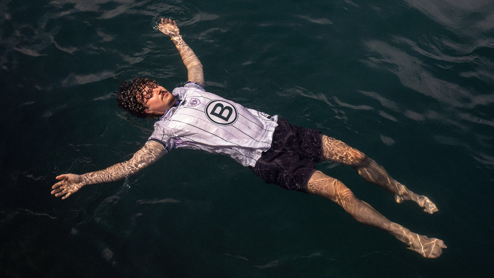
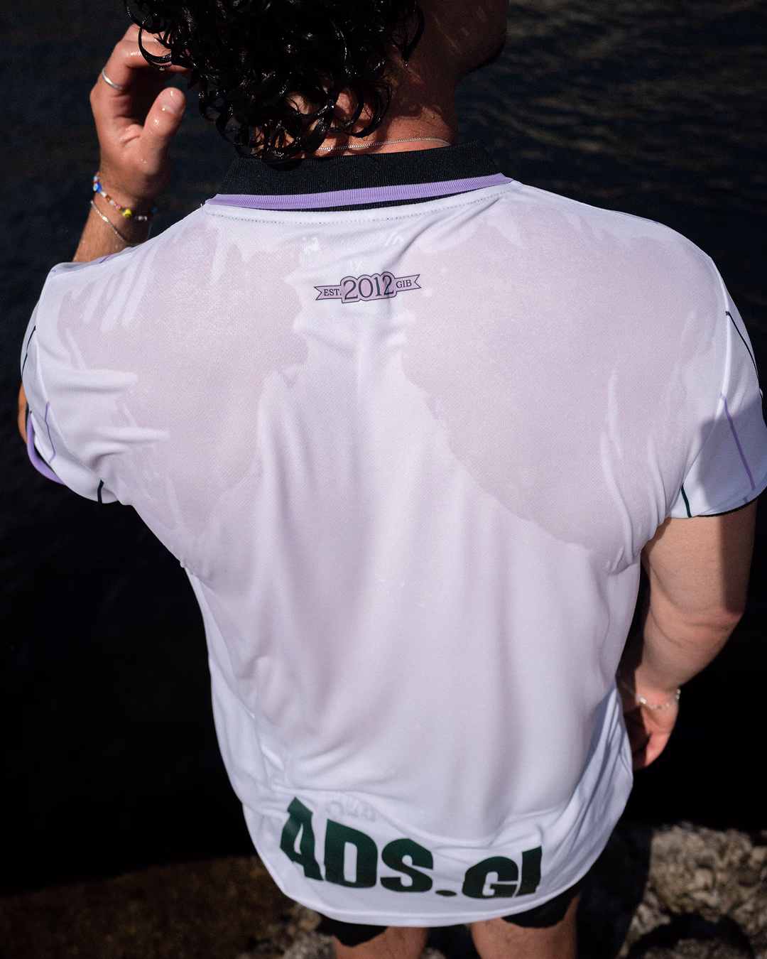
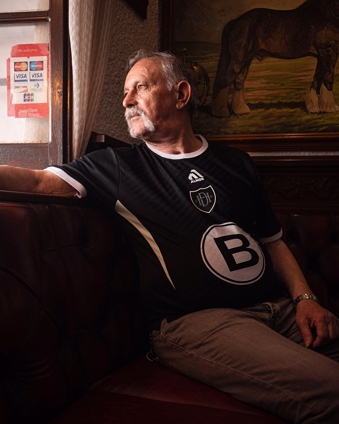
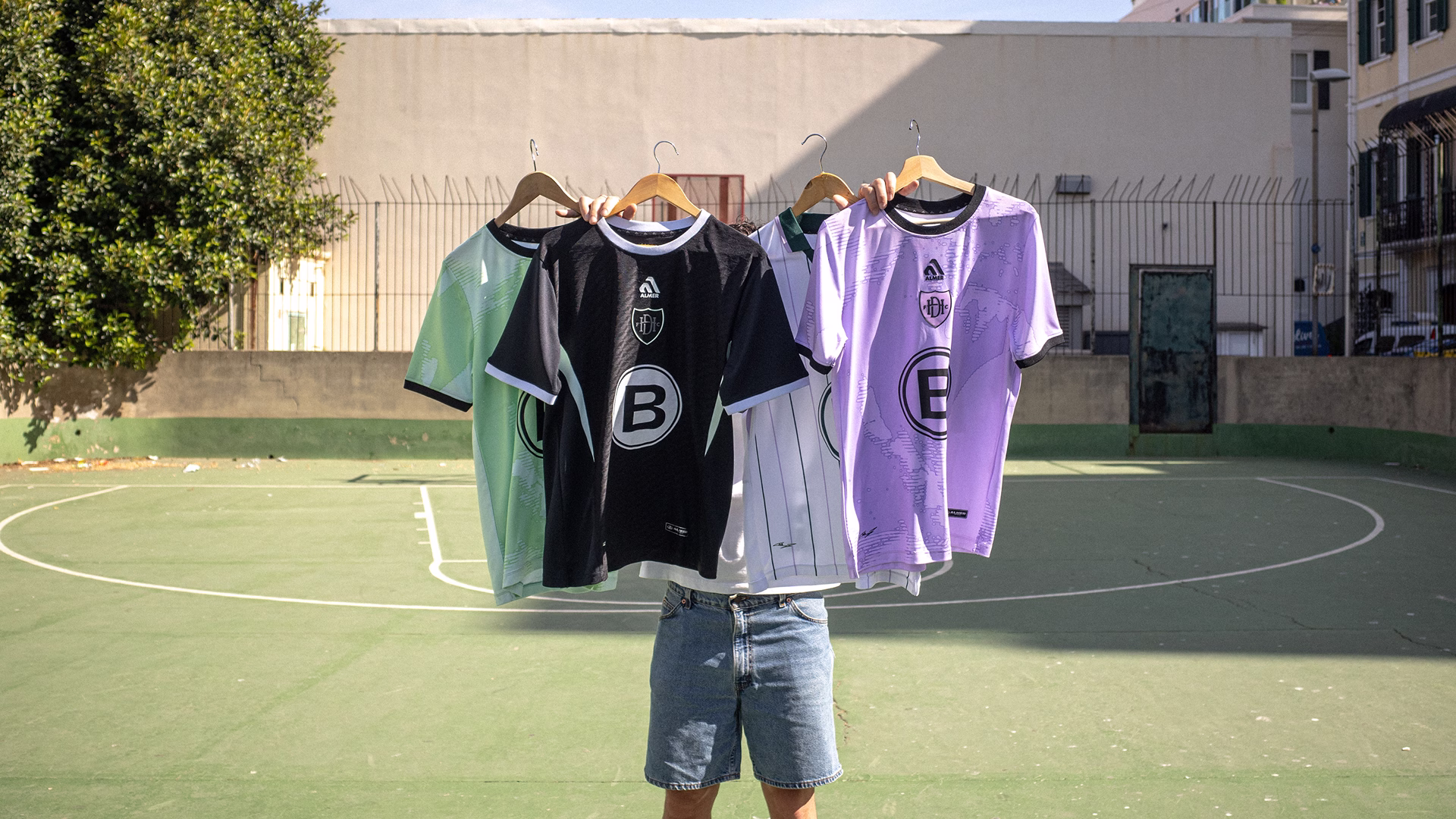
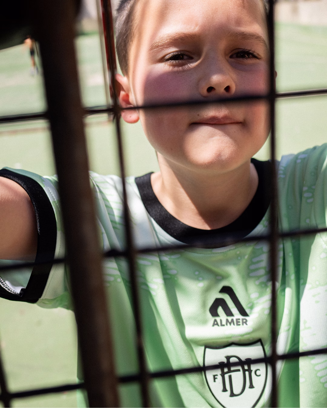
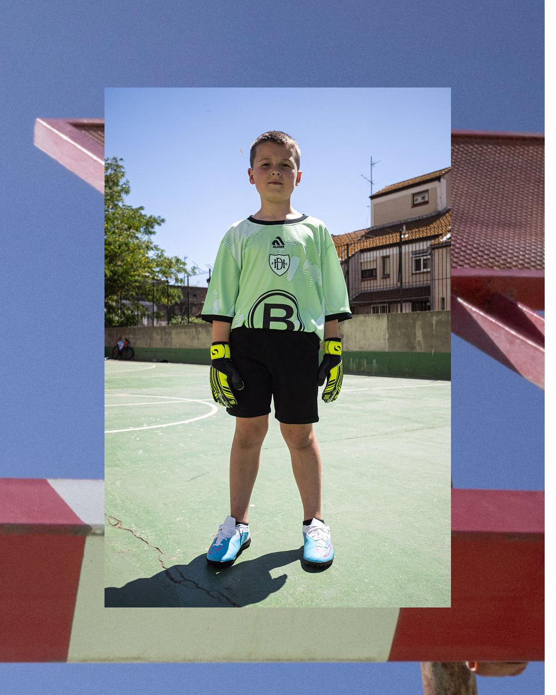
The colour palette builds from the club's existing black and pistachio green, while the wider visual system makes use of sharp typography and editorial photography to build a world that intimately captures the romance of football in Gibraltar, shining a light on the beauty and uniqueness of the local game in a way that speaks to both local and international audiences.
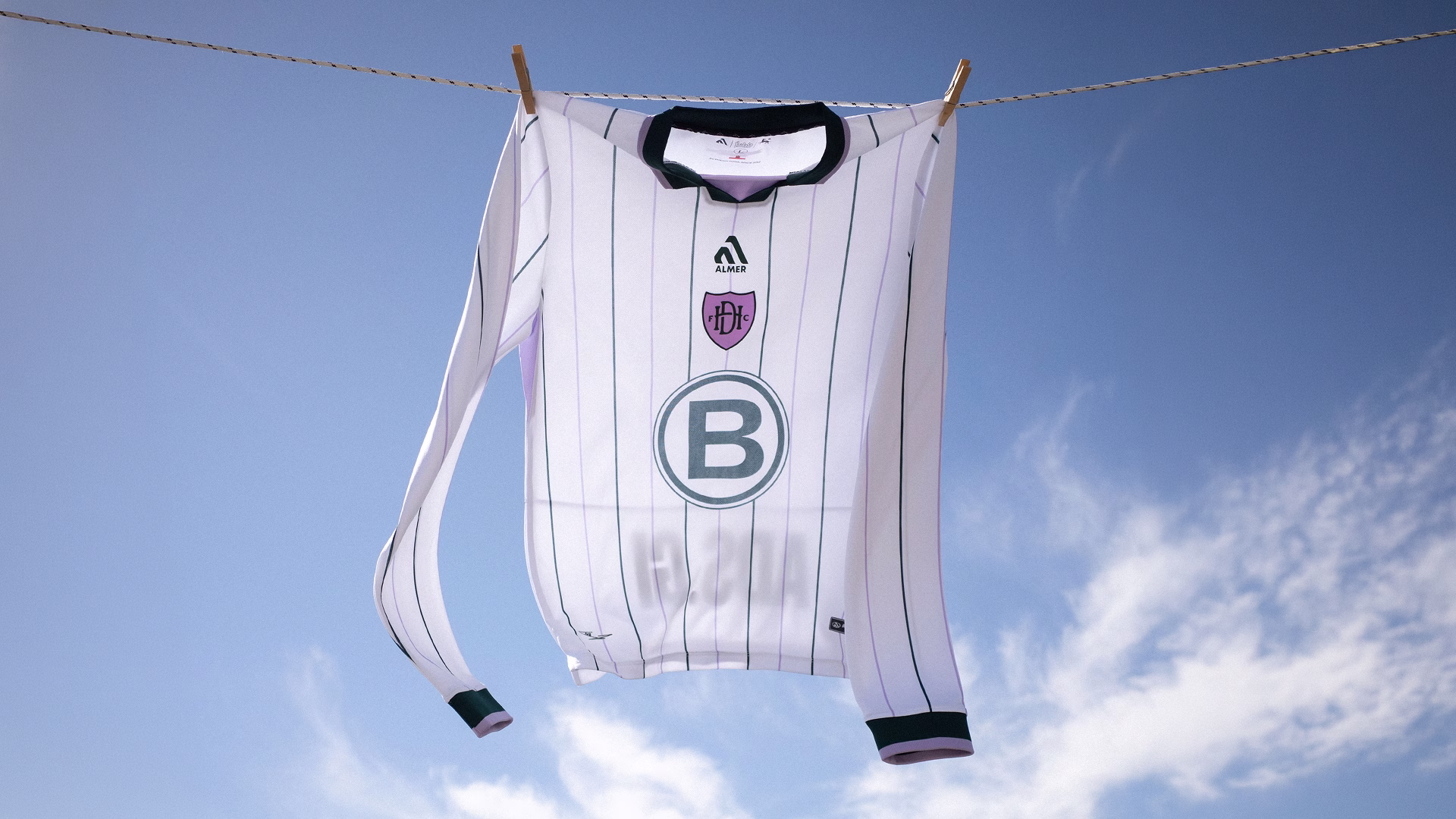
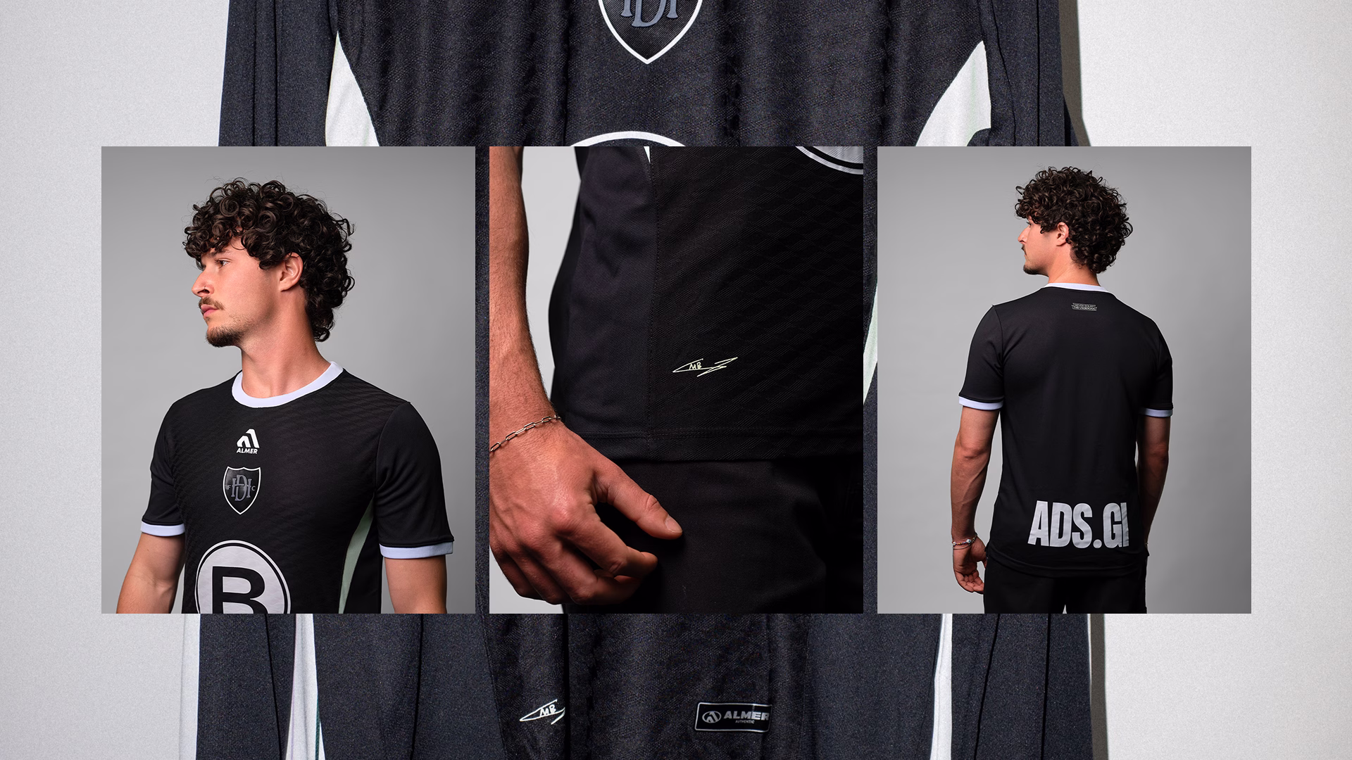
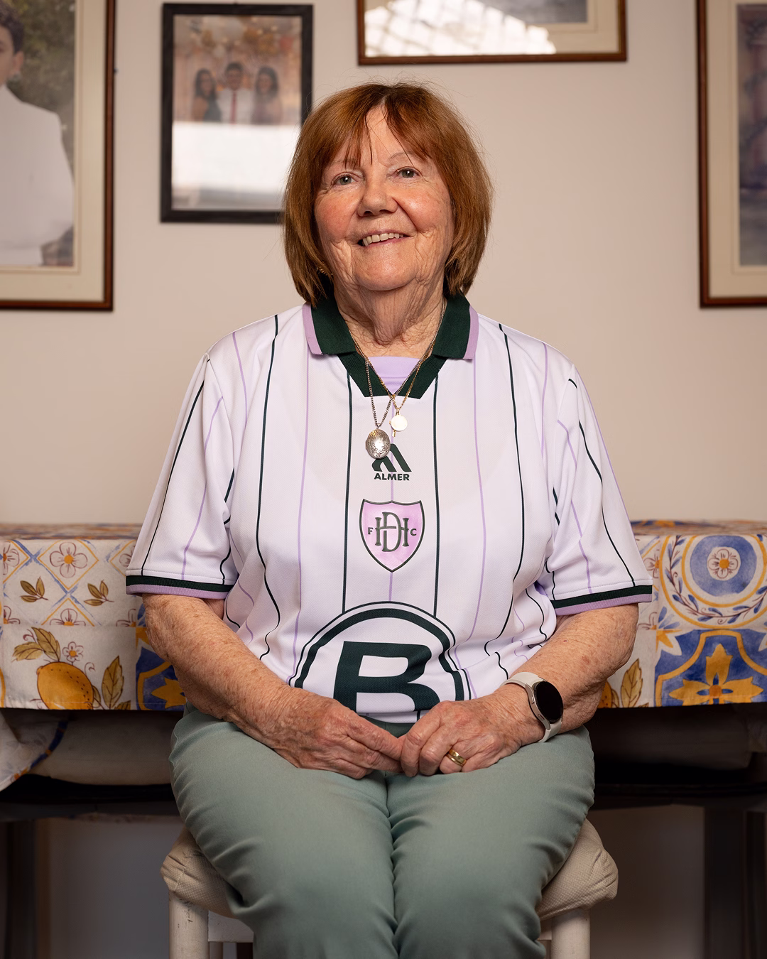
Kit and apparel design was central to the project. The aim was to raise the bar for teamwear in Gibraltar, creating pieces people would want to own whether they supported the club locally or discovered it from abroad.
Beyond Gibraltar, the work helped the club gain recognition with audiences who had no prior connection to the territory, with international kit sales creating a tangible new revenue stream and giving the club a stronger commercial foundation to compete at a higher level.
As Club President Jordan Duo put it: "When we first began our rebrand journey, one of our biggest concerns was losing the club's identity and ending up with something that felt meaningless. From day one, the Kensho team completely understood our vision and what we wanted to achieve. They ensured our identity remained at the heart of the process while delivering the fresh, exciting new look and feel the club truly needed. The team did an incredible job of telling the story of the club and communicating that authentically to our audience. The final result exceeded anything we could have imagined."
Case details
Strategy, Visual Identity, Kit Design, Art Direction, Campaign, Photography
Since FC Hound Dogs was founded in 2012, football in Gibraltar has changed dramatically. The territory’s entry into UEFA and FIFA brought new levels of opportunity, visibility and professionalism to the domestic game.
For Hound Dogs, admission into Gibraltar’s first division marked a defining moment. The club had moved from being a reserve league side to a first division team with a direct route, however ambitious, into European competition.
At this new stage, the club did not have a visual identity that reflected what it had become. Hound Dogs had an outdated crest and club colours, with little else to express its story outwardly.
Much of what made the club special already existed in practice: in its people, values and the way it conducted itself. Our role was to bring that internal culture to the fore, giving the club an outward-facing identity to be proud of.
Our strategic process began by working with the club president and committee members to understand Hound Dogs' origins, ethos and journey to date.
What resonated was the story of the perennial underdog. Hound Dogs had taken the slow route because it felt true to the club, growing against the odds while staying close to the principles it was founded on.
The opportunity was to tell that story. FC Hound Dogs was not just another team in Gibraltar's first division. It was a community club trying to do things the right way, with a memorable name, playing in a unique league and with genuine European ambition.
There was also a wider cultural opportunity. Interest in niche clubs, distinctive kits and emotive football storytelling has grown significantly beyond traditional fanbases. The brand needed to represent Hound Dogs authentically, while giving people beyond Gibraltar a reason to notice, follow and support the club.
We began by assessing what the club already had and identifying what was worth carrying forward. The shield from the original crest was adapted and refined, creating the structure for a new primary mark.
At the centre of the identity is an intertwined H and D monogram, designed to feel timeless and powerful. Alongside it, we introduced a secondary hound mark inspired by the club's name and original crest, adding movement, personality and a more playful expression of the brand.
The colour palette builds from the club's existing black and pistachio green, while the wider visual system makes use of sharp typography and editorial photography to build a world that intimately captures the romance of football in Gibraltar, shining a light on the beauty and uniqueness of the local game in a way that speaks to both local and international audiences.
Kit and apparel design was central to the project. The aim was to raise the bar for teamwear in Gibraltar, creating pieces people would want to own whether they supported the club locally or discovered it from abroad.
Beyond Gibraltar, the work helped the club gain recognition with audiences who had no prior connection to the territory, with international kit sales creating a tangible new revenue stream and giving the club a stronger commercial foundation to compete at a higher level.
As Club President Jordan Duo put it: "When we first began our rebrand journey, one of our biggest concerns was losing the club's identity and ending up with something that felt meaningless. From day one, the Kensho team completely understood our vision and what we wanted to achieve. They ensured our identity remained at the heart of the process while delivering the fresh, exciting new look and feel the club truly needed. The team did an incredible job of telling the story of the club and communicating that authentically to our audience. The final result exceeded anything we could have imagined."
Like what you see?