Creating an identity for a Gibraltar-based trust and corporate services firm.
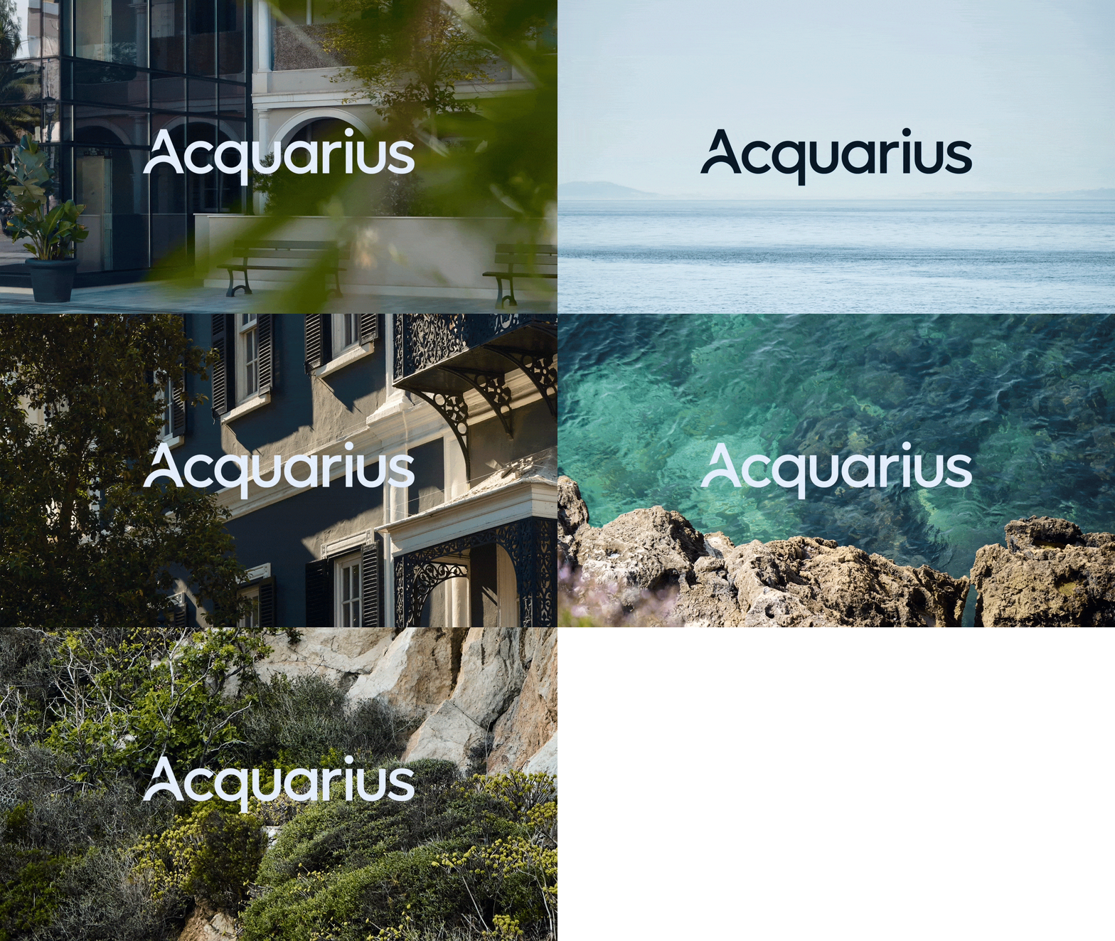
Acquarius
Acquarius is a Gibraltar-based trust and corporate services firm established in 1998, providing a comprehensive range of accounting, company administration and fiduciary services. The firm has spent almost three decades building a reputation grounded in trust, integrity and close client relationships.
As the business entered a new phase of leadership, it became clear that Acquarius’ existing brand had not kept pace with the company it had become.

“Kenshō Agency helped us redefine our identity and elevate our brand. Their approach supported our growth, ownership transition, and positioning on par with international competitors.”
Gareth Cross
Chief Operating Officer, Acquarius


Acquarius had grown considerably since its founding. Its staff were experienced, its services had expanded, and a new generation of leadership was preparing to take the business forward.
But the identity that had served the firm for almost three decades no longer reflected where the business found itself. Externally, it struggled to connect with the next generation of clients Acquarius wanted to attract. Internally, it did not reflect the company culture the firm had built.
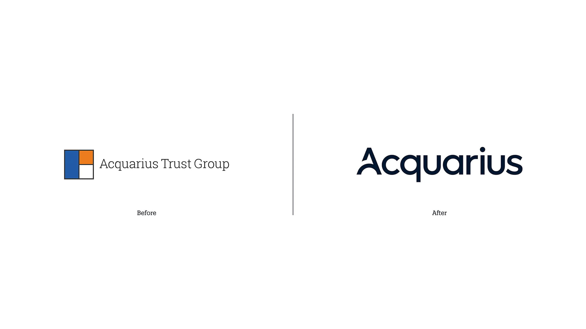
Our strategic work began with a series of workshops to understand the business, its values and where it was heading. What emerged was a clear sense of what Acquarius stood for: trust, clarity, accountability and a genuine investment in its people. Crucially, the existing identity was not without equity. The original logo's geometric, building block-like mark was a recognisable part of the brand and something worth preserving. Rather than starting from scratch, the strategic direction centred on evolution, drawing on the existing logo to build a brand concept that would underpin the creative work to come.
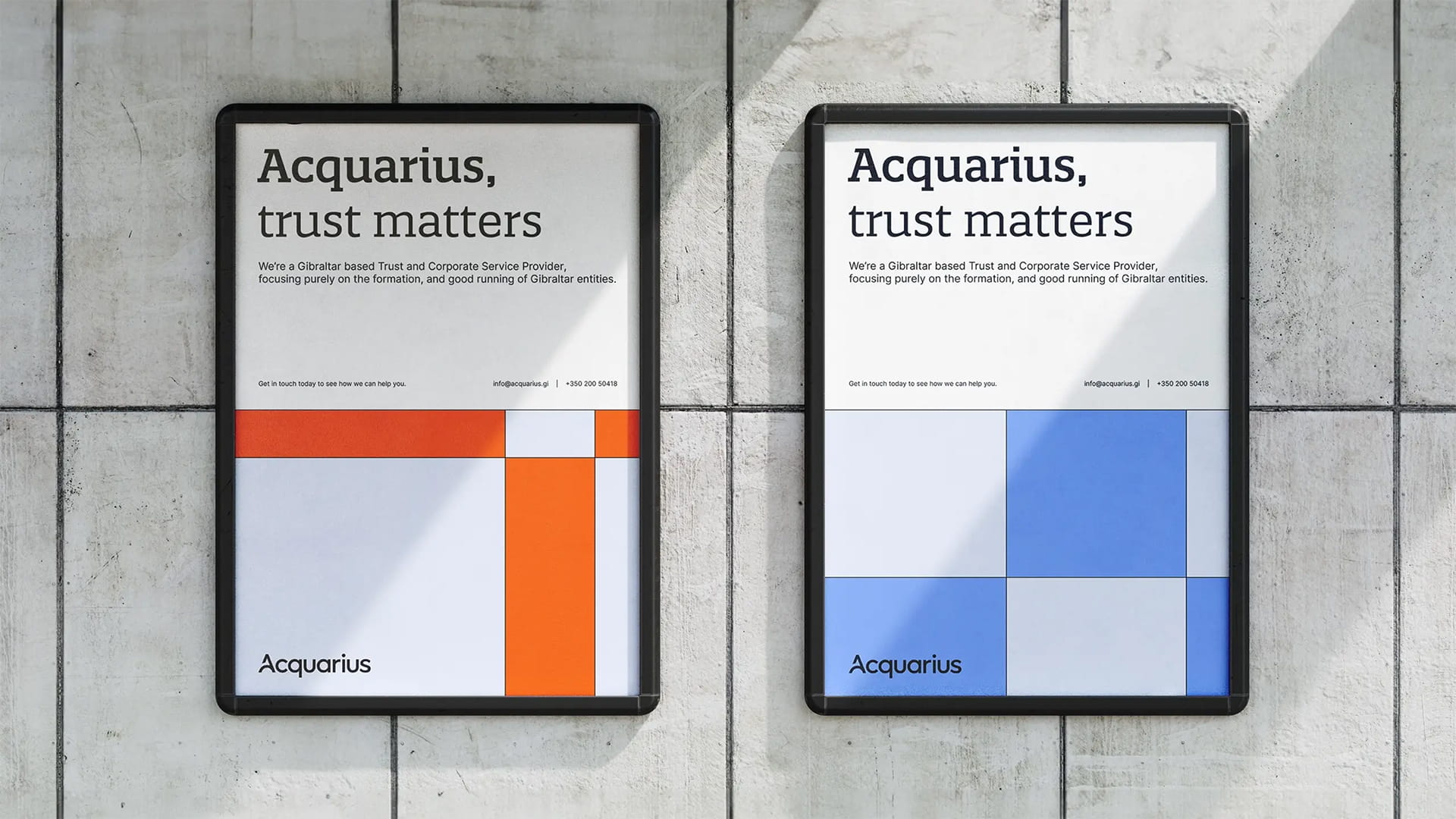
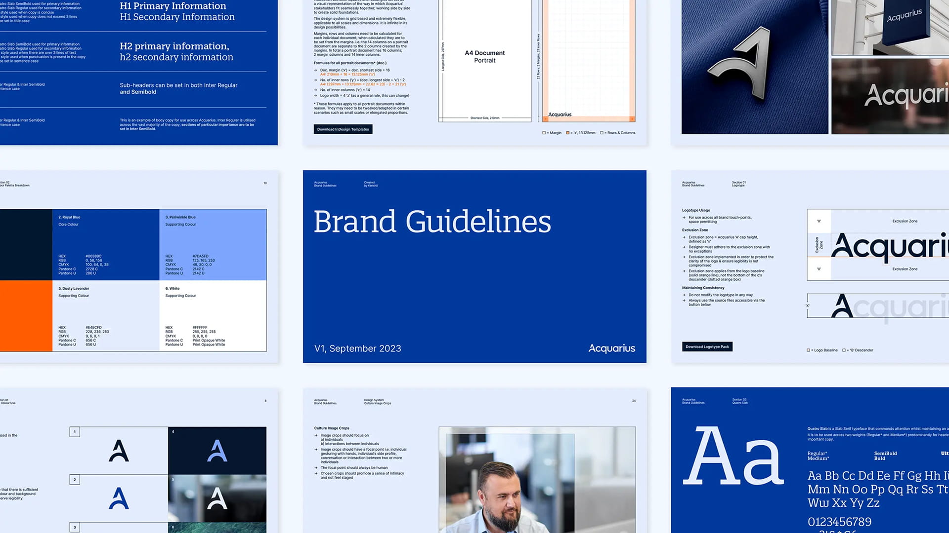
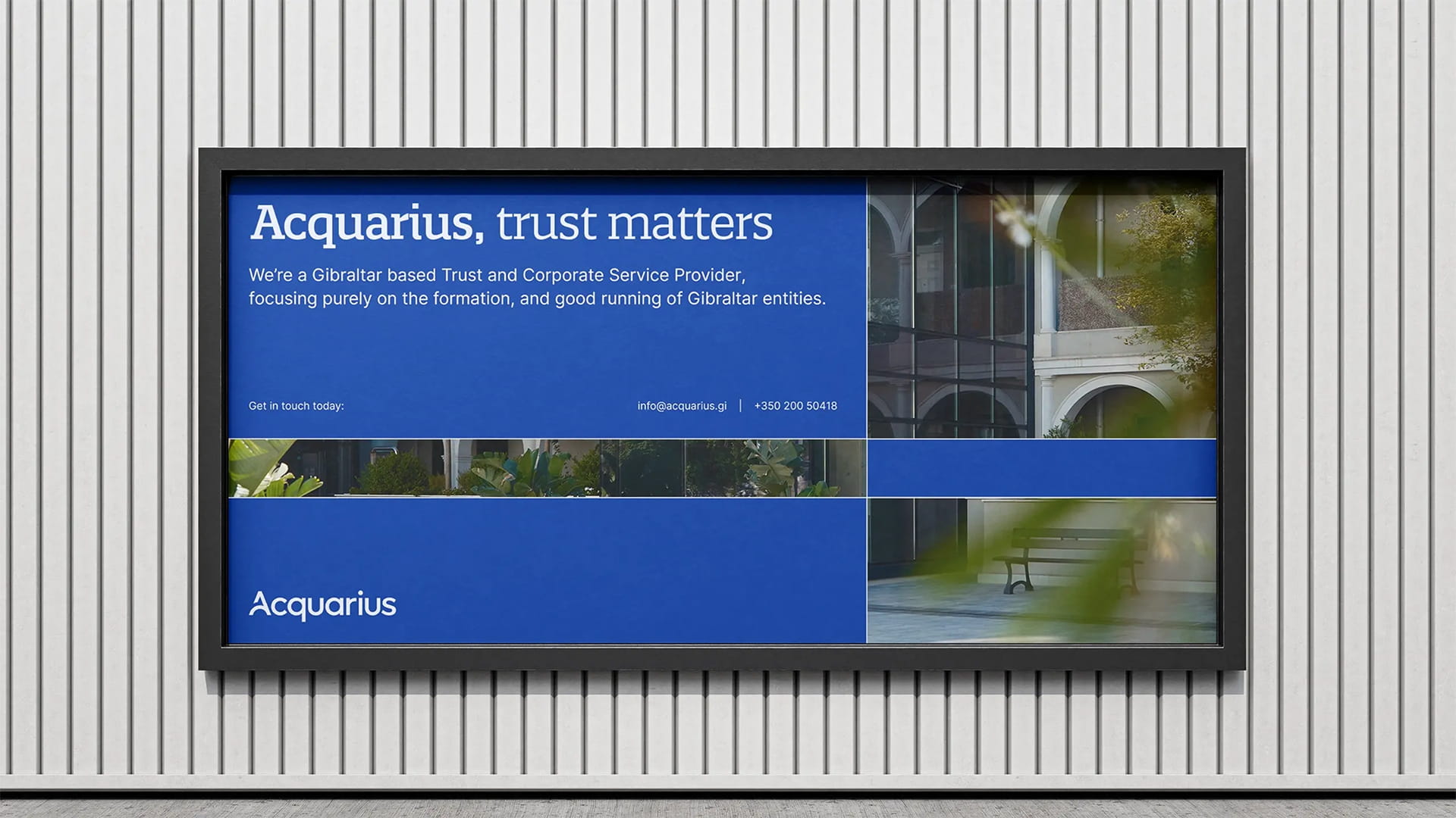
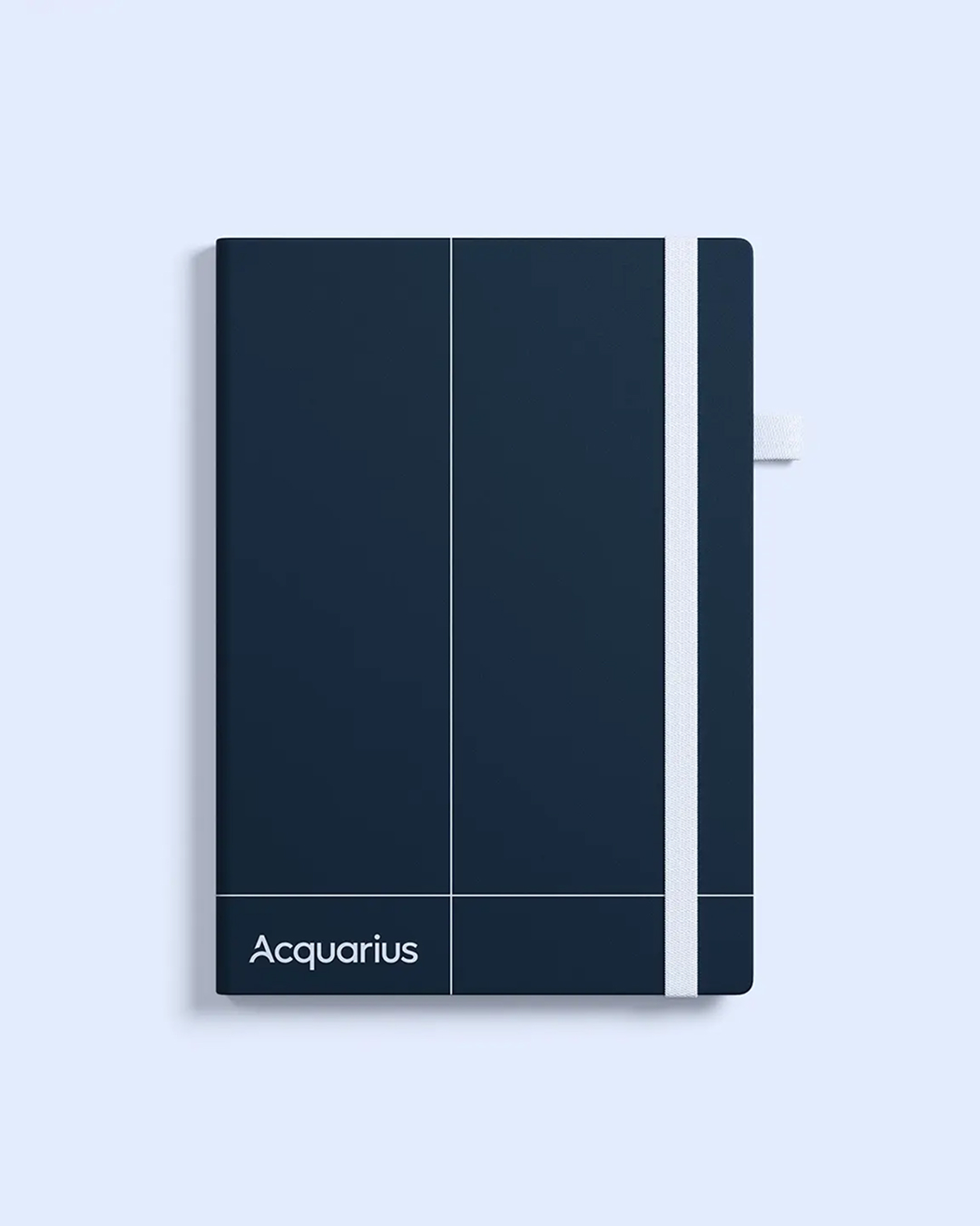
The creative concept took its lead directly from the geometry of the original Acquarius logo. Squares and rectangles became the foundation of the visual system, slotting together in a modular system to suggest structure, unity and the idea that every part of the business works in relation to the others.
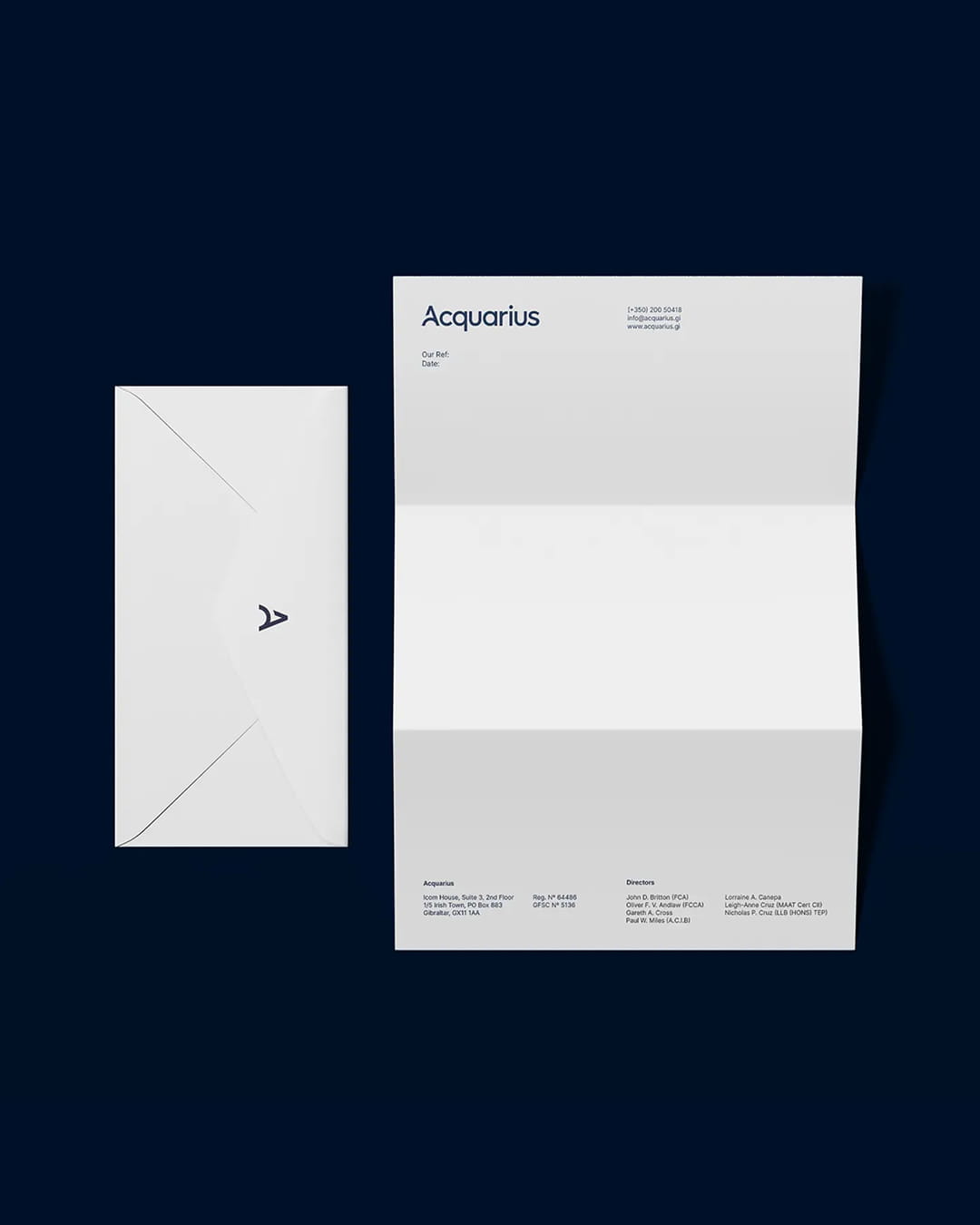
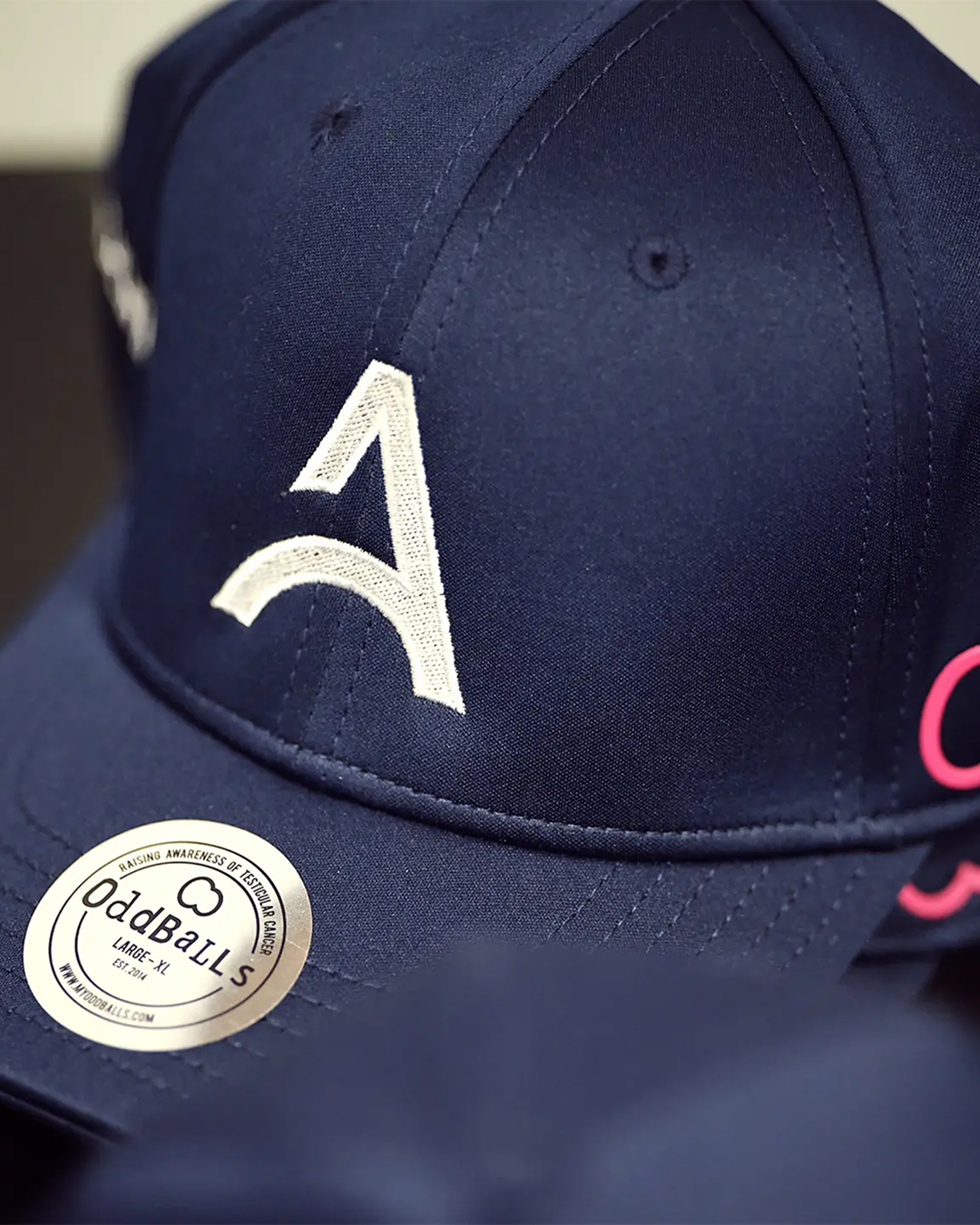
At the centre of the identity is a bespoke logotype built around the distinctive Acquarius A, geometric in construction but humanist in feel, designed to work as a standalone mark and sit naturally within the wider logotype.
The colour palette evolved from the existing brand, with Royal Blue and Bright Orange pushed to more vibrant, confident versions of themselves. New tones including Ink Blue and Periwinkle were introduced to give the system greater range, allowing the identity to feel bold and energetic without sacrificing the professionalism expected of a firm in this space.
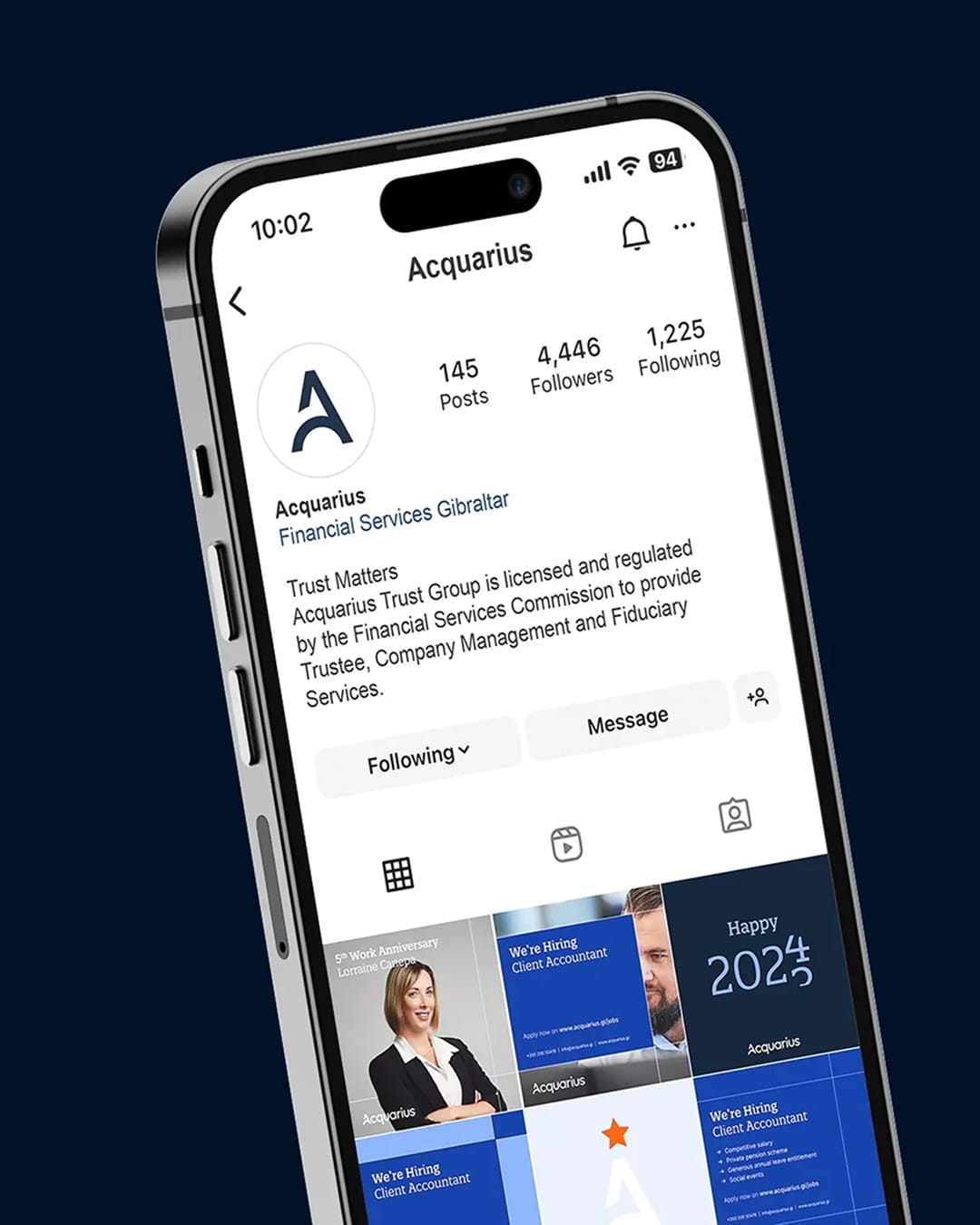
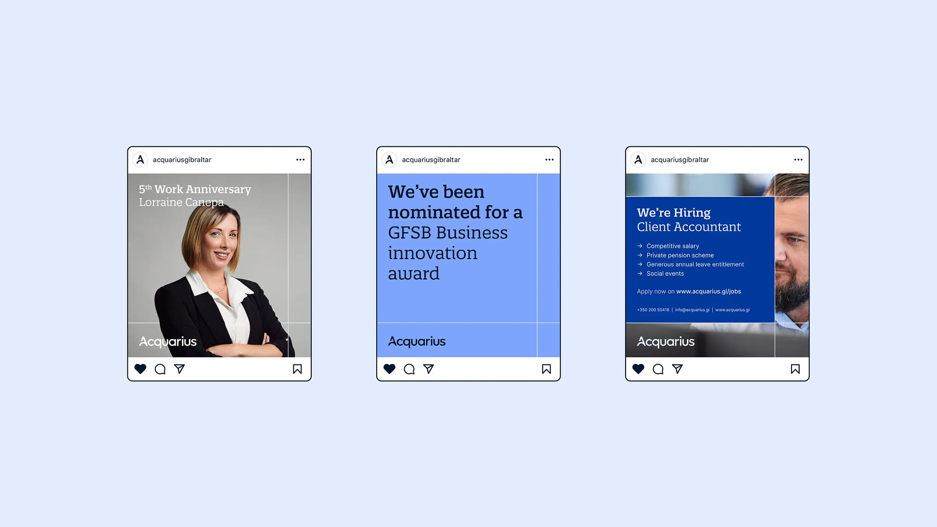
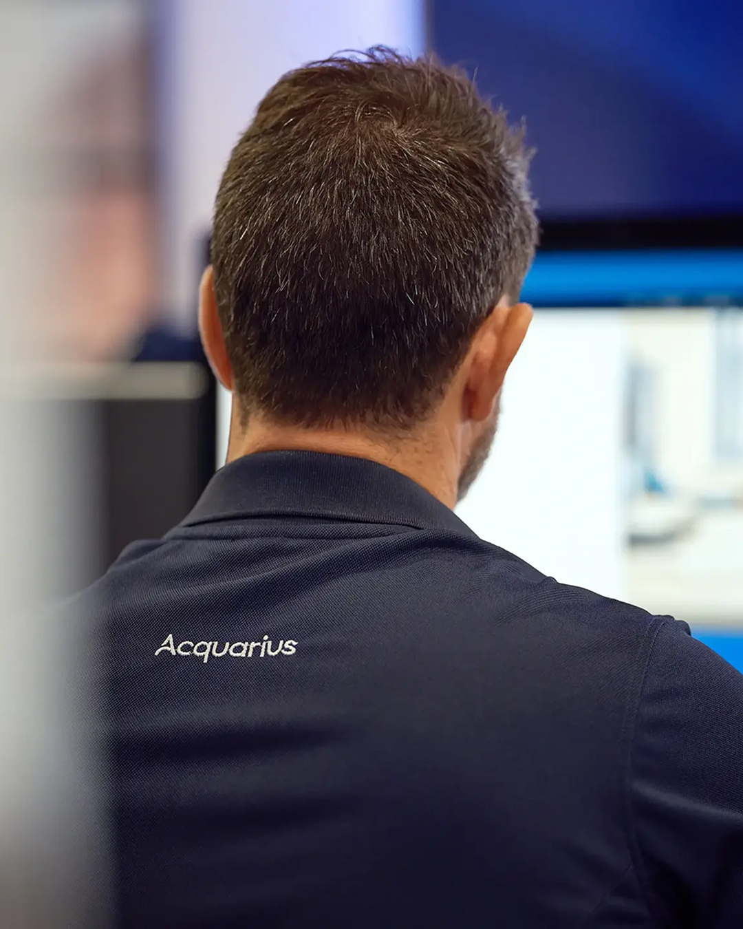
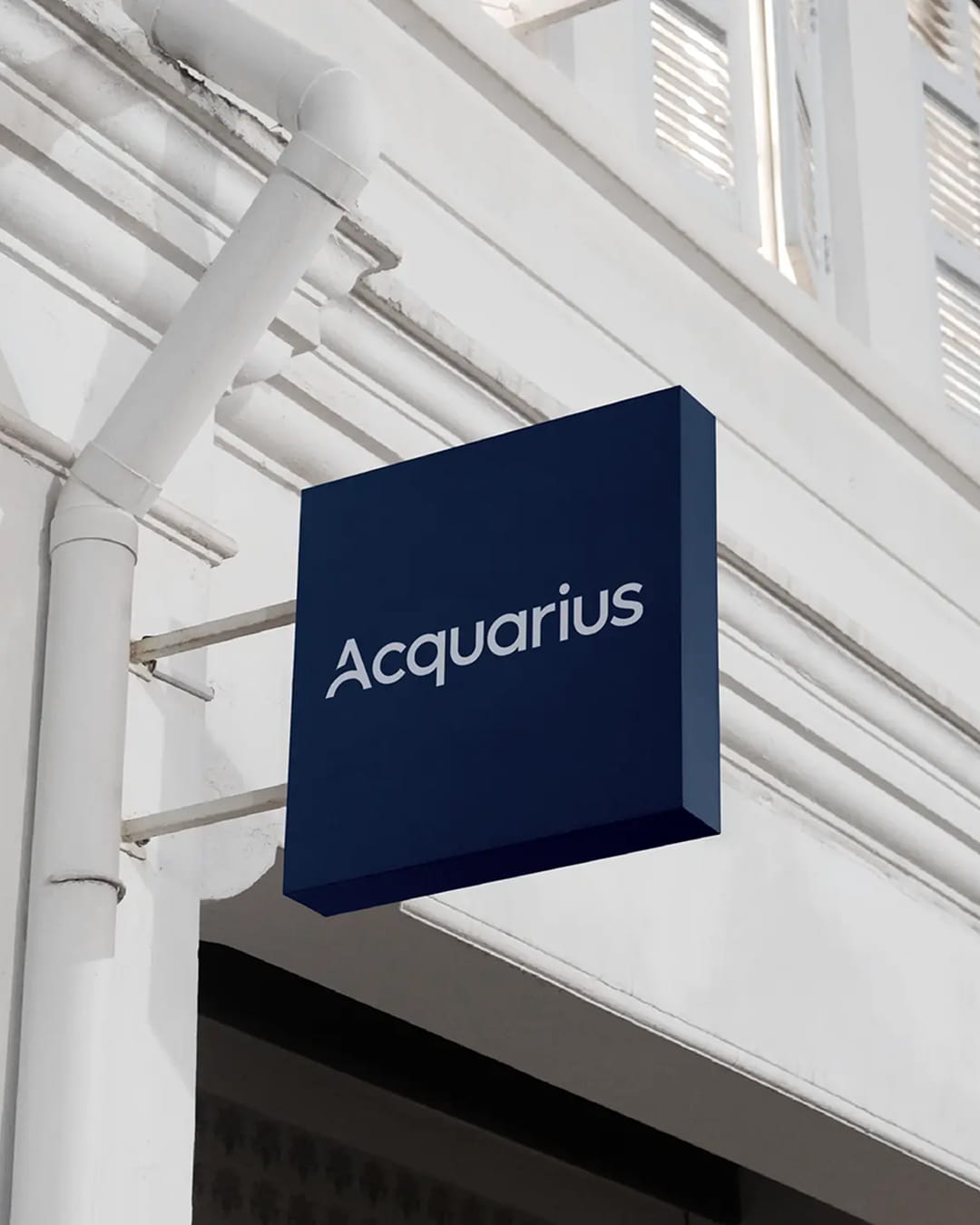
Applied across print, digital, signage and social media, the building blocks system is flexible by design, built to adapt and scale across any and all touchpoints.
Case details
Acquarius had grown considerably since its founding. Its staff were experienced, its services had expanded, and a new generation of leadership was preparing to take the business forward.
But the identity that had served the firm for almost three decades no longer reflected where the business found itself. Externally, it struggled to connect with the next generation of clients Acquarius wanted to attract. Internally, it did not reflect the company culture the firm had built.
Our strategic work began with a series of workshops to understand the business, its values and where it was heading. What emerged was a clear sense of what Acquarius stood for: trust, clarity, accountability and a genuine investment in its people. Crucially, the existing identity was not without equity. The original logo's geometric, building block-like mark was a recognisable part of the brand and something worth preserving. Rather than starting from scratch, the strategic direction centred on evolution, drawing on the existing logo to build a brand concept that would underpin the creative work to come.
The creative concept took its lead directly from the geometry of the original Acquarius logo. Squares and rectangles became the foundation of the visual system, slotting together in a modular system to suggest structure, unity and the idea that every part of the business works in relation to the others.
At the centre of the identity is a bespoke logotype built around the distinctive Acquarius A, geometric in construction but humanist in feel, designed to work as a standalone mark and sit naturally within the wider logotype.
The colour palette evolved from the existing brand, with Royal Blue and Bright Orange pushed to more vibrant, confident versions of themselves. New tones including Ink Blue and Periwinkle were introduced to give the system greater range, allowing the identity to feel bold and energetic without sacrificing the professionalism expected of a firm in this space.
Applied across print, digital, signage and social media, the building blocks system is flexible by design, built to adapt and scale across any and all touchpoints.
Like what you see?