What does it feel like to return home?

The Aliyah
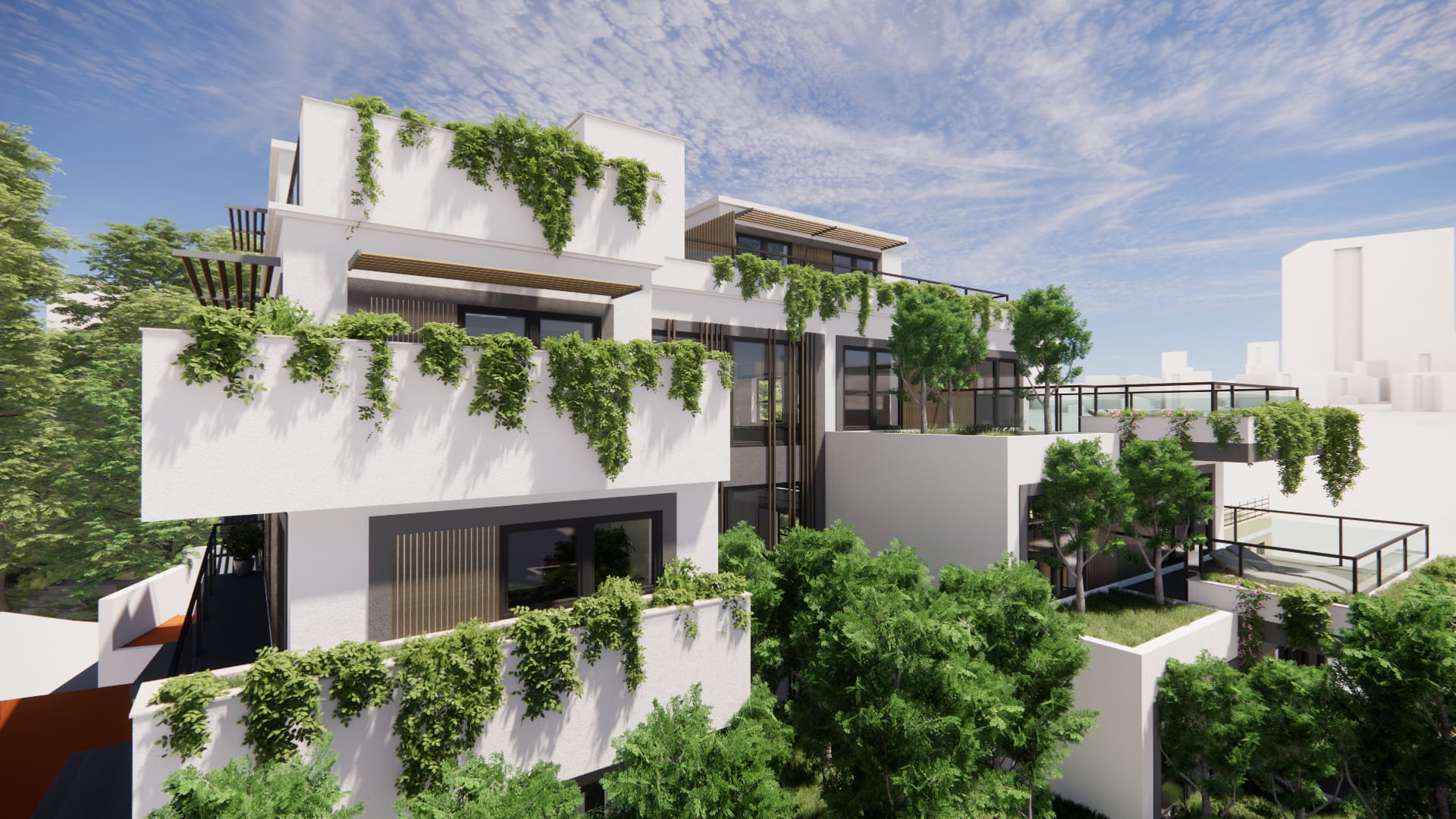
The Aliyah is a landmark residential development set within Gibraltar’s historic old town, offering a limited collection of expansive freehold apartments.
Designed for those who value privacy, quiet luxury and long-term investment, the development presented a rare opportunity to define a new benchmark for modern living within Gibraltar’s city walls.
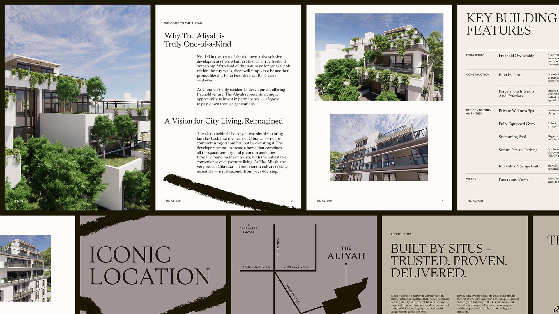
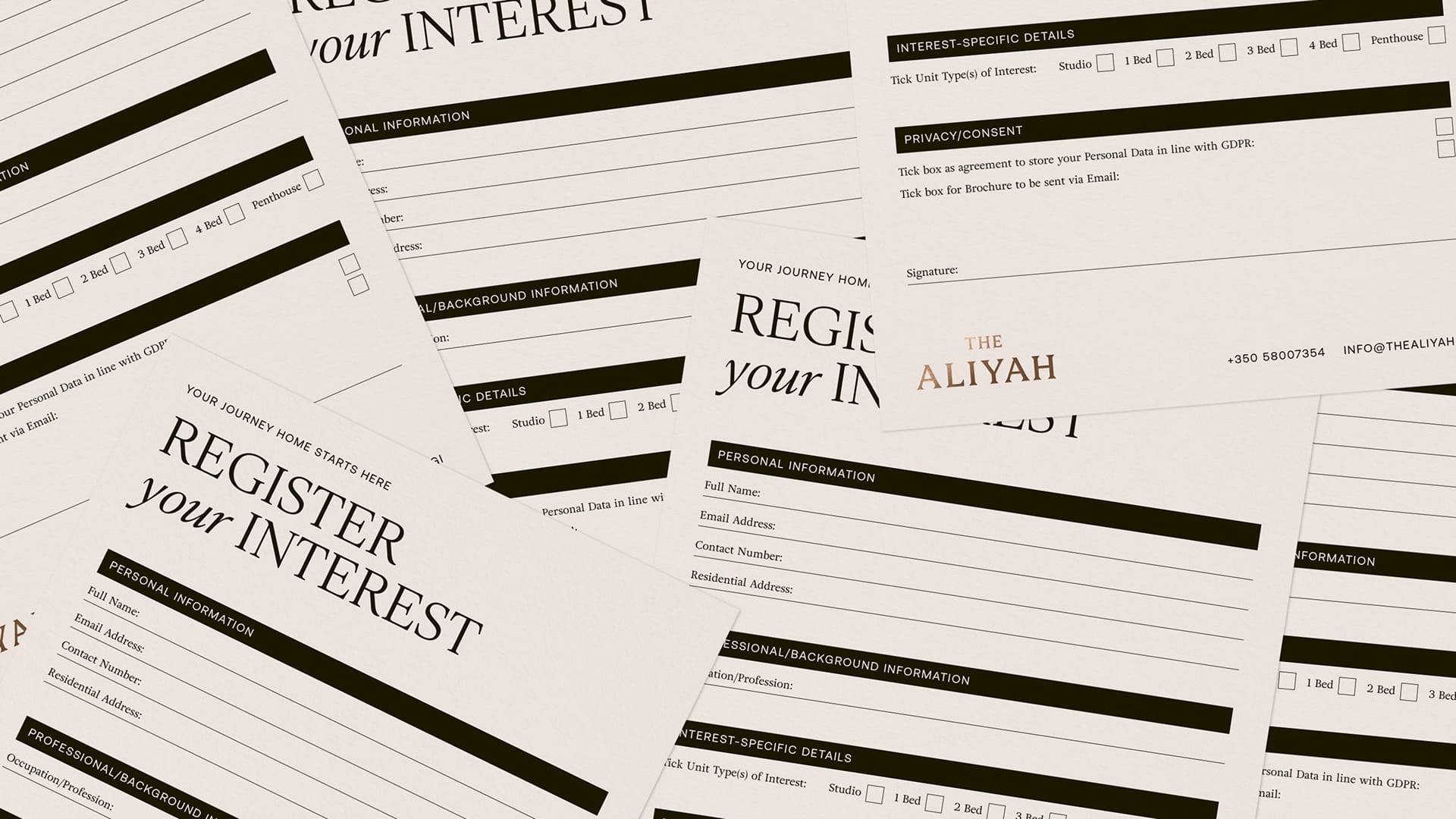

The developers recognised that a project of this calibre needed an identity that could match its quality and ambition. Launching into an increasingly competitive market, with buyer confidence softened by wider regional uncertainty, meant The Aliyah needed to do more than simply present itself as premium. It was not just another residential address, but a rare freehold opportunity in one of Gibraltar's most historic and spatially constrained areas.
Our strategic process began by sitting down with the developers to understand the ambition behind The Aliyah and the audience it needed to speak to.
What came through clearly was the idea of permanence. These were homes designed not only for the present, but for families, future generations and long-term investment. The name Aliyah, which can be interpreted in Hebrew as “the return home”, gave us a central idea to build around. From there, we shaped the brand around place, heritage and belonging, creating an identity that felt luxurious and contemporary while remaining connected to the streets, architecture and atmosphere of Gibraltar’s old town.
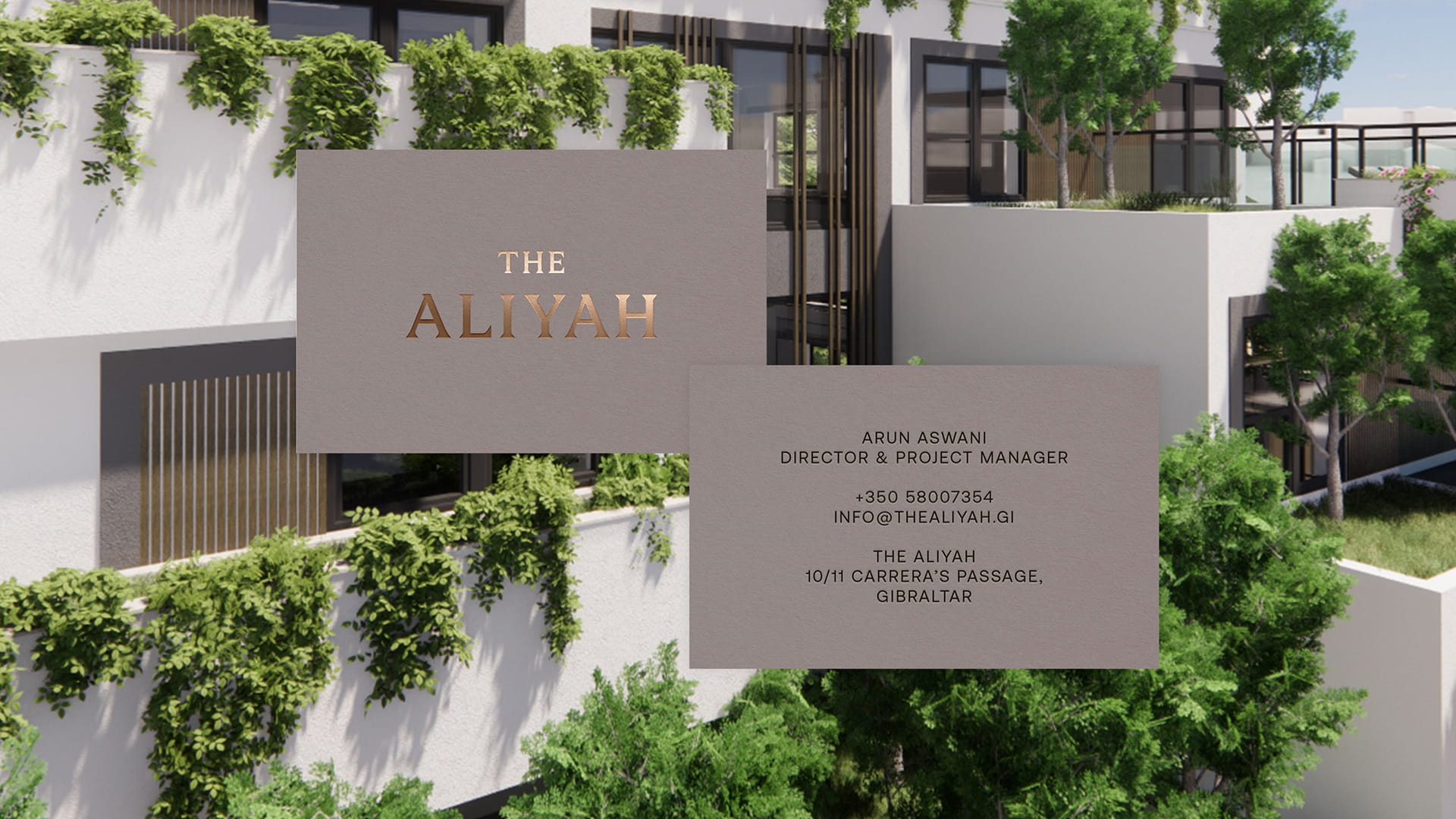
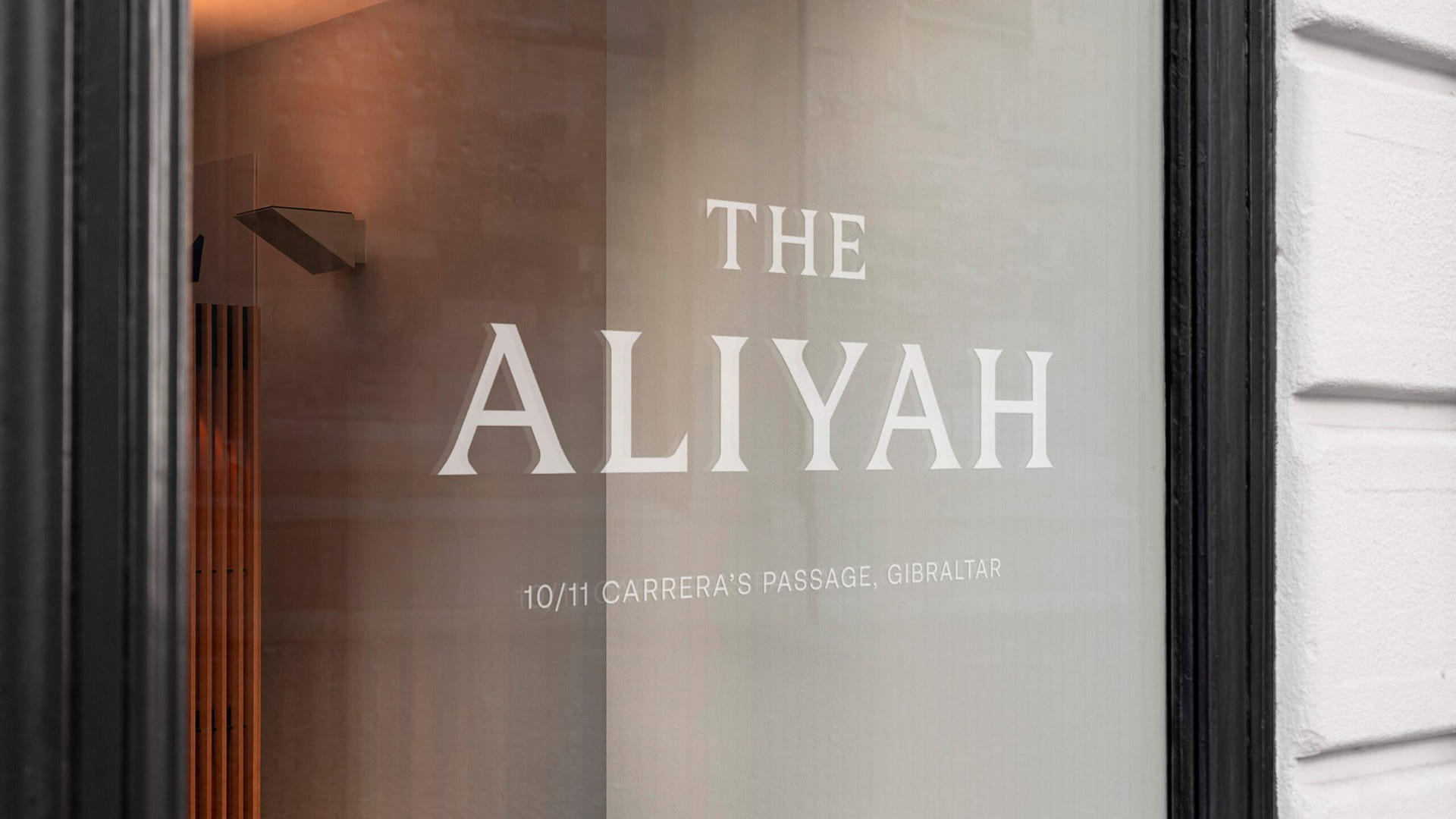
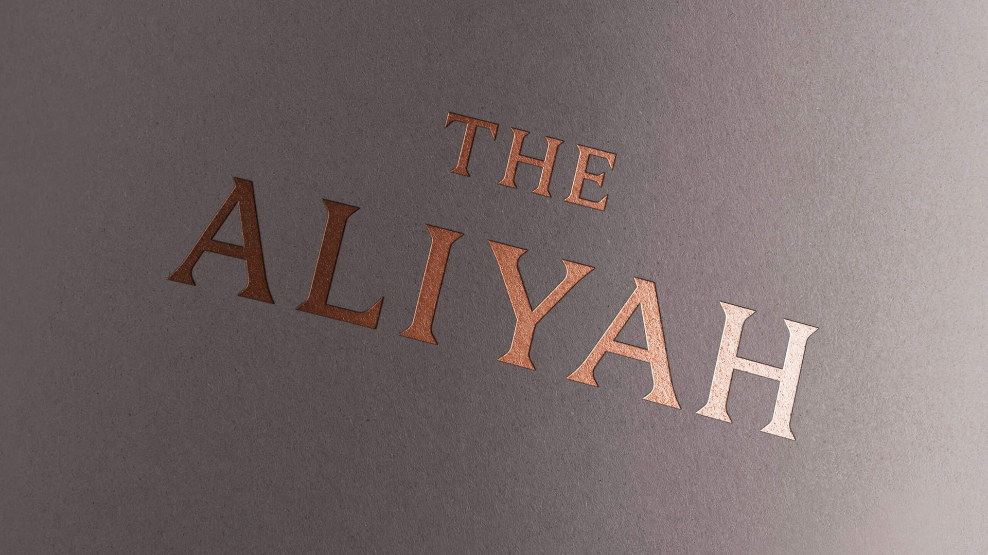
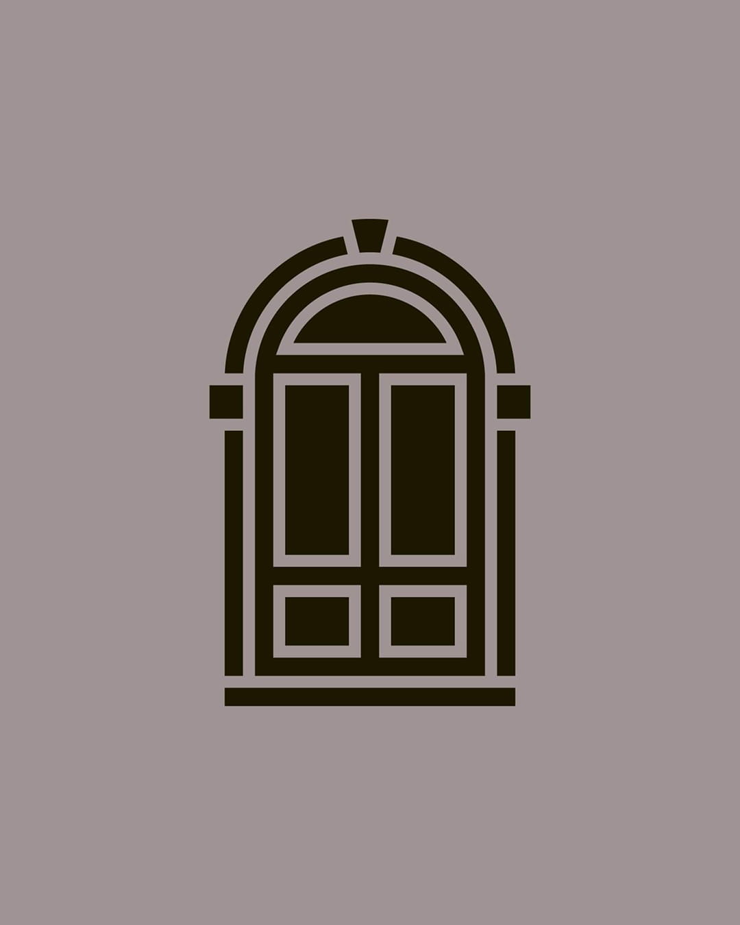
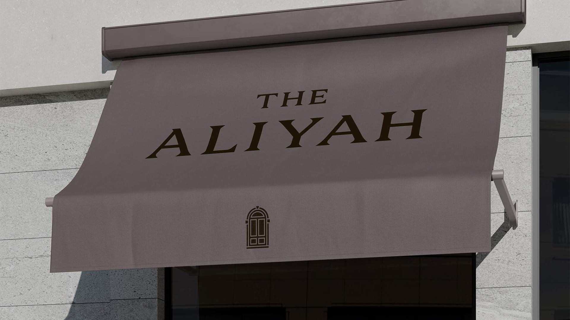
The creative solution centred on the idea of returning home. We created a logomark inspired by the distinctive doorways of Gibraltar's old town, drawing from their arches, keystones and springers. The mark became both a reflection of local architecture and a metaphor for crossing the threshold into a home.
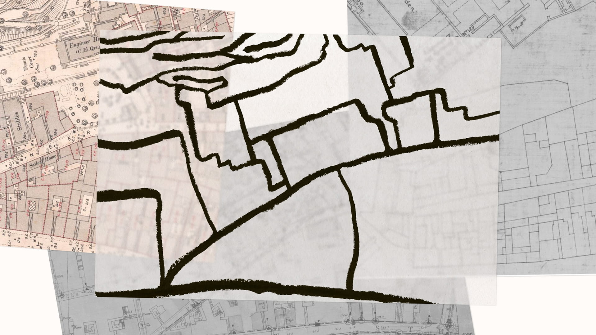
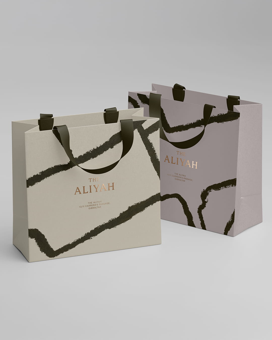
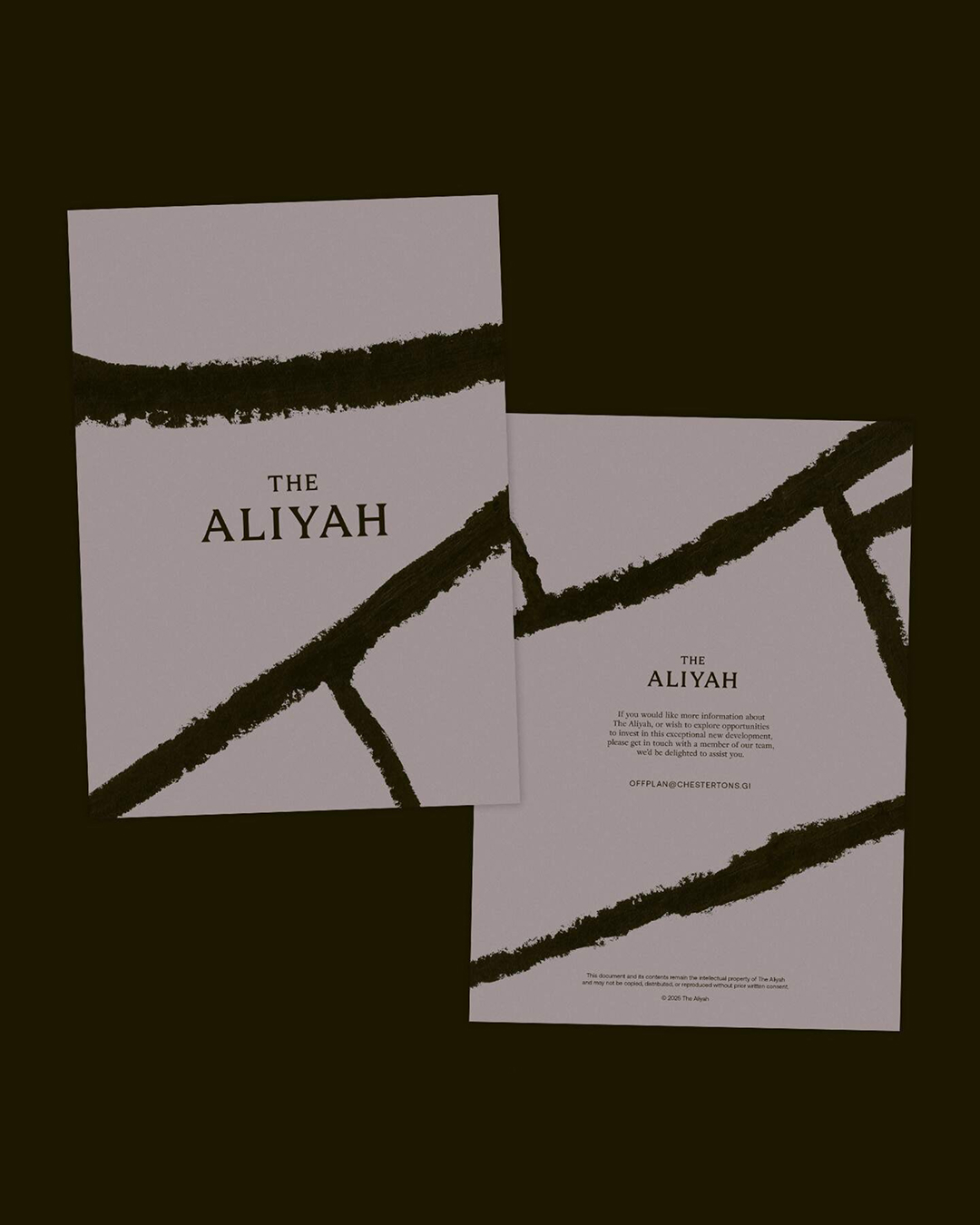
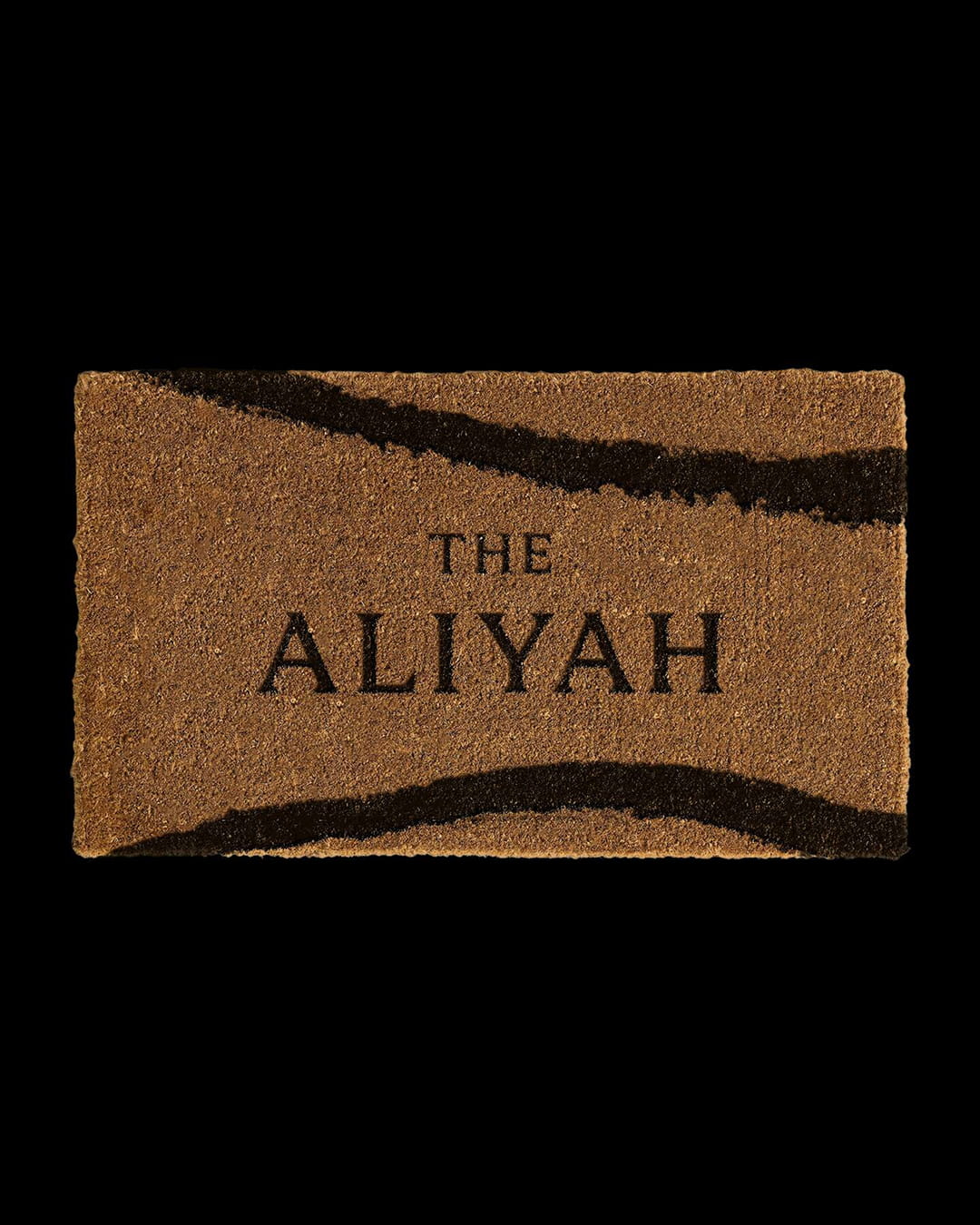
To extend this sense of place, we developed a hand-painted map depicting Gibraltar's streets and alleys. Used as an abstract visual device, it references the paths that lead residents back home. This idea was carried through the tone of voice, where home became a recurring motif across the brand and sales campaign.
Case details
The developers recognised that a project of this calibre needed an identity that could match its quality and ambition. Launching into an increasingly competitive market, with buyer confidence softened by wider regional uncertainty, meant The Aliyah needed to do more than simply present itself as premium. It was not just another residential address, but a rare freehold opportunity in one of Gibraltar's most historic and spatially constrained areas.
Our strategic process began by sitting down with the developers to understand the ambition behind The Aliyah and the audience it needed to speak to.
What came through clearly was the idea of permanence. These were homes designed not only for the present, but for families, future generations and long-term investment. The name Aliyah, which can be interpreted in Hebrew as “the return home”, gave us a central idea to build around. From there, we shaped the brand around place, heritage and belonging, creating an identity that felt luxurious and contemporary while remaining connected to the streets, architecture and atmosphere of Gibraltar’s old town.
The creative solution centred on the idea of returning home. We created a logomark inspired by the distinctive doorways of Gibraltar's old town, drawing from their arches, keystones and springers. The mark became both a reflection of local architecture and a metaphor for crossing the threshold into a home.
To extend this sense of place, we developed a hand-painted map depicting Gibraltar's streets and alleys. Used as an abstract visual device, it references the paths that lead residents back home. This idea was carried through the tone of voice, where home became a recurring motif across the brand and sales campaign.
Like what you see?