Reimagining an insurance provider around its local community.

Masbro
Masbro is a Gibraltarian insurance provider that has served the local community since 1985, building a strong relationship with its customers over decades of service.
Positioning itself as “Gibraltar’s favourite insurance broker”, Masbro has always had a close connection to the place and people it serves. The opportunity was to create a brand identity that reflected that relationship more clearly.



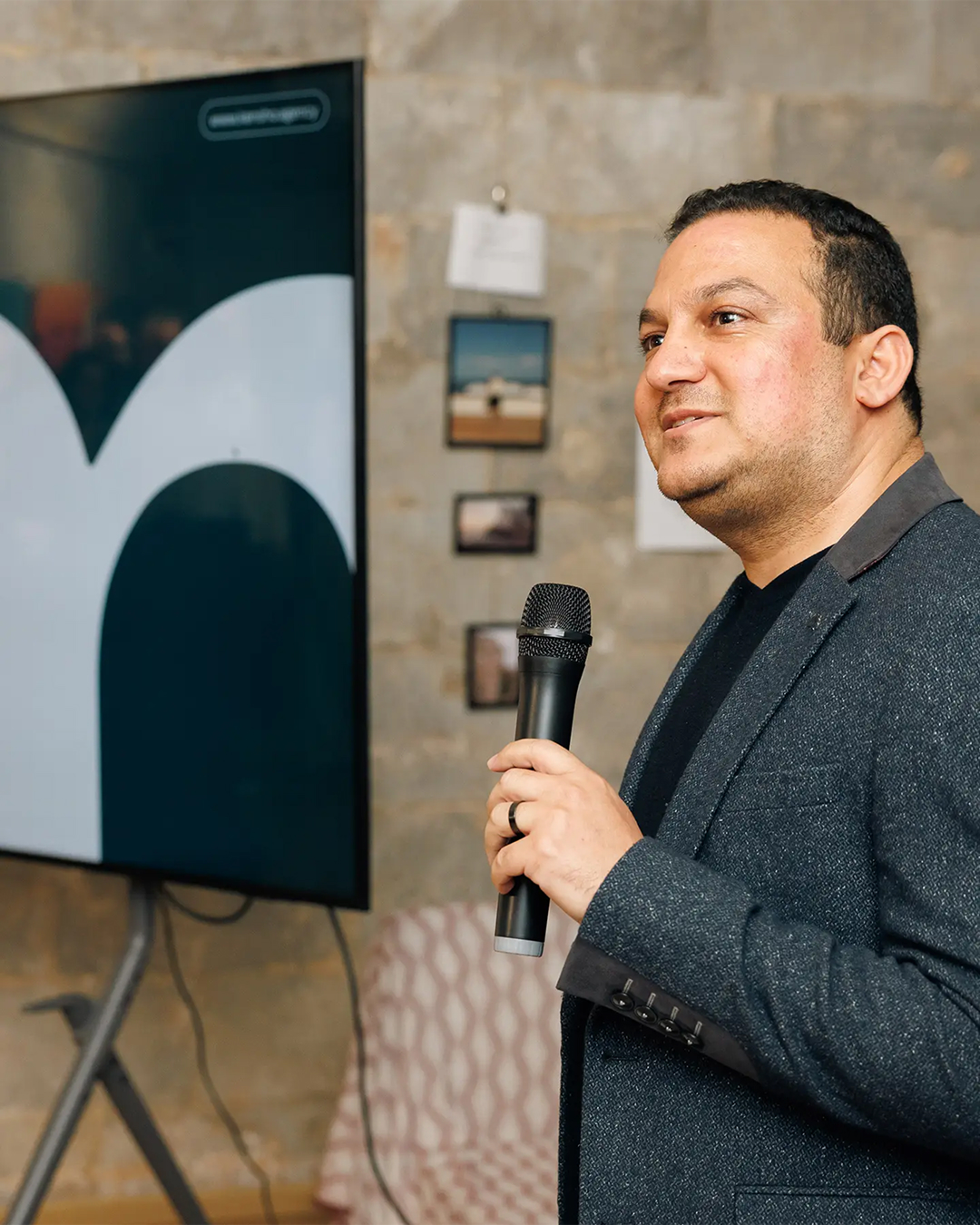
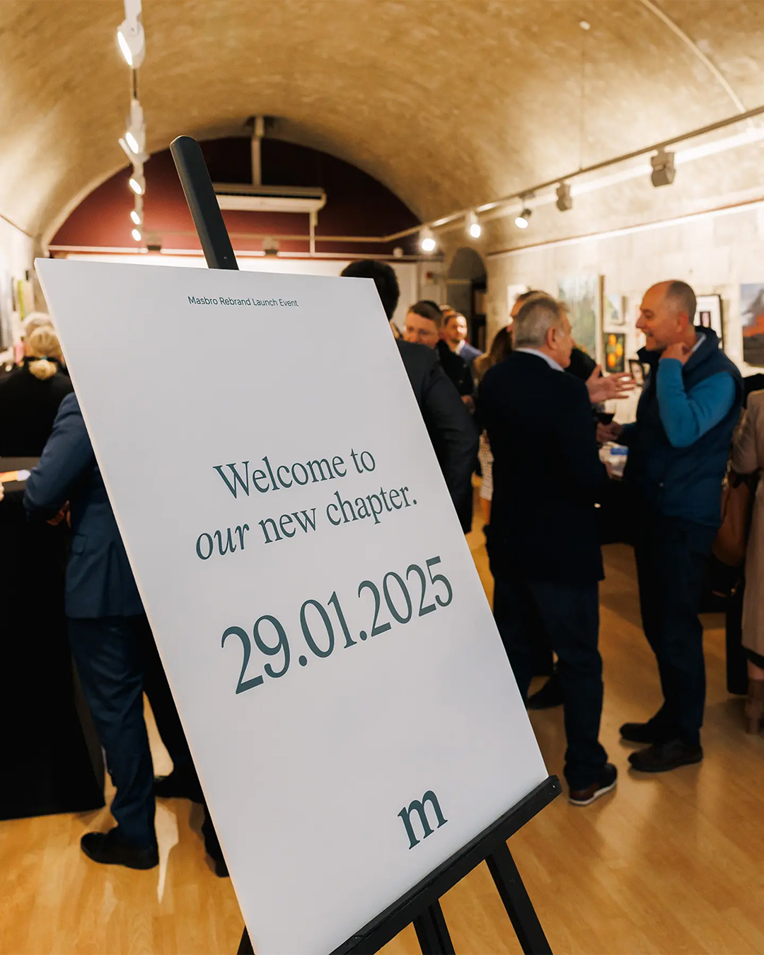
As Masbro prepared for an office move and a wider shift under new management, the business reached a natural point of reflection. Looking across its physical space, customer experience and broader brand presence, it became clear that the identity no longer reflected the direction of the company or the people behind it.
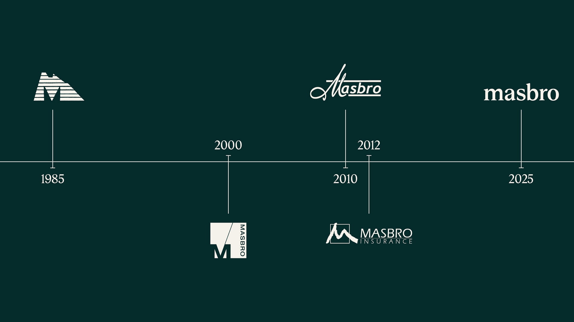
Although Masbro had built a strong reputation over decades of service, the brand had remained largely unchanged for more than ten years. In an increasingly competitive market, there was a clear need to evolve how the business was perceived, retaining the professionalism and trust it was known for while introducing a greater sense of warmth, personality and local relevance.
Our strategic process began by sitting down with Masbro's leadership team to understand why the business wanted to make this shift and what the new brand needed to communicate.
What came through clearly was a desire for Masbro to be seen as part of the community, not separate from it. That insight shaped the direction of the brand, shifting the focus towards the people, places and everyday interactions that define life in Gibraltar.
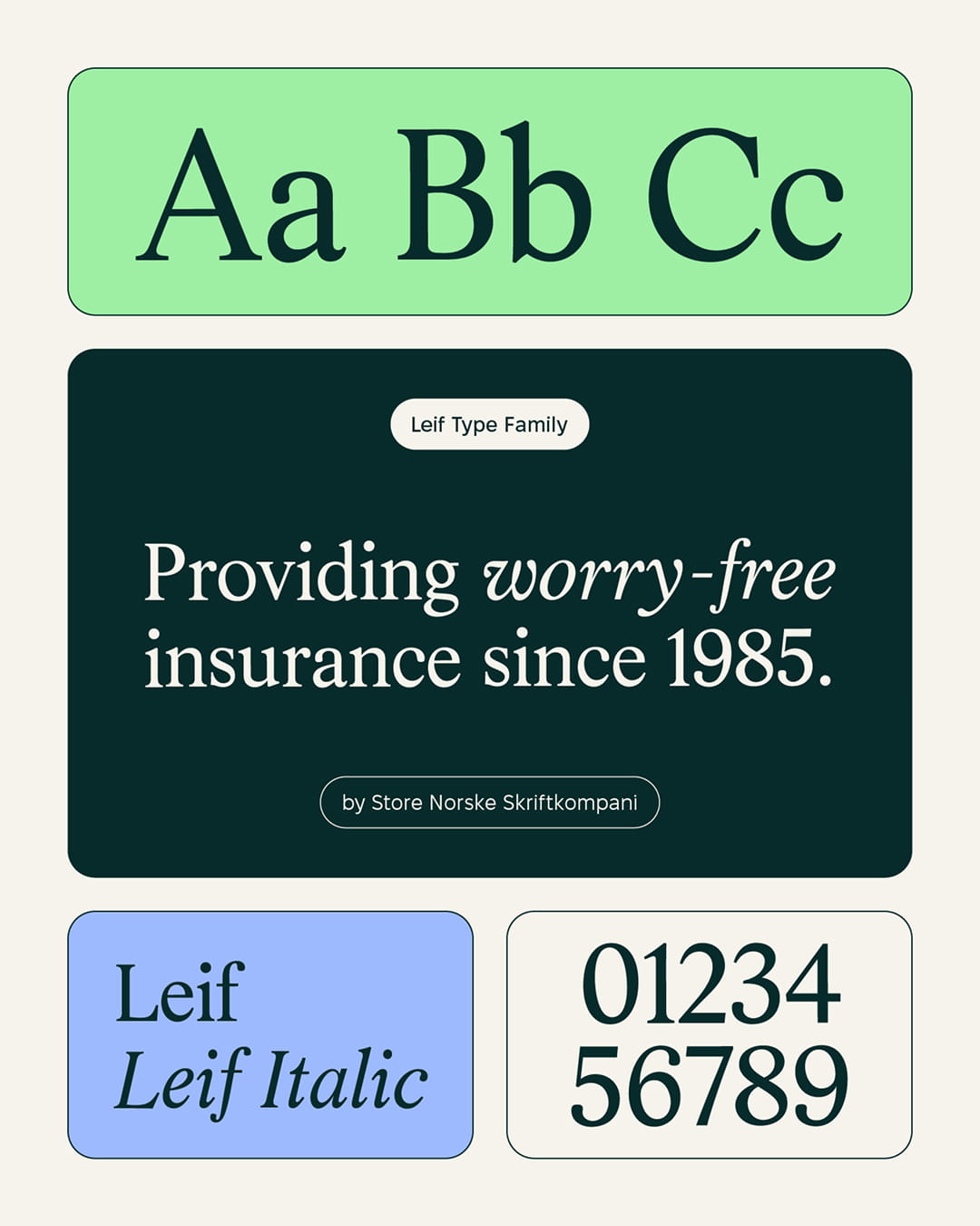
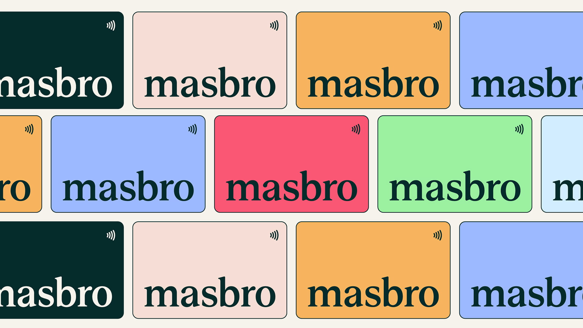
We moved Masbro away from conventional insurance aesthetics and into a more playful, imaginative visual language. The typographic logo suite and wider type system brought character into the brand while preserving the credibility expected of an insurance provider.
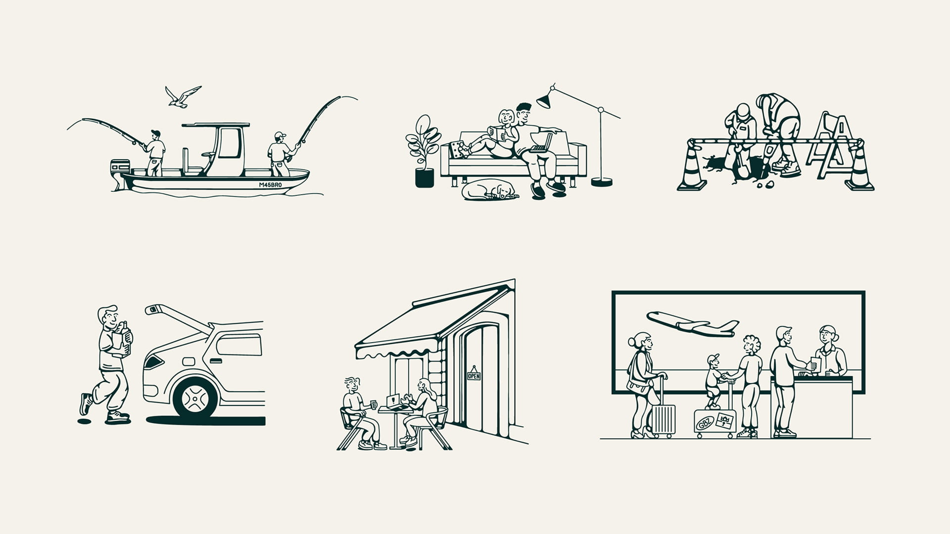
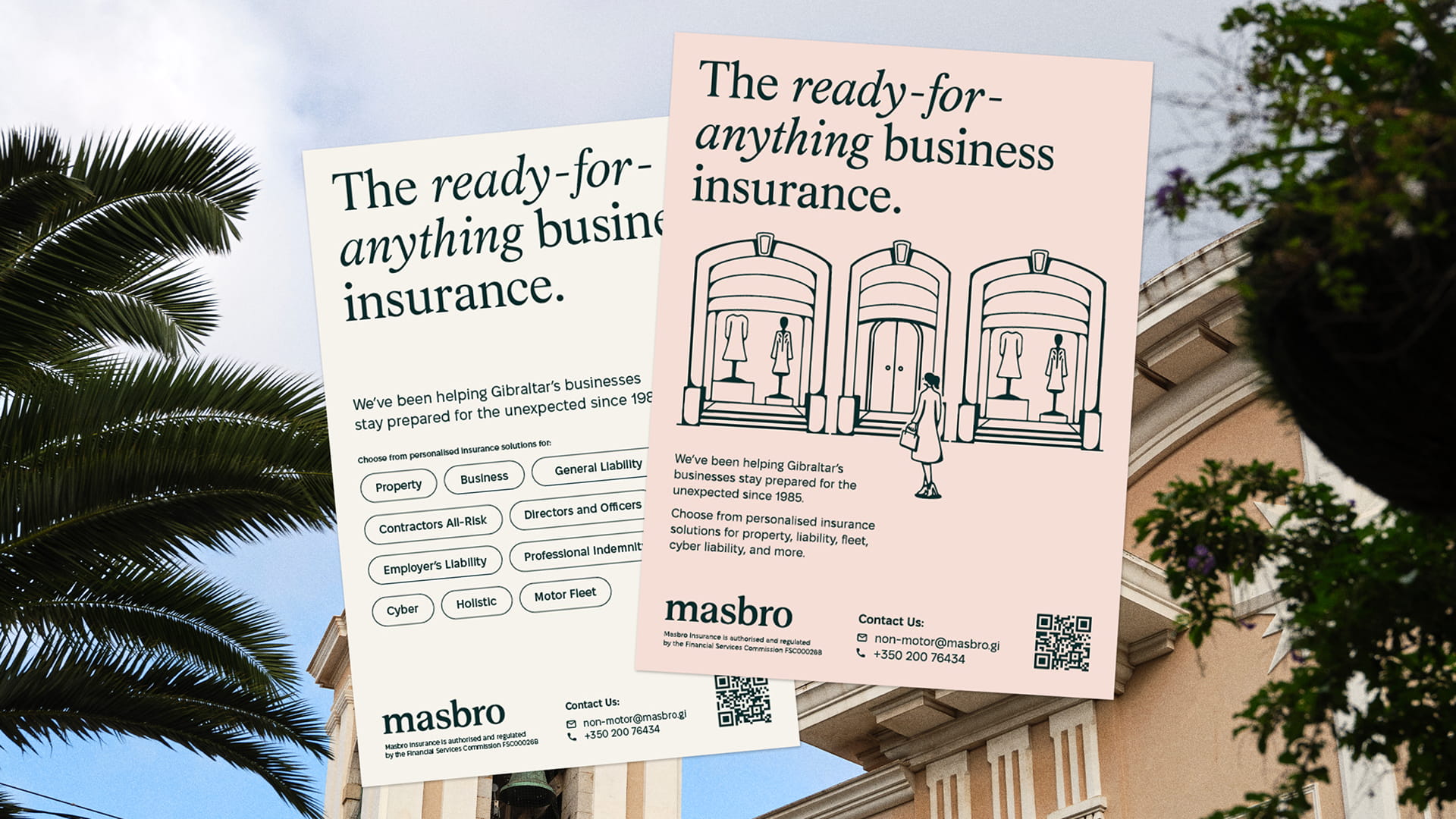
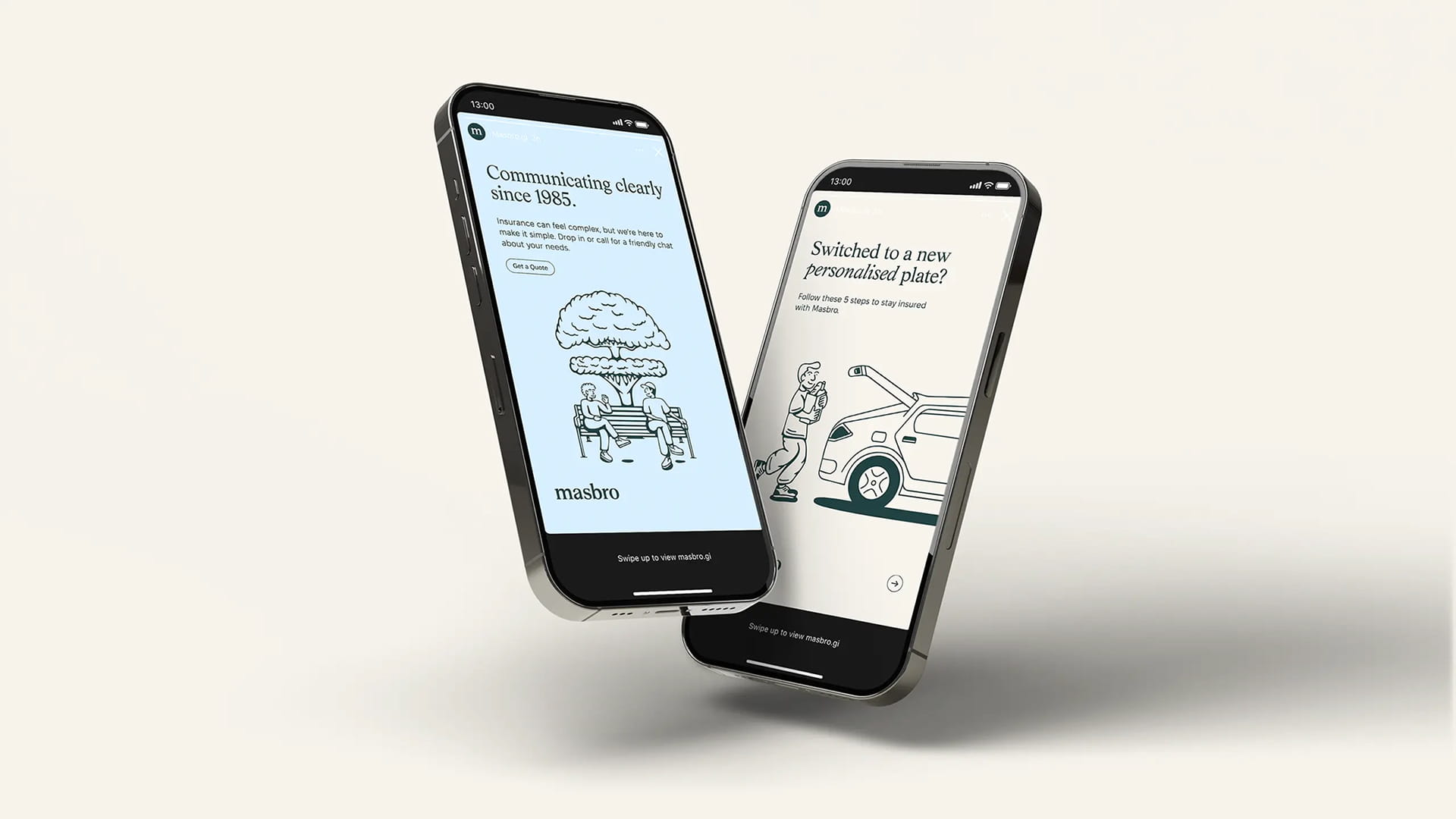
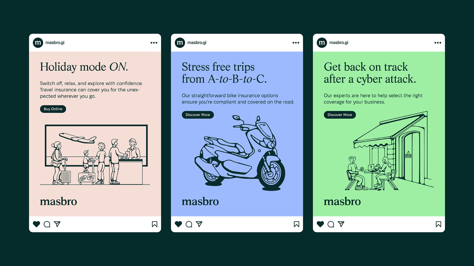
This was supported by a colour palette drawn from Gibraltar's lively architecture and, at the centre of it all, an illustration suite depicting familiar moments of everyday Gibraltarian life.
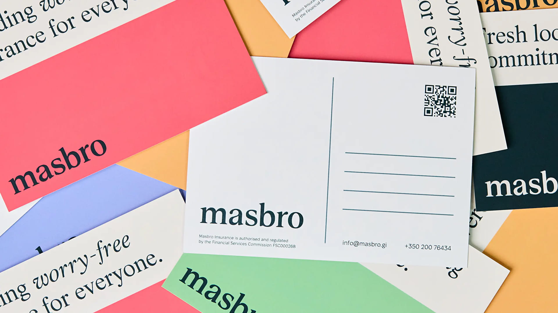
Used together across web, print and digital, these elements create a brand world that feels distinctly local, reinforcing Masbro's position as Gibraltar's favourite insurance broker.
Case details
As Masbro prepared for an office move and a wider shift under new management, the business reached a natural point of reflection. Looking across its physical space, customer experience and broader brand presence, it became clear that the identity no longer reflected the direction of the company or the people behind it.
Although Masbro had built a strong reputation over decades of service, the brand had remained largely unchanged for more than ten years. In an increasingly competitive market, there was a clear need to evolve how the business was perceived, retaining the professionalism and trust it was known for while introducing a greater sense of warmth, personality and local relevance.
Our strategic process began by sitting down with Masbro's leadership team to understand why the business wanted to make this shift and what the new brand needed to communicate.
What came through clearly was a desire for Masbro to be seen as part of the community, not separate from it. That insight shaped the direction of the brand, shifting the focus towards the people, places and everyday interactions that define life in Gibraltar.
We moved Masbro away from conventional insurance aesthetics and into a more playful, imaginative visual language. The typographic logo suite and wider type system brought character into the brand while preserving the credibility expected of an insurance provider.
This was supported by a colour palette drawn from Gibraltar's lively architecture and, at the centre of it all, an illustration suite depicting familiar moments of everyday Gibraltarian life.
Used together across web, print and digital, these elements create a brand world that feels distinctly local, reinforcing Masbro's position as Gibraltar's favourite insurance broker.
Like what you see?