Making B2B banking feel simple.
Justbank
Justbank is a modern banking provider created to make B2B banking simpler, clearer and more accessible.
Entering a sector often defined by complexity, jargon and legacy processes, Justbank needed a brand that could communicate its proposition from day one: banking made simple.


“Despite our 20-year history, this partnership has helped us re-emerge with the energy of the “new kids on the block”. It has helped us move away from being a quiet presence in the background to becoming a more proactive, visible choice for our clients.”
Nikolai Gafan
justbank, Head of Corporate Banking






As a newly established banking provider, Justbank entered a market where business banking had long been defined by complexity, jargon and legacy processes. The opportunity was to rethink how B2B banking could present itself, building a brand around clarity, accessibility and ease of use rather than the familiar conventions of the financial sector.
The strategy centred on the idea already embedded in the name: Justbank. Simple and to the point.
This shaped the strategic direction. The brand needed to demystify banking without losing credibility, avoiding corporate jargon and communicating in a way that felt clear, human and professional.
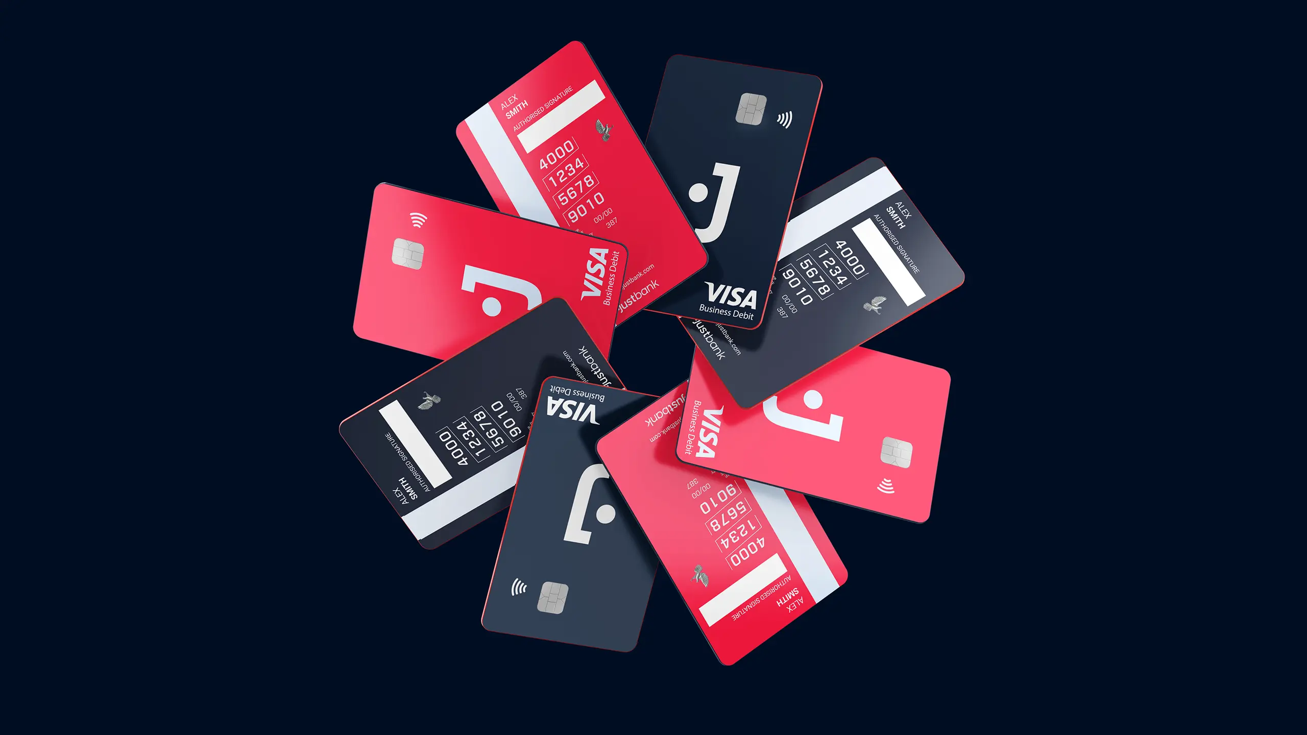
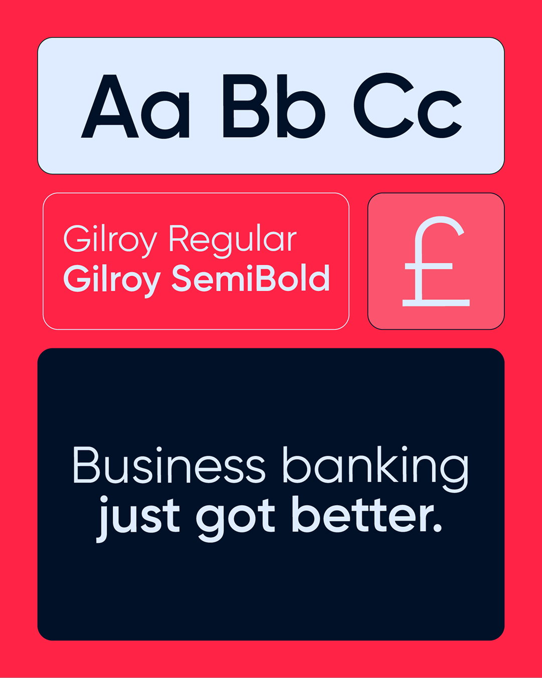
Visually, the brand strips banking back into a direct and approachable system. Clean sans-serif typography positions the brand as contemporary, while the colour palette introduces moments of energy into a category that can often feel clinical or overly corporate.
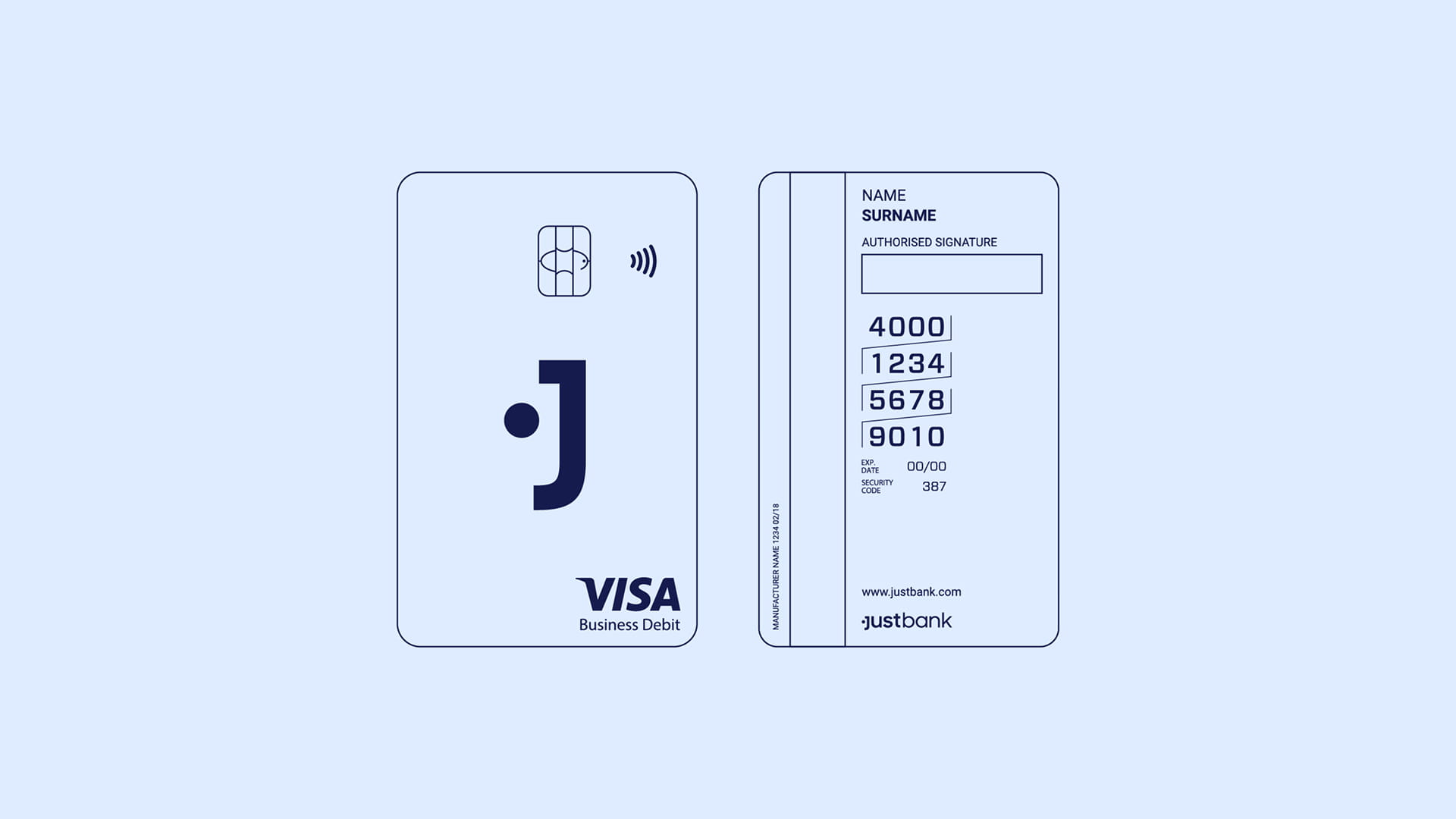
At the centre of the logo suite is a distinctive "J" mark. Its tittle sits to the side, creating the impression of a face and introducing a subtle human element into the identity. Through motion, this detail becomes more expressive, giving the brand small moments of personality while keeping the system simple and controlled.
That same tittle becomes the foundation for the wider 3D visual world. Reimagined as a ball, it moves through pathways, routes and environments, suggesting navigation, progress and the act of getting from A to B.
Case details
As a newly established banking provider, Justbank entered a market where business banking had long been defined by complexity, jargon and legacy processes. The opportunity was to rethink how B2B banking could present itself, building a brand around clarity, accessibility and ease of use rather than the familiar conventions of the financial sector.
The strategy centred on the idea already embedded in the name: Justbank. Simple and to the point.
This shaped the strategic direction. The brand needed to demystify banking without losing credibility, avoiding corporate jargon and communicating in a way that felt clear, human and professional.
Visually, the brand strips banking back into a direct and approachable system. Clean sans-serif typography positions the brand as contemporary, while the colour palette introduces moments of energy into a category that can often feel clinical or overly corporate.
At the centre of the logo suite is a distinctive "J" mark. Its tittle sits to the side, creating the impression of a face and introducing a subtle human element into the identity. Through motion, this detail becomes more expressive, giving the brand small moments of personality while keeping the system simple and controlled.
That same tittle becomes the foundation for the wider 3D visual world. Reimagined as a ball, it moves through pathways, routes and environments, suggesting navigation, progress and the act of getting from A to B.
Like what you see?